Located in the leafy streets of Brighton just a few hundred metres from the waterfront, the project comprises 16 contemporary residences and is led by local developer, Fortis. Appearing as a landscaped corridor, a ribbon of established trees lining the front of one of the street fronts ensures privacy and intimacy for the residents inside.
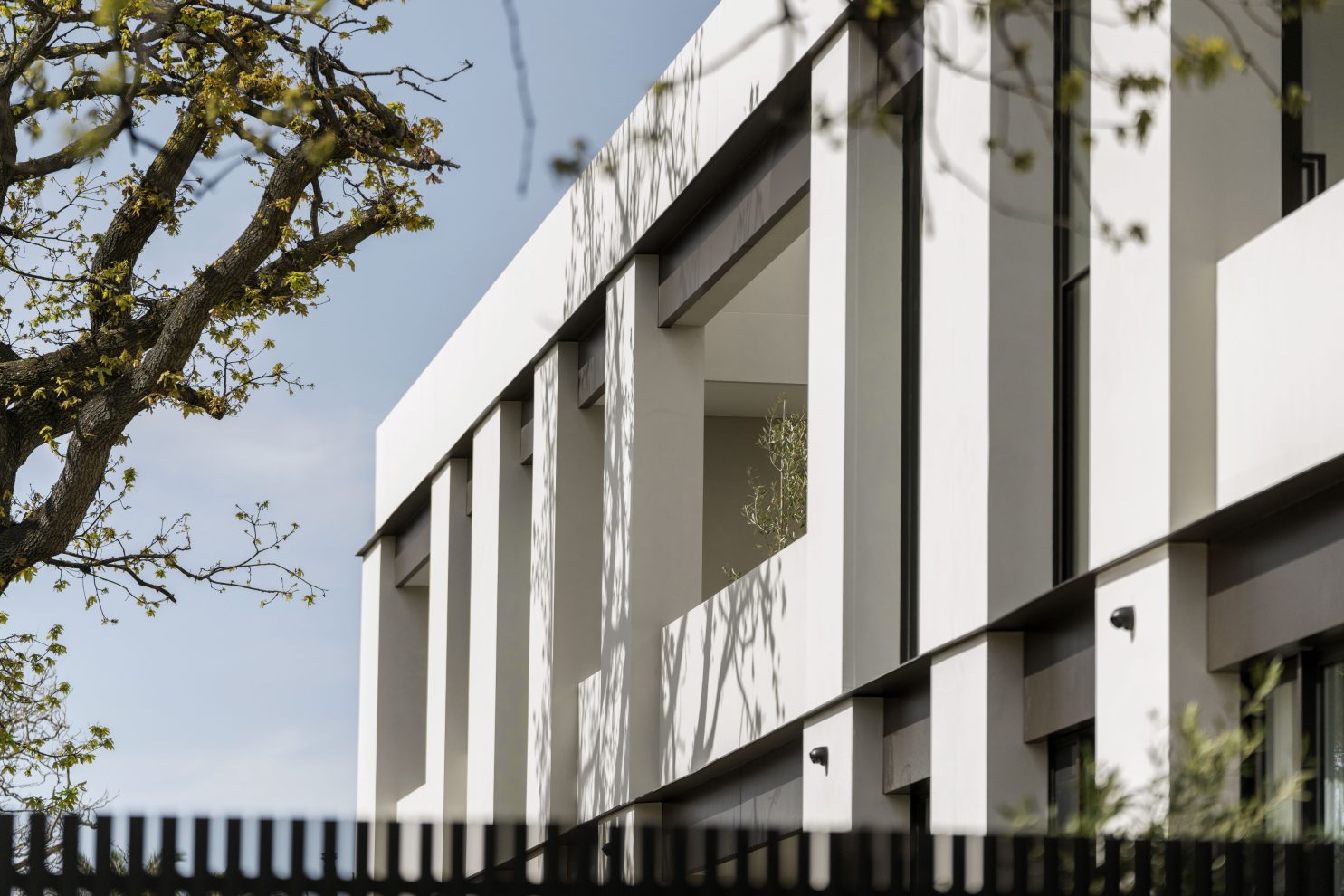
Strong in form, the gentle shift in the façade is a play on formal classism, which can be viewed as a timeless, yet modern design. This façade rhythm is expressed through staggered vertical elements, and recessed metal panel details, resulting in a softening to the building mass. The horizontal staggering of these modules breakdown the mass of the two level podium form.
Recessed balustrades create further depth and articulation and are highlighted greatly from shadow play from the surrounding established trees.
The design has been shaped to convey substance and quality, with robust natural materials and an abundance of space reflective of Brighton’s local architectural context.
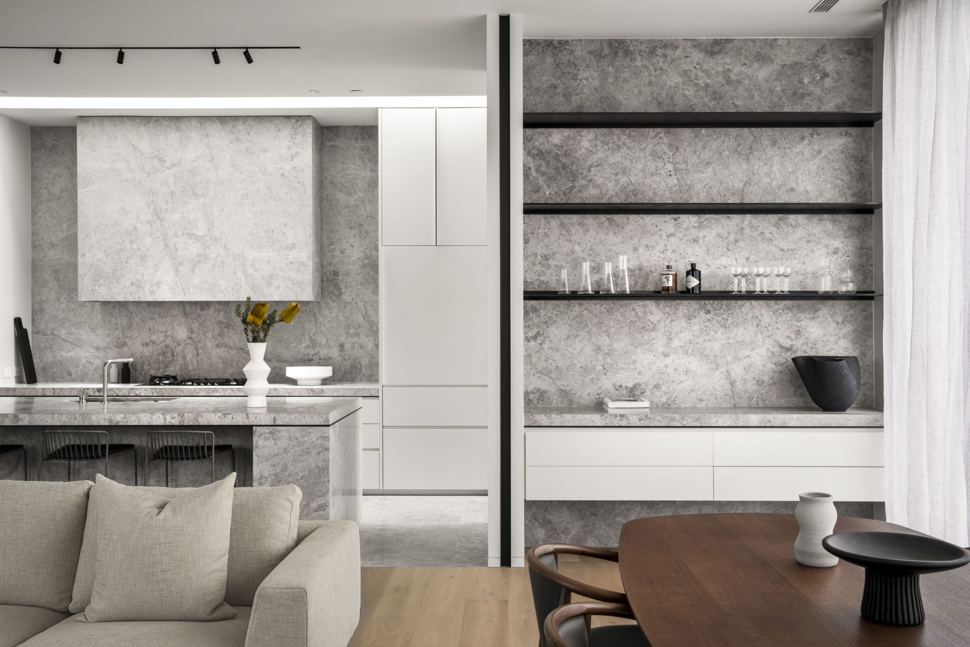
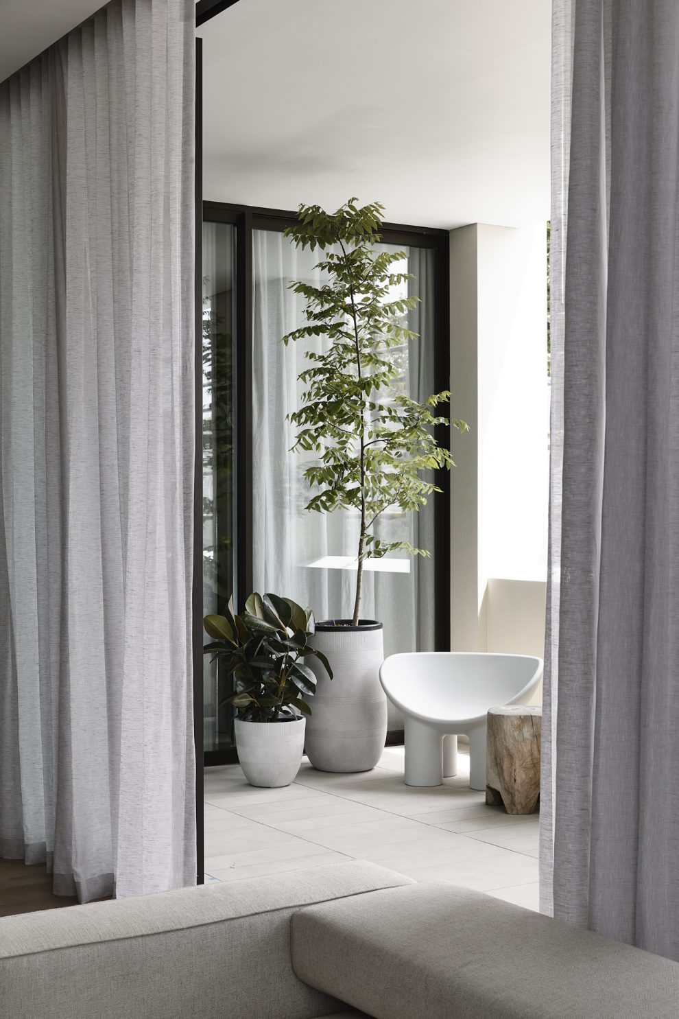
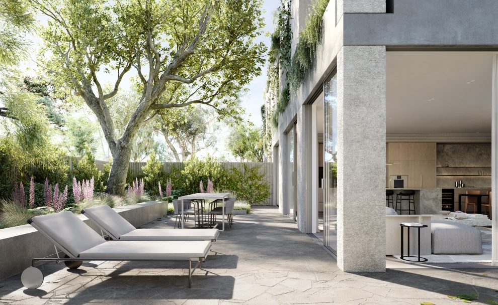
Each of the residences have been designed with respect to orientation to capture the best natural light, while deep set awnings provide added protection from the sun when needed. With highly vegetated front yard, residents have access to private open space, with direct street access for ground level apartments.
The upper level is recessed behind the front podium wall to provide relief to the building mass. The materiality and proportions of this level are read in conjunction with the podium to present a consistent design response to the street.
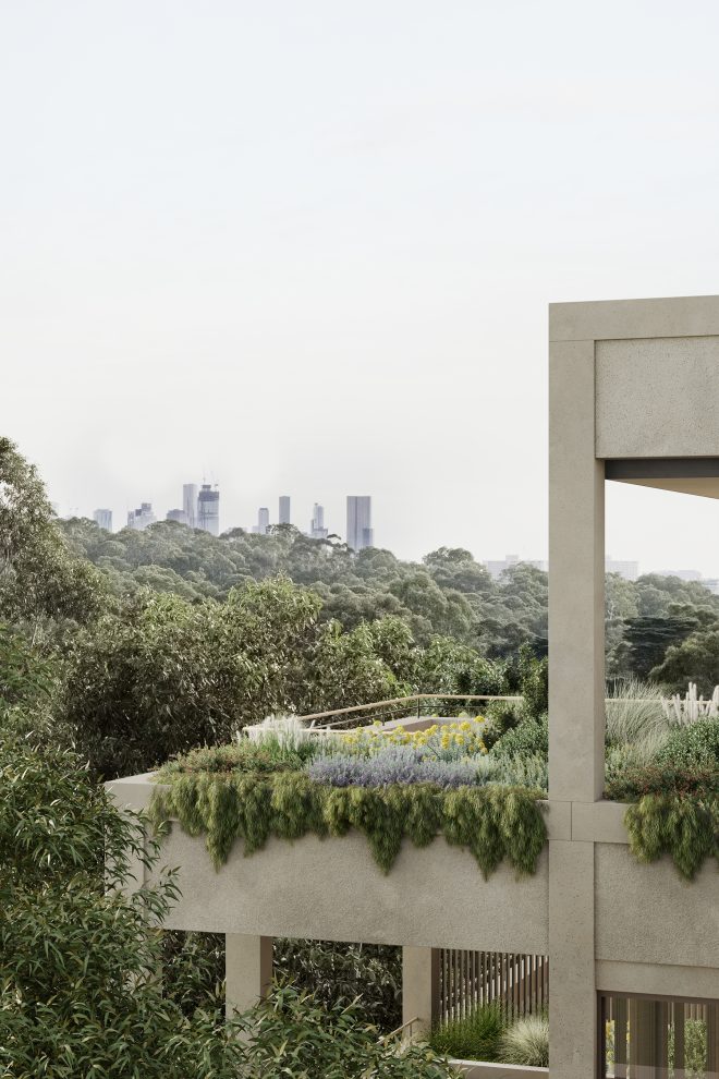
The top floor is further separated and broken down by the introduction of generous planting zones that drape over the podium parapet, softening the geometric form and further enhancing the established landscape character of the site.
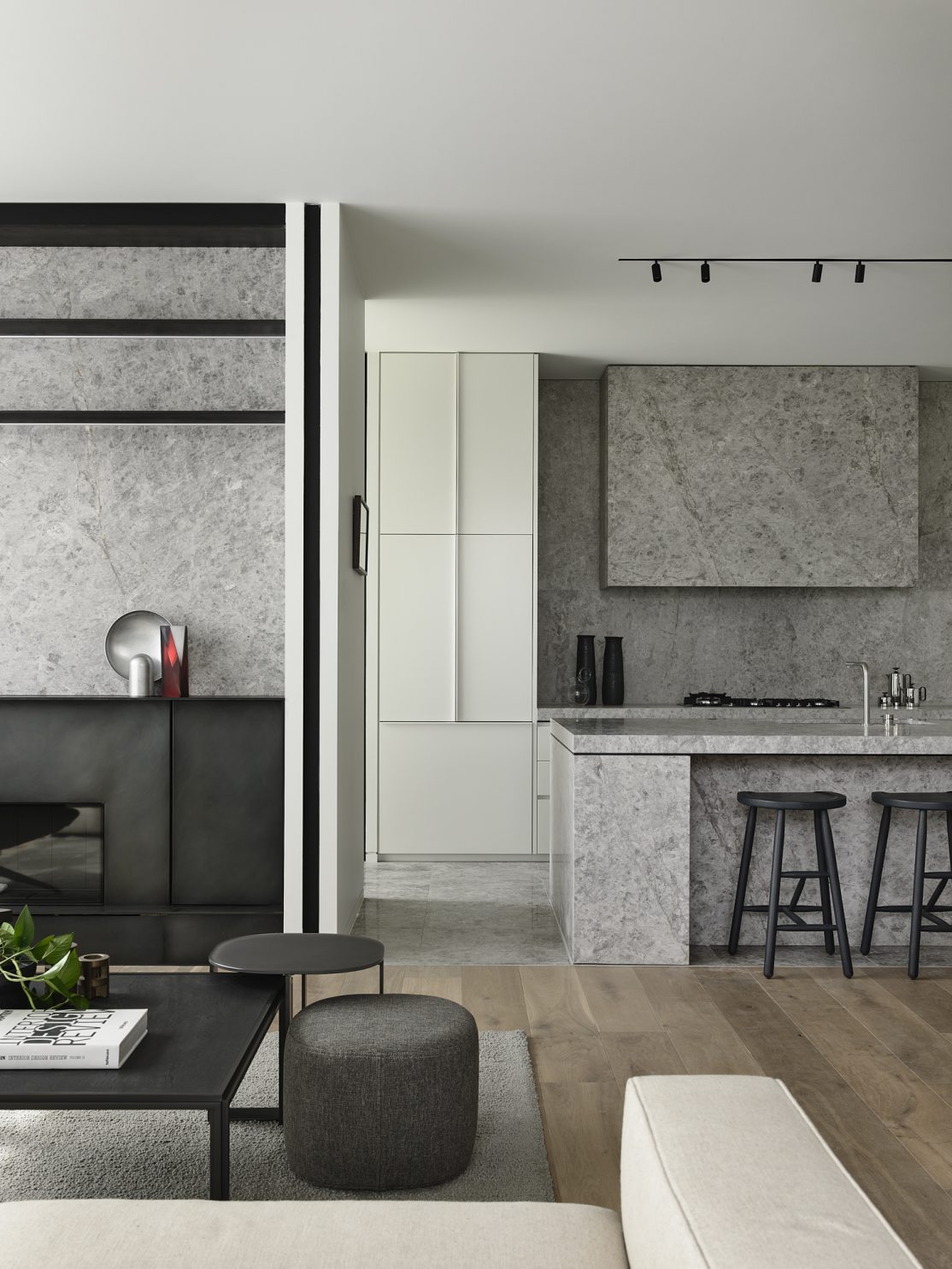
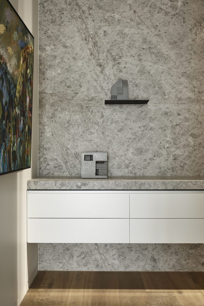
The strength of the architectural form and materiality is continued throughout the interior spaces. Details are elevated and articulated, whether it’s the fine datum lines that carve through the walls in steel, or the swathes of natural stone that bring a bold durability.
The spaces are sequenced to bring occupants deeper inside where each of the joinery elements create a harmonious layering and repetition. From the communal spaces, through to each individual apartment, the harmonious, layered joinery elements create a human-scaled experience that’s very tactile.
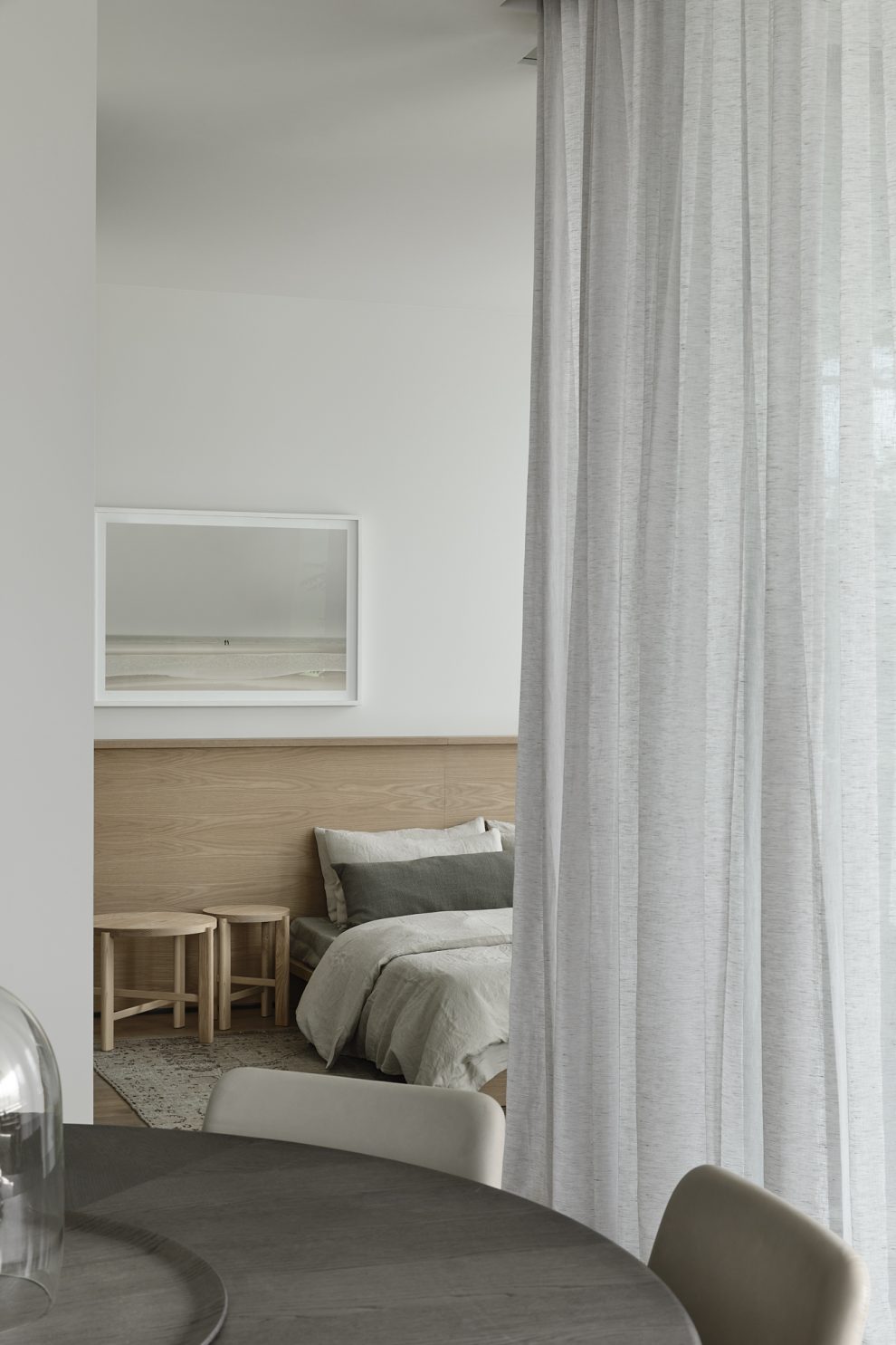
There is also considerable emphasis into meticulously planning the main bedroom suite and living areas, allowing residents to live and entertain effortlessly. A few examples of this include the generous separations between the main bedroom and secondary bedrooms, locating sculleries adjacent the kitchens, and the use of large walk-in laundries.
While all Pillar+Tide residences feature the same design language and materiality, each is finished in a subtly different way creating a deep sense of individuality. No two are alike.”
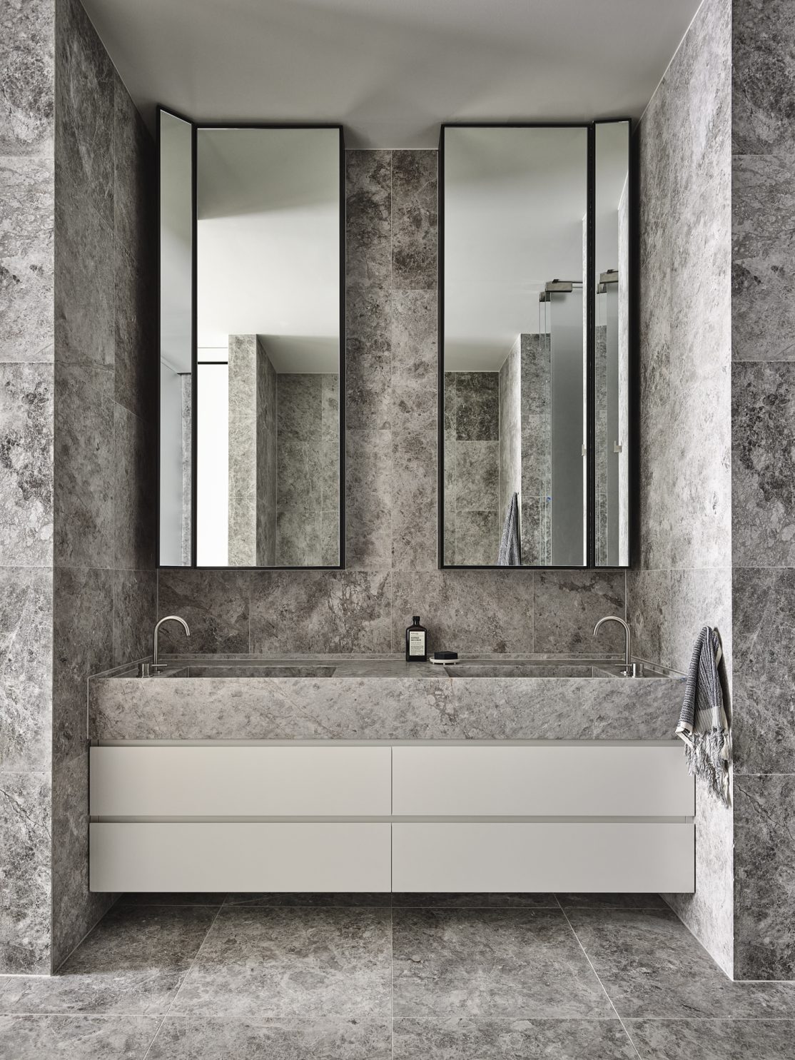
Throughout the entire project, there is an added playfulness to the contemporary composition by balancing robust forms against fine skeletal steel elements – an approach repeated the interior design and detailing. Each residence captures the best natural light while deep recesses provide shade where needed, making for an intangible, relaxing interior quality.
