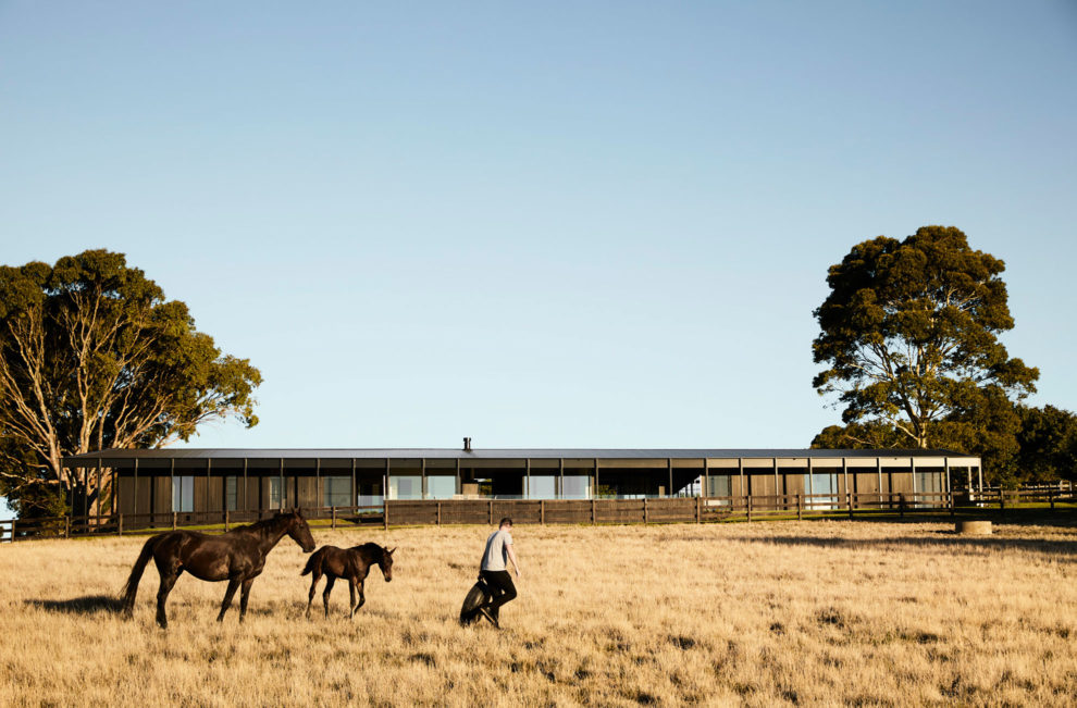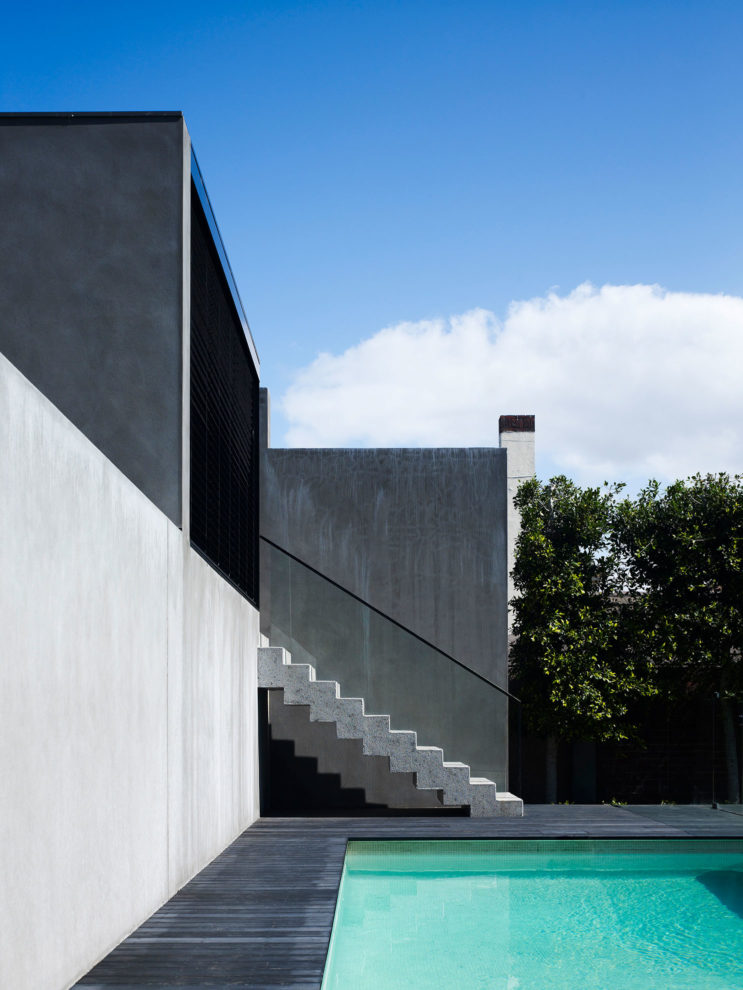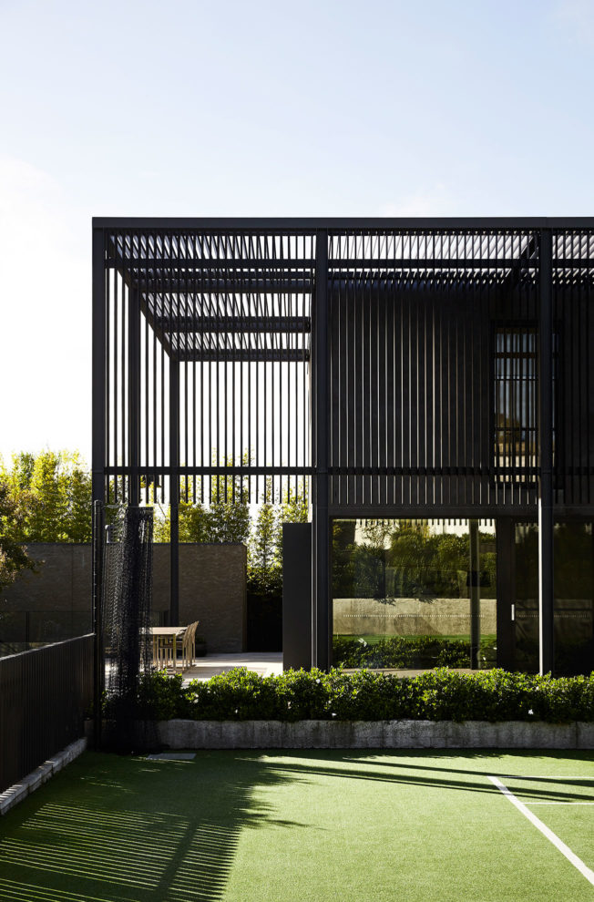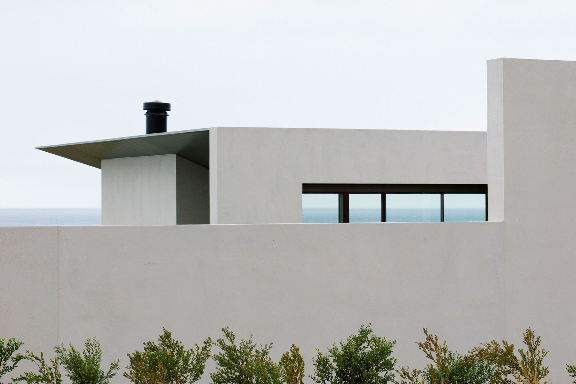
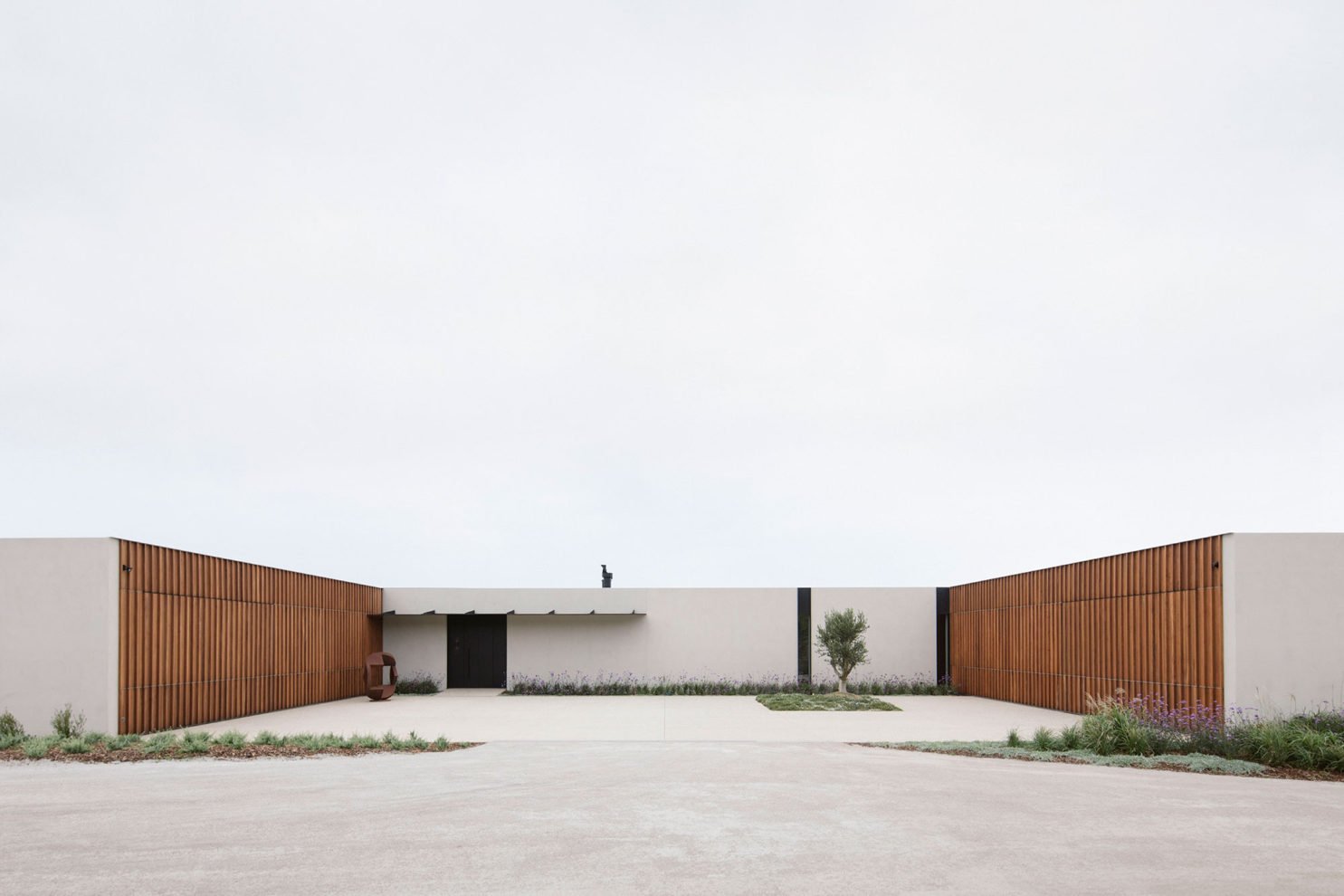
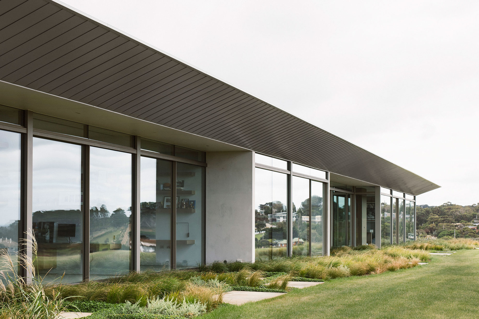
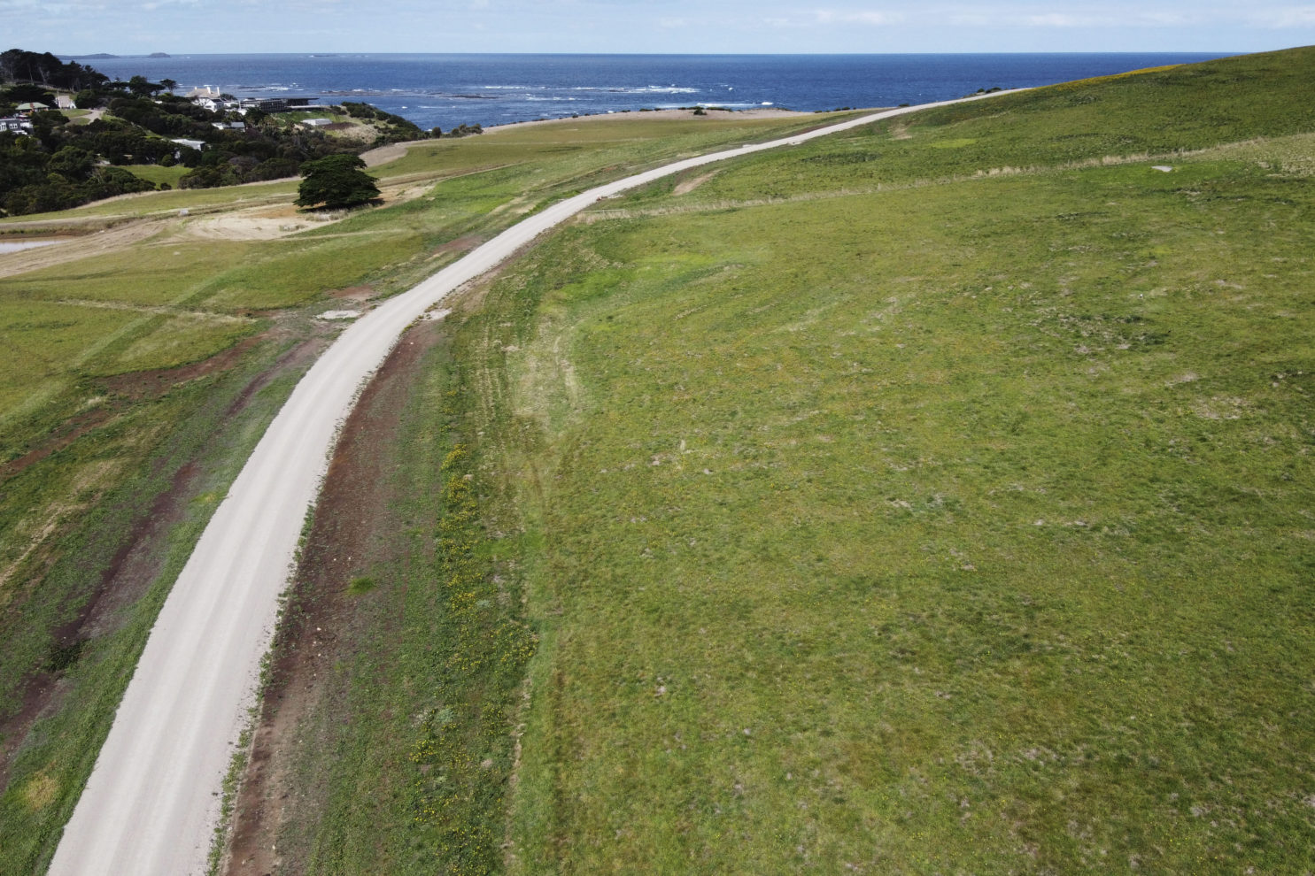
Peninsula House is conceived as a contemporary farmhouse, set within rolling agricultural farmland on a rugged coastline of Victoria’s Mornington Peninsula. Presented as a striking pavilion structure, the large dwelling appears almost civic in its scale, with the rectangular form standing singularly on the ridgeline. Embedded in the conceptual framework of Peninsula House is a series of dichotomies, experiences, and journeys that come together to create a home that is monolithic yet enveloping and intimate.
The architecture
As a large site, one of the key concepts that drove the planning and placement was about creating anticipation. As Director Chris McCue explains, “We wanted to create a journey that would meander through the landscape, providing an opportunity for art like installations formed from the landscape itself. That journey from the front gate to the house was centred on the idea of compressing and revealing the views at key vantage points, with the view then disappearing again when you discover the house.” The architectural form then followed this line of thinking, taking cues from the rural site and client brief, emerging as a single pavilion volume, focused out towards the water. A concept that Principal Sue Carr says never faltered, “The initial vision that was first presented to the client remained true throughout the whole process.”
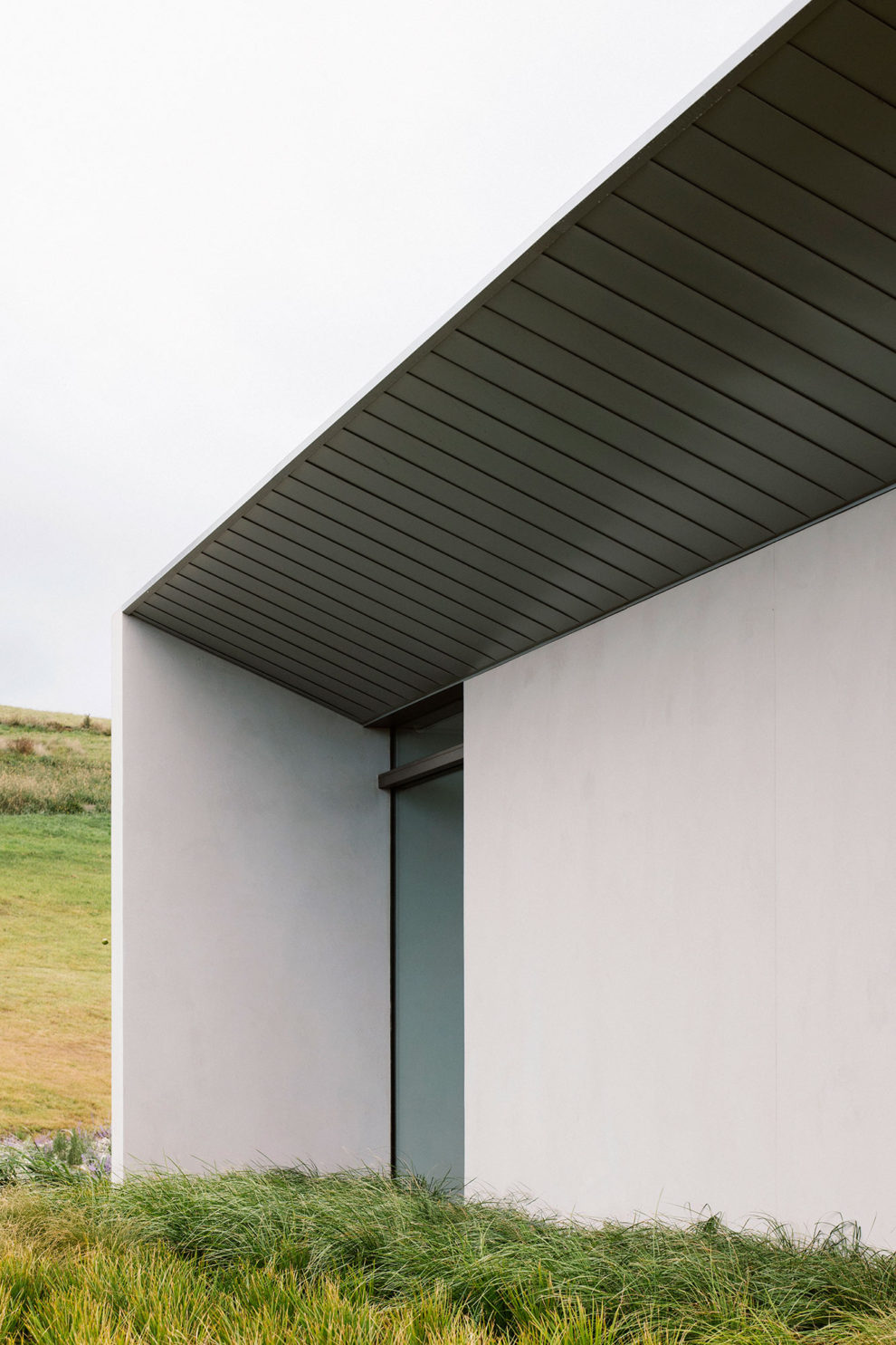
Bringing the pavilion to life in the landscape was an iterative process. “Finding the perfect location was very challenging,” shares Sue. The final placement followed extensive wind and solar analysis, and various tweaks and adjustments. Set on the coast, the property experiences extremes of weather – both vicious winds as well as sweltering summers. “We nestled the home into the landscape, tucking it into the ridgeline so the wind kicks up off the roof, keeping the private areas sheltered and protected against the elements,” says Associate Lucy Cuthbertson. The curving, zinc-lined roof serves both a functional and aesthetic purpose, appearing with a “jewel box” quality while also providing solar and wind protection. The expressive curve form also creates vantage and viewpoints when inside, concealing and revealing the landscape and views beyond. While the landscape serves as a distinct feature of the project, it also presented one of the greatest challenges. The 80 acres of land is classed as a green zone wedge with some of the toughest planning restrictions.
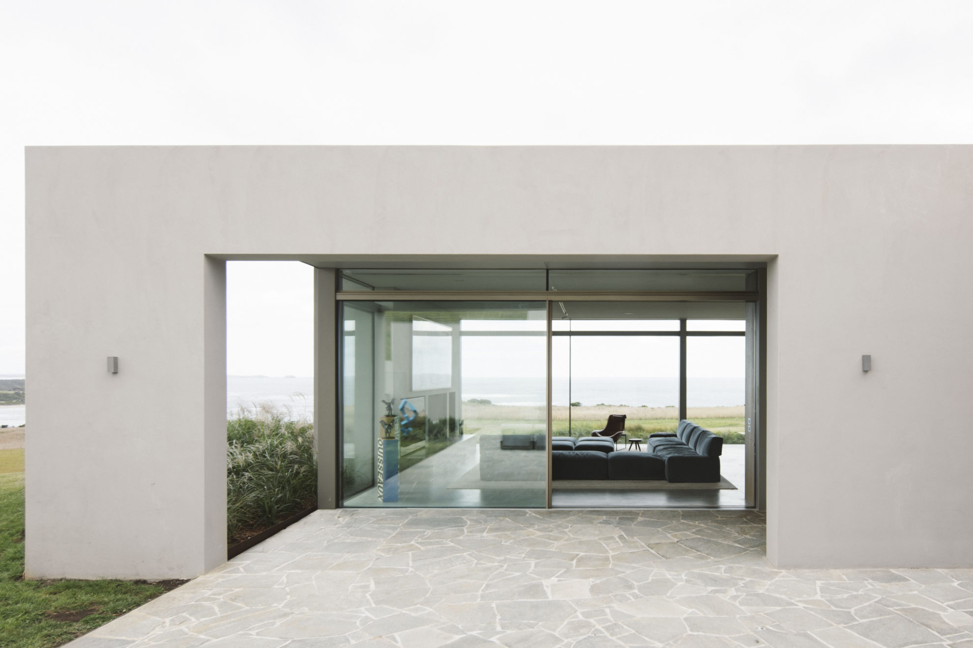
In addition to maximising the views and natural beauty of the site, the brief also called for the client’s art collection to be thoughtfully integrated, and the home also needed to feel intimately scaled when being used by just the couple. To achieve the latter, the layout has been carved up into key zones, this allows for the home to come down to a human scale with one side of the house dedicated to the client’s day to day life, while the other half of the house can be opened up when family visits.
The interiors
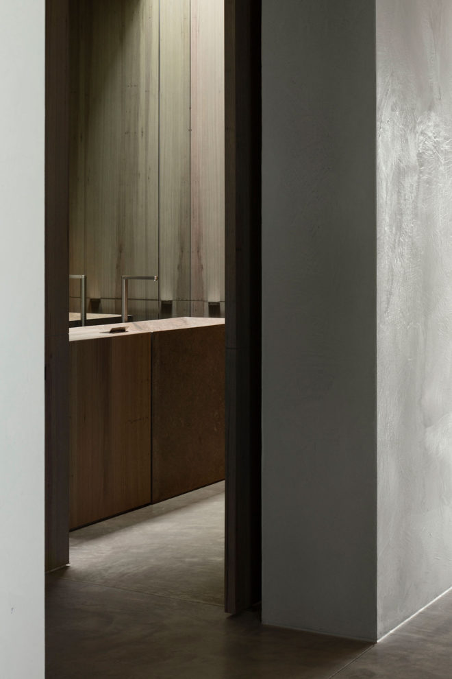
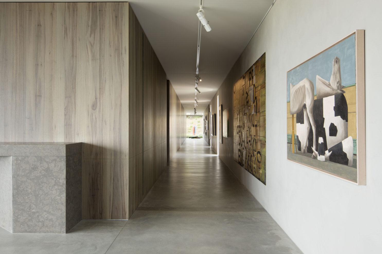
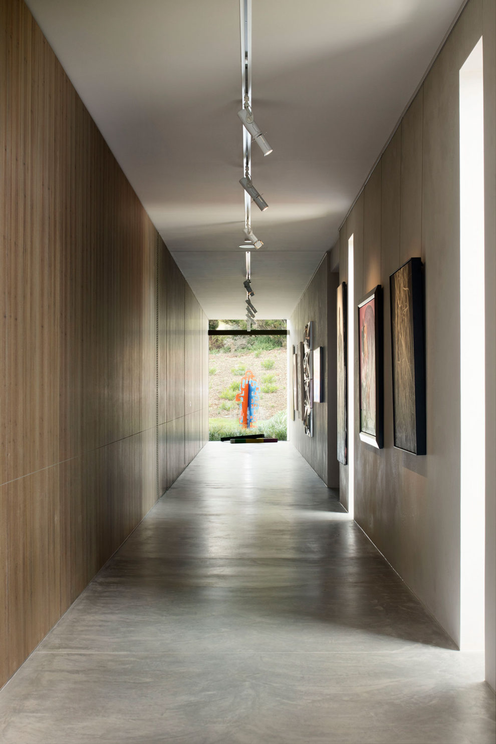
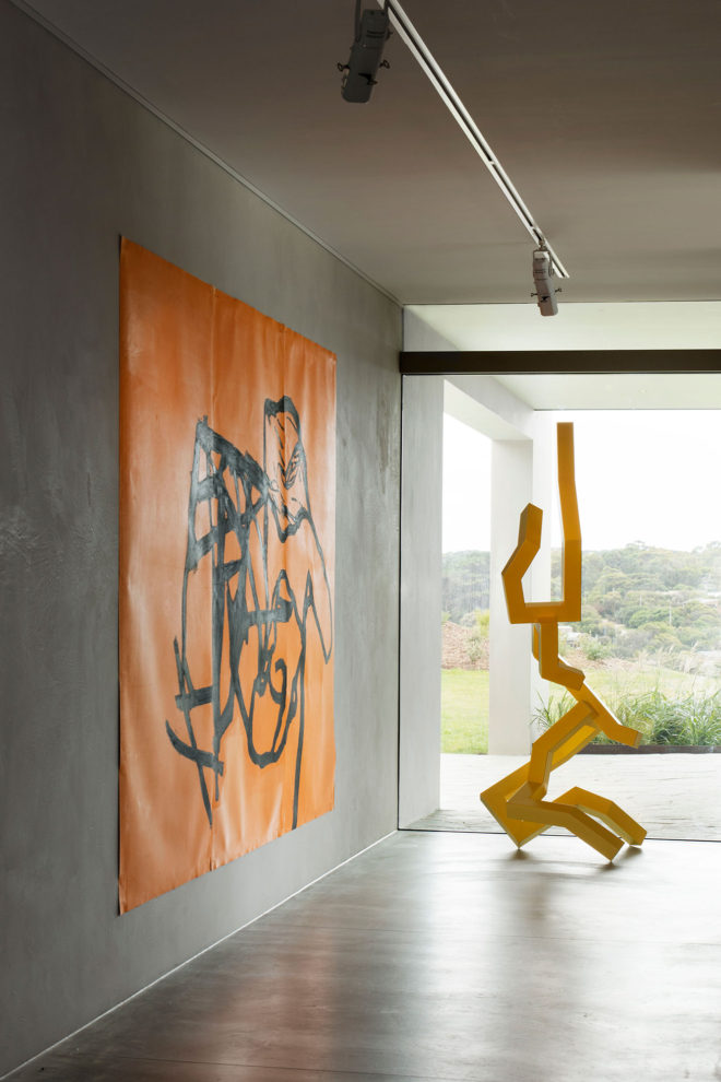
The notion of compression and release also factor into the design and sequencing of the interiors. Once arriving at the house, the entry shrouds the view, adding a sense of mystery to what lies beyond. Stepping over the threshold into the home, the internal layout orientates to the views, with every space linked by a circulation space – or gallery spine – filled with artwork. “It’s a really logical and rational way to arrange the house on the edge of the landscape,” says Chris. The gallery walkway is the public transition between spaces, while a more intimate thoroughfare lines the front of the house out to the views. The gallery hall responds functionally to the need for housing the client’s extensive art collection but also establishes a formal journey into the home. Standing as a beacon at the end of the gallery is a large window, where a sculpture provides a focal endpoint.
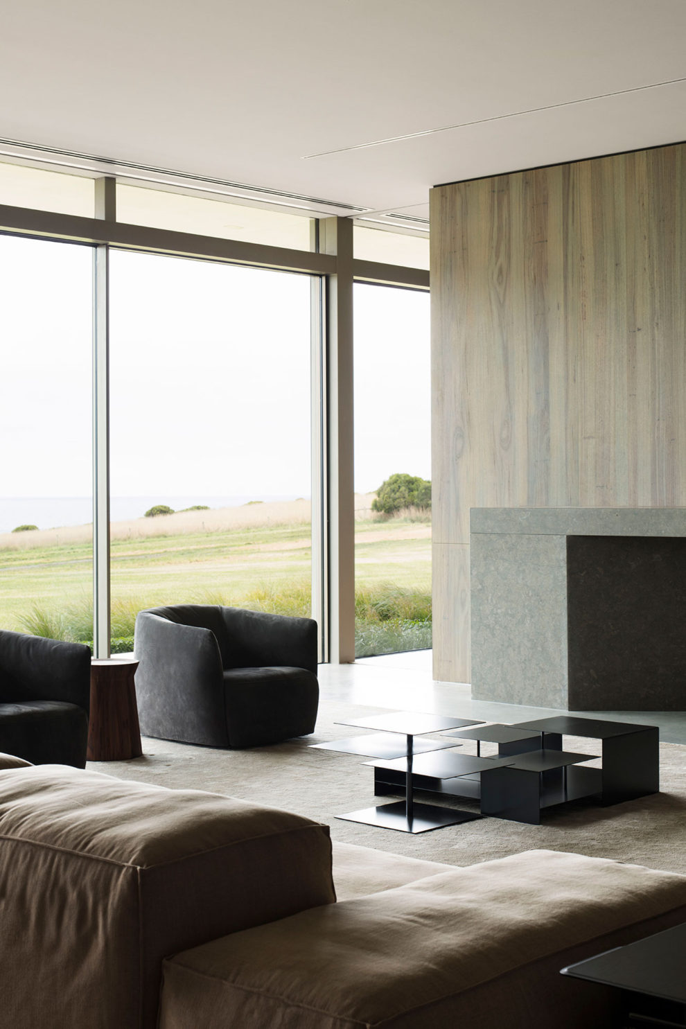
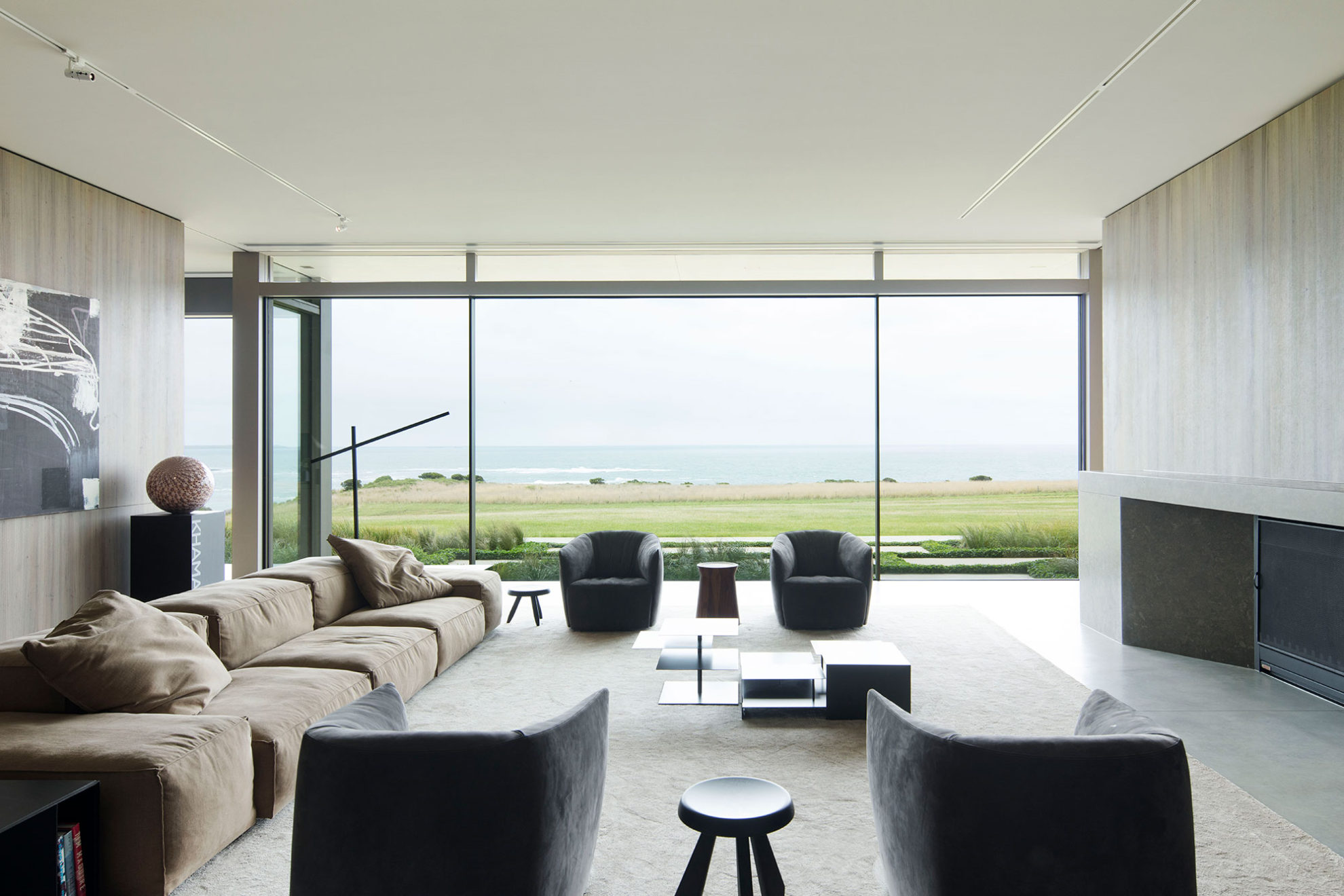
On the private edge, no single space is treated in isolation, rather they flow from one to another, always with a glimpse to the next space beyond. Traversing the home along the front façade is one of the great successes of the interior planning. It provides a personal journey through the core living zones – master suite, dining, kitchen, living – and was about enhancing the client’s everyday lives and rituals. Creating that sense of refined cosiness was not just about scale, but what Chris explains is “how you move through the space, how you use it, how you engage with it”. Since settling in, the client’s have discovered pockets and places throughout the home, embedding a sense of daily ritual even further, something that Sue says comes back to the “Successful selection of furniture, which changes the way you can use the space in different scenarios”.
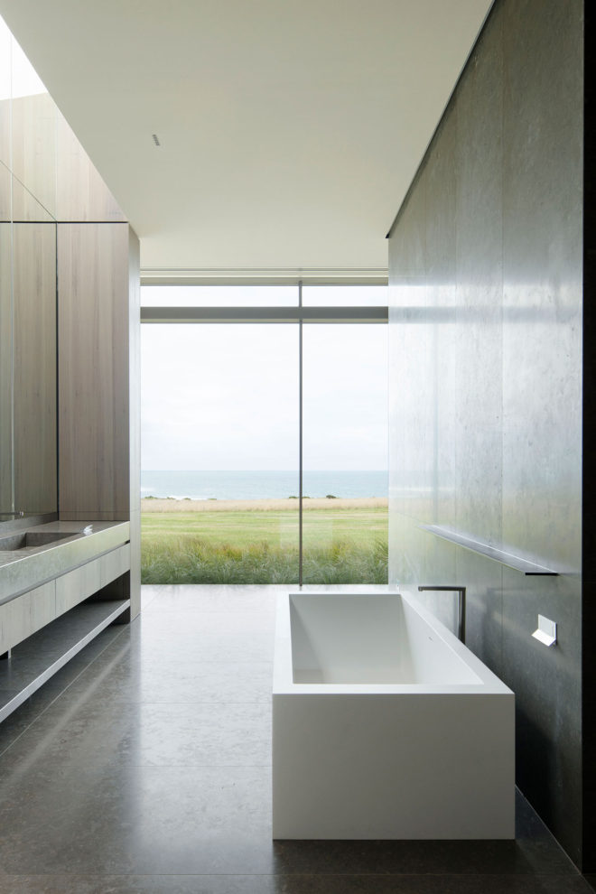
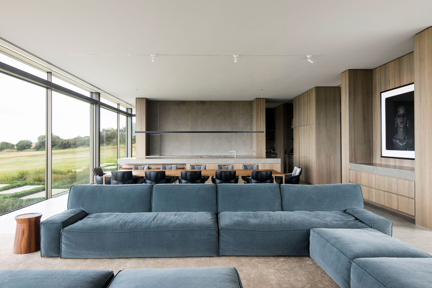
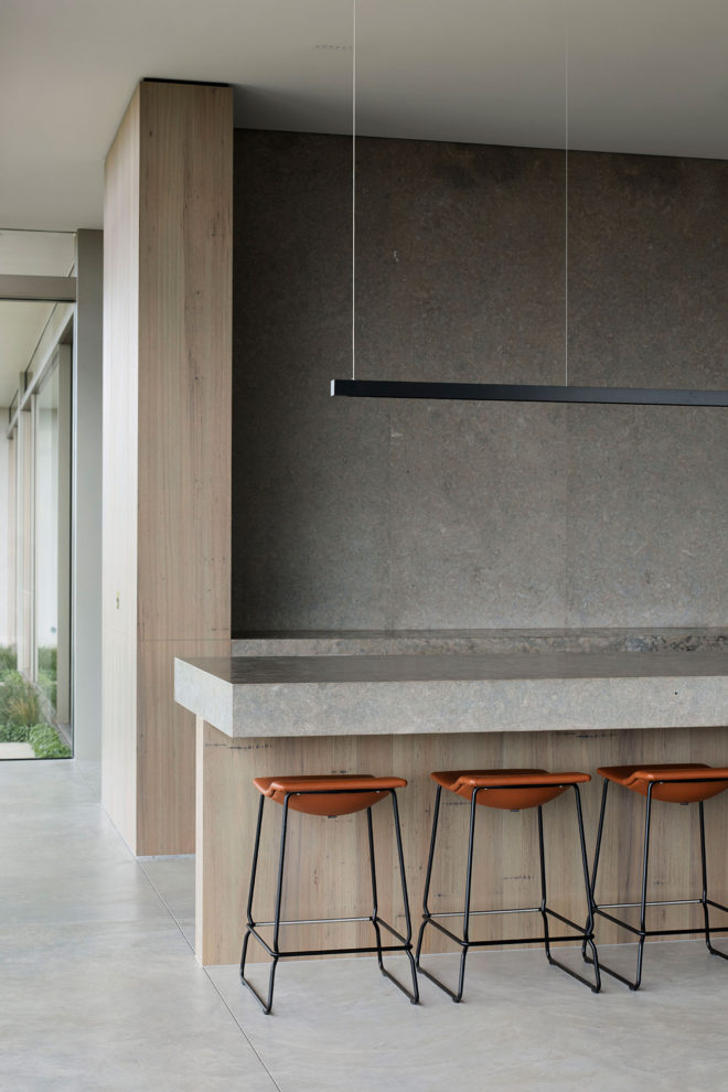
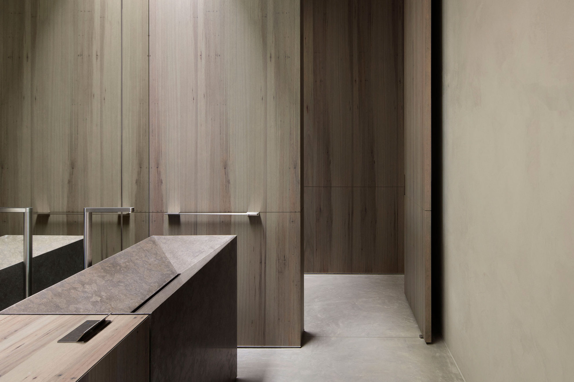
Other layers of refinement and quality come through the project’s materiality, which is defined by concrete, natural stone and timber, all coming together to create a subdued palette that lets the incredible art collection and view remain the focus. This materiality was key in realising the refined farmhouse aesthetic, but more importantly was chosen for their quality, durability and simplicity.
Every element in Peninsula House has been thoughtfully planned, designed and detailed, which comes together to make a home that not only delivers to the client’s needs but creates an enduring building that stands uniquely in the landscape.
