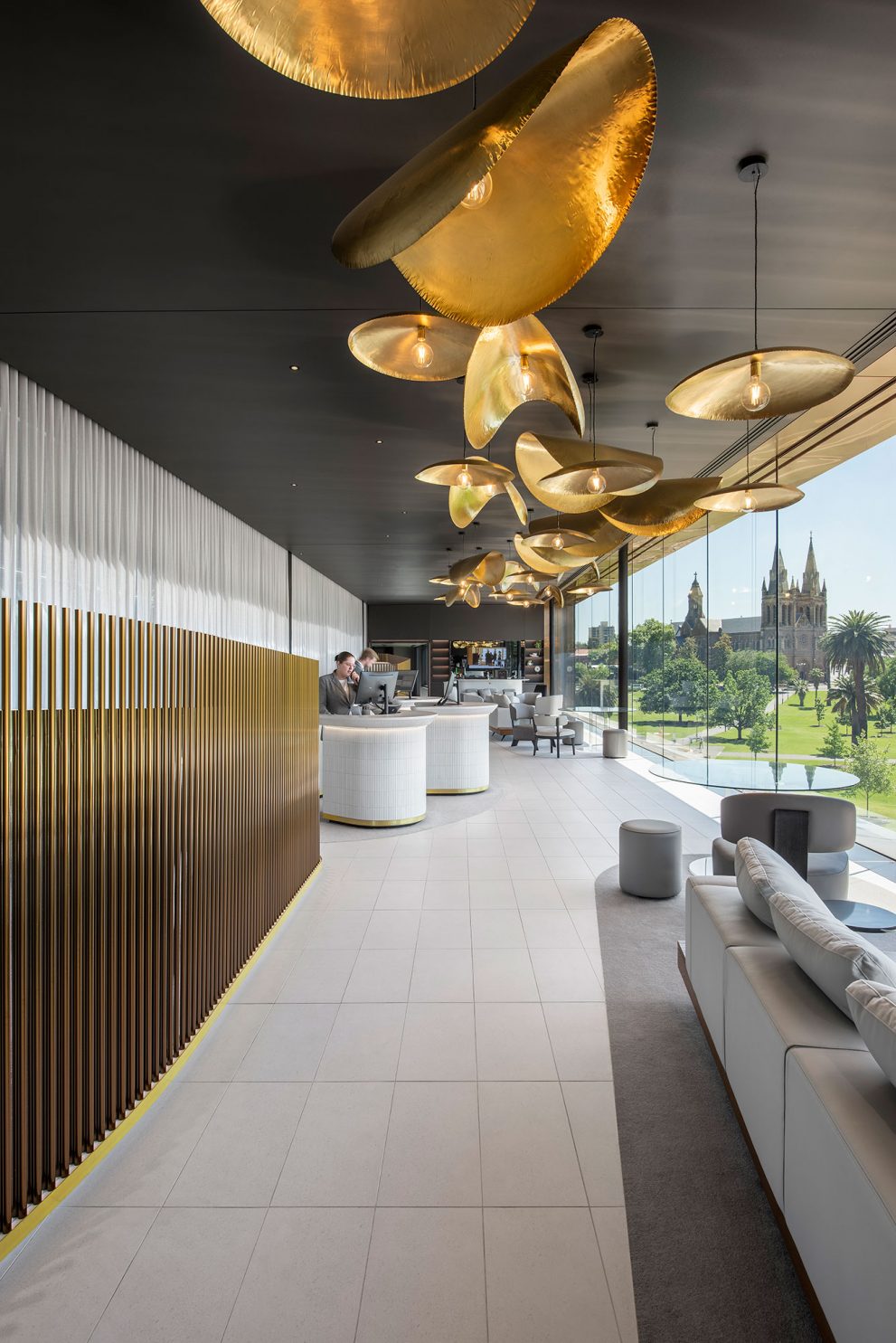
The Oval Hotel adds to the reverence and history of the Adelaide Oval. As a world-class sporting venue set within the lush surrounds of the park, any kind of addition to the Adelaide Oval needed to be carried out with thought and care.
Cox has designed a hotel that carefully attaches itself to the Adelaide Oval, gently wrapping the edge and constructed in cross-laminated timber (CLT). Carr came on board to work alongside Cox on the interior design, bringing our expert hotel knowledge to ensure that guest experience from beginning to end would be sumptuous and refined. An experience that extends from the park and honours the Oval, while developing its own sense of identity.
The hotel’s structure includes a north and south wing, with a central reception pod floating about the stadium’s eastern entry. As one of the main thoroughfares for attendees to the stadium, this elevated pod became a beacon of the project. We saw this as an opportunity to frame the hotel’s reception and create a moment of surprise and awe for those traversing underneath – a visual signifier of the hotel – without the need for signage. Any visitor to the stadium that passes through the main entrance, whether a guest at the hotel or not, catches a glimpse of the installation on the hotel’s ceiling above, made of hand-beaten, organic formed pendants.
Driving the concept of the hotel was recognising its unique connection to the Oval and the park, but also its point of difference. Through the creation of the hotel two distinct offerings have materialised within the precinct – the entertainment, dynamism and action of the Adelaide Oval and the premium, calming ambience of the hotel. Two separate experiences delineated by a threshold – the spectacle of the stadium or the stillness of the park – both crucial to the entire experience. Respecting and honouring the interstitial spaces, the reception of the hotel becomes the point of crossover between the two worlds and their deliberate opposing forces. It was the concept of thresholds that pushed the narrative of the hotel and informed many of the design decisions.
The arrival sequence for the Oval Hotel is also not typical – either walking through the park or being dropped off in the basement. Playing on the drama of being in a subterranean level, the arrival provokes anticipation as the guest is immersed in the darkness below, journeying up into the light where a glowing reception pod shows a welcoming entrance.
As an antithesis to the stadium itself, the interior design of the Oval Hotel is anchored by the park, bringing in natural textures and gentleness that provokes lingering and relaxation. Complexity and texture are added through the use of opposing materiality, for example rough and raw is offset by polished finishes, or dark and light.
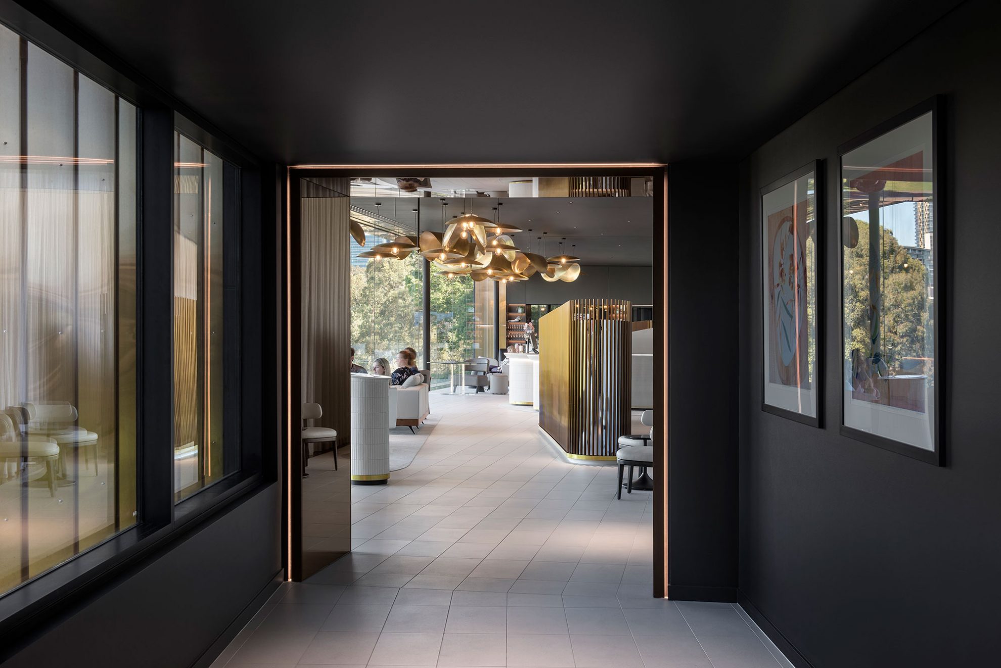
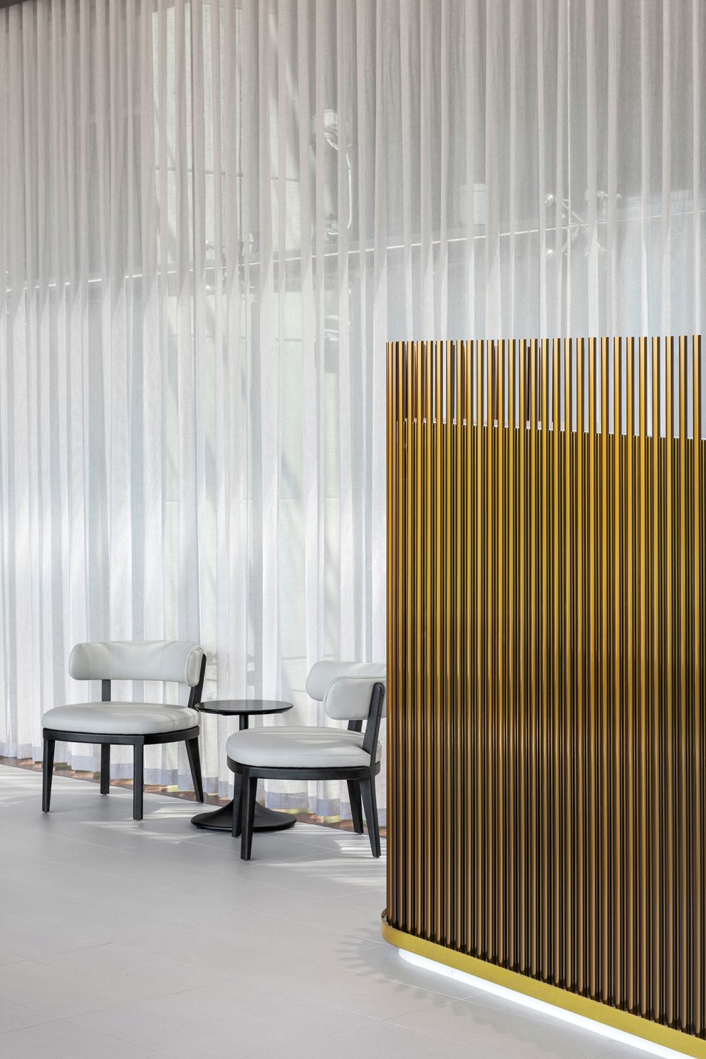
The reception was planned around a bespoke winged joinery element that houses the luggage store, while opening up the floorplate and the views. The new winged forms are a visually interesting insertion, as well as having a functional application. The ceiling is the focal point in the reception space, a celebration and a statement that draws the eye. The design brings inspiration from the context of the park, which is dotted with bronze sculptures, while the shell-like form of the ceiling installation links back to the architecture of the Adelaide Oval, without being overt.
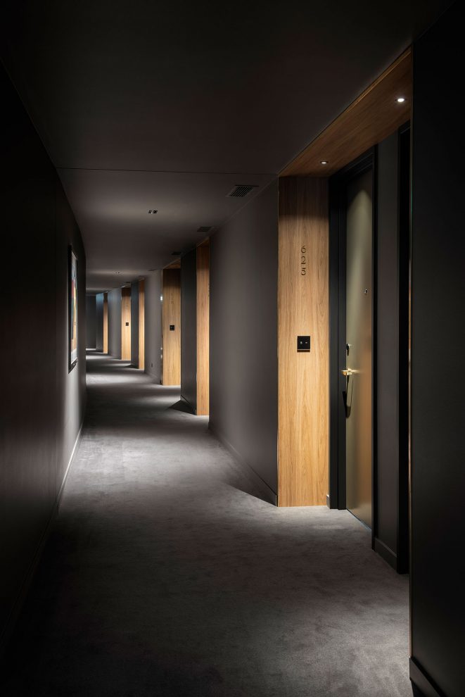
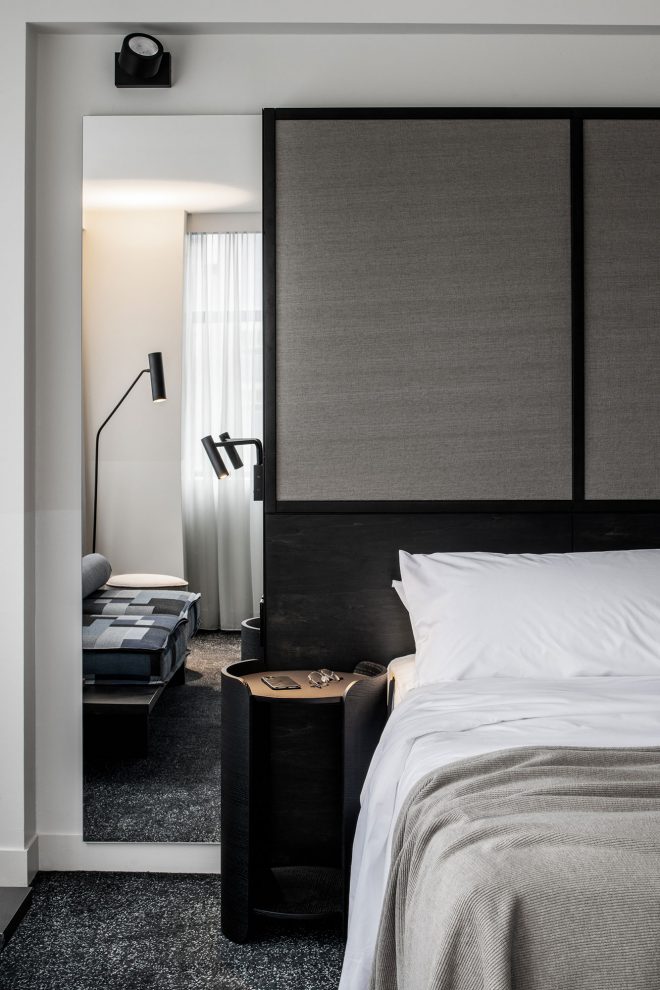
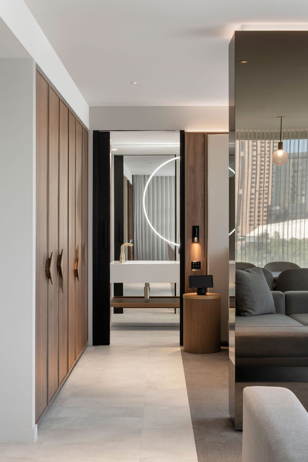
Carr’s scope was to bring our hotel design knowledge to the project, refining and elevating the design through detailing, materiality and an adept understanding of the mechanics of orchestrating a hotel experience. We instilled a sense of journey and discovery within the hotel, through moments of expansion and compression in order to focus the guest’s experience through the arrival sequence and the sculptural form of the luggage wall, through to the dark, compressed corridors that open up to a light-filled room. Other design elements include an illuminated mirrored box that creates a moment with the mini bar, much like a jewellery box.
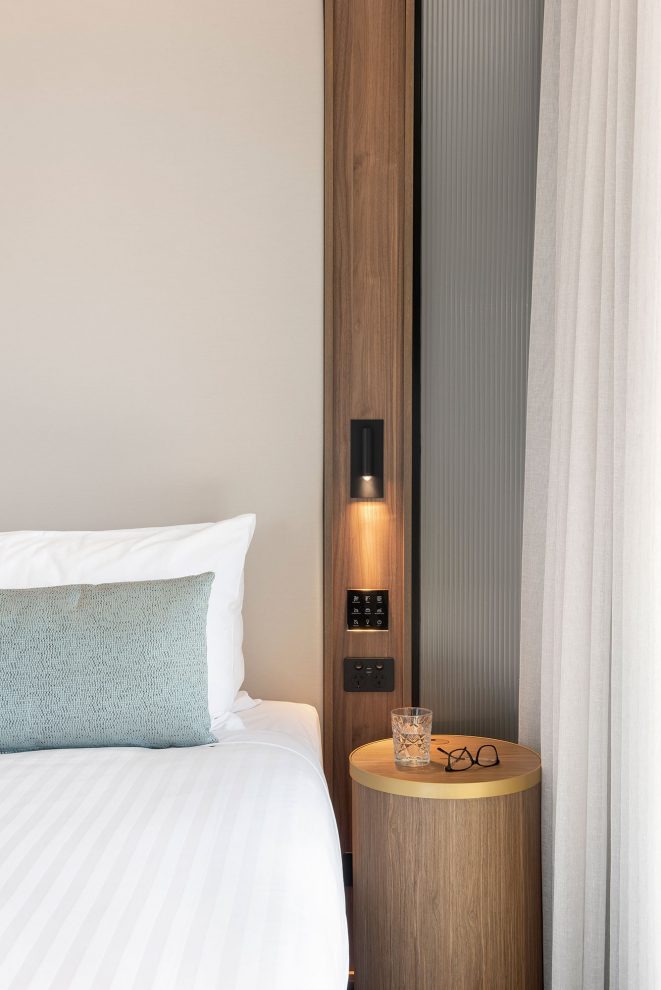
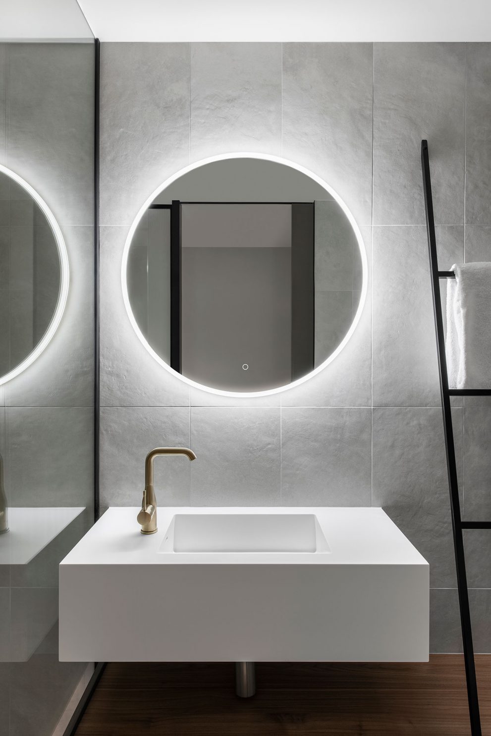
The bathroom design was also looked at closely, with the introduction of fluted glazing to allow natural light to filter into the space. By opening up the bathroom in this way, a greater connection between the park and the surroundings helps to ground the rooms. In the King Suites, the bathrooms were configured bringing in Carr’s residential principles, creating circulation zones and openness through the use of functional joinery as walls.
In addition to design elements, we also worked on other essential requirements to elevate the hotel experience, including holding a tender for the branding agency and furniture procurement. Carr worked as a trusted consultant, bringing in additional disciplines to create a highly resolved outcome.
