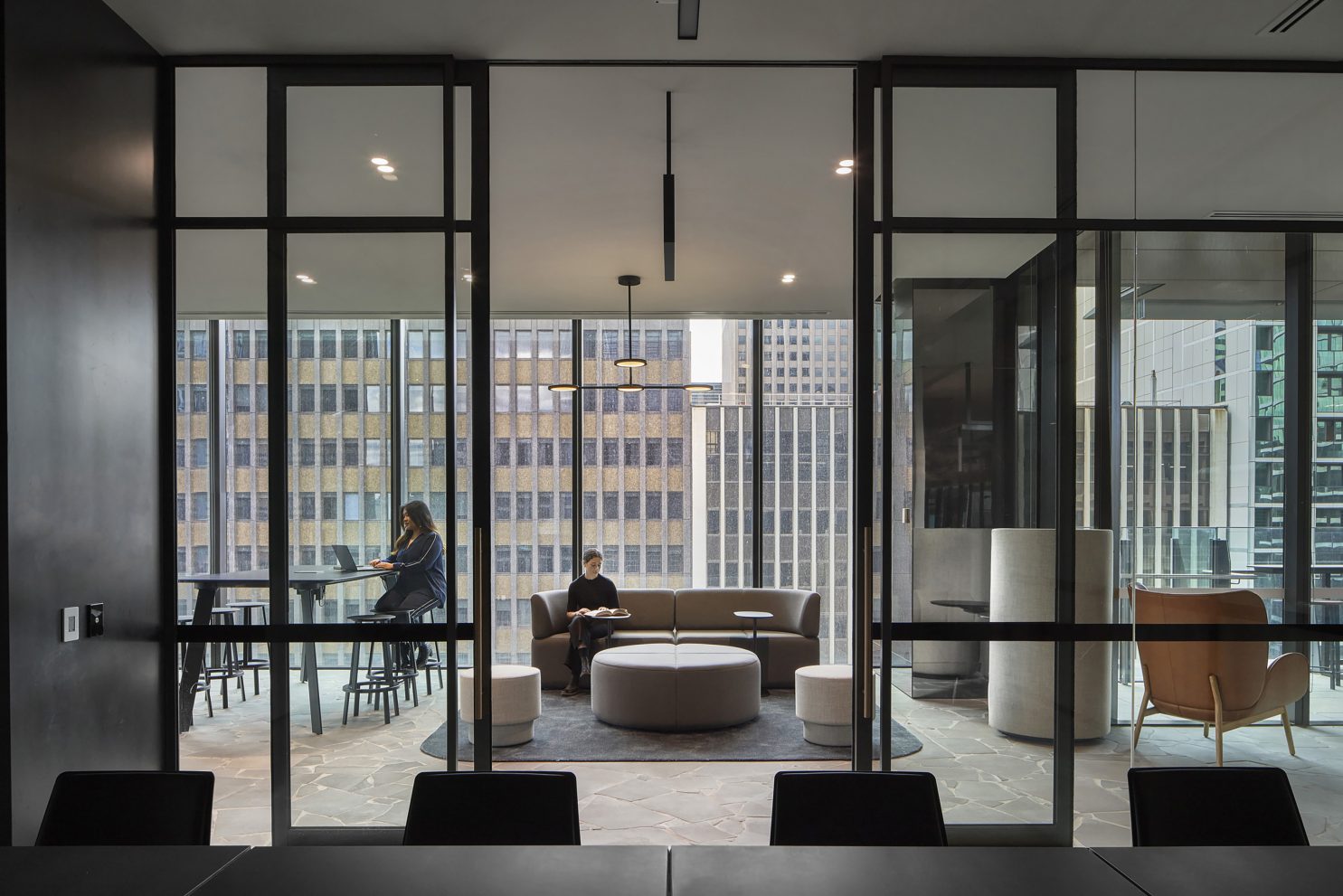
Leading Australian law firm Lander & Rogers envisioned a workplace that reflected its values of authentic, connected and innovative; an environment that would foster creativity, equality and inclusiveness while offering its people flexibility and adaptability in the way they worked. The fitout is in the historic refurbishment of Olderfleet in Melbourne, where Carr completed the base build interior design in collaboration with Grimshaw. Joining the project in the early stages, initially on workplace strategy, Carr developed an intimate understanding of the client’s needs. The result is a holistic design outcome melding powerful functionality with a warm and natural aesthetic.
People from across the firm were given a voice in the strategy phase, providing input and feedback on their professional and social needs. Lander & Rogers was eager to embrace a different way of working, removing archaic hierarchies to create an adaptable, flexible and diverse workspace.
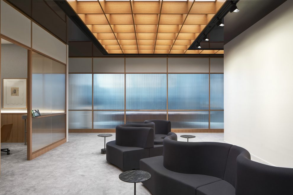
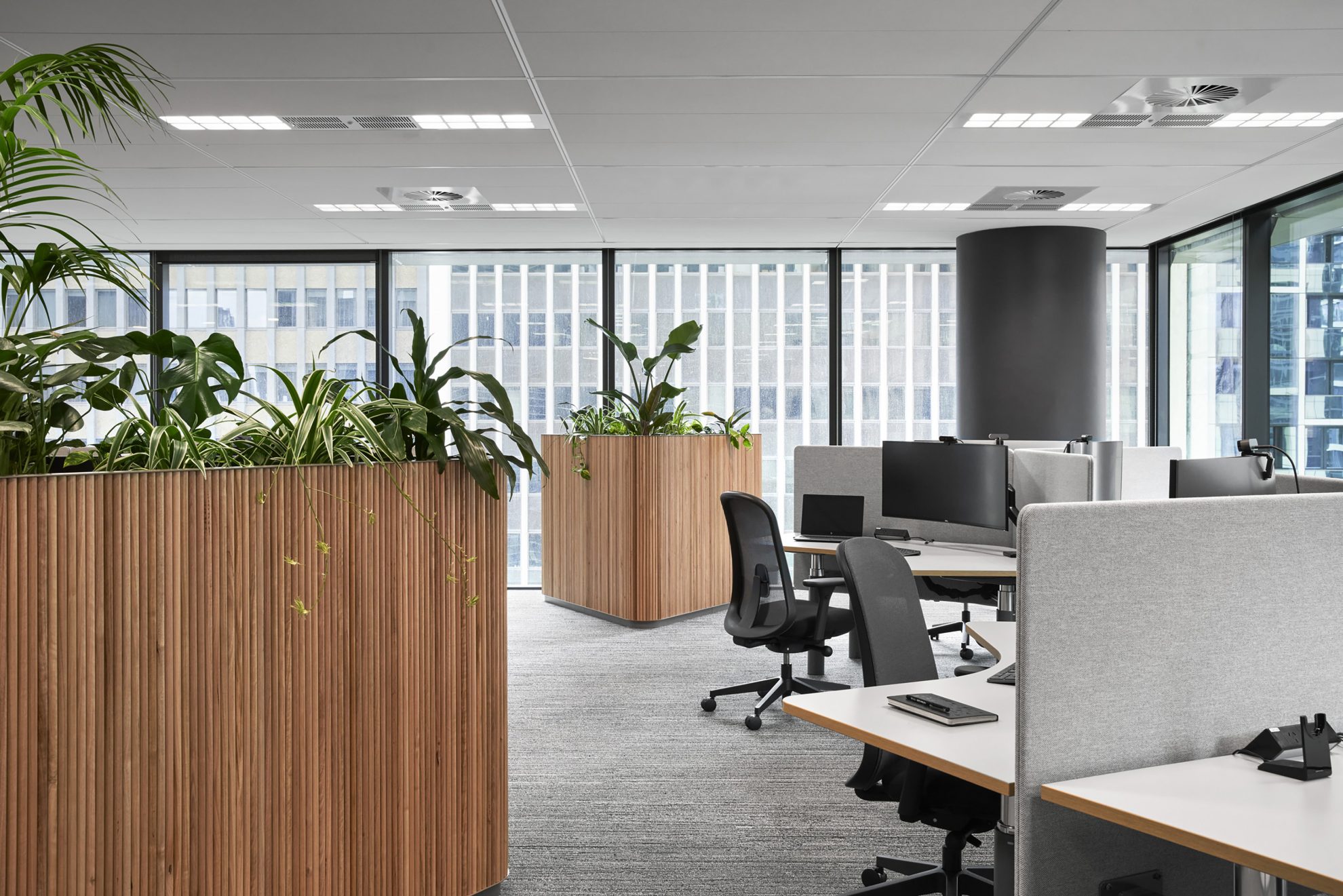
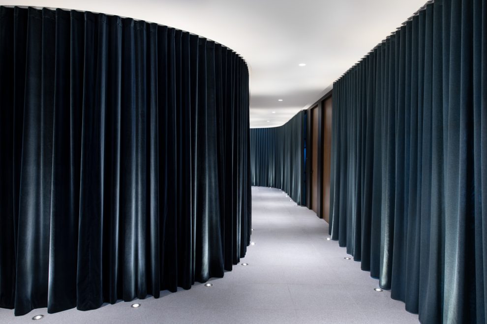
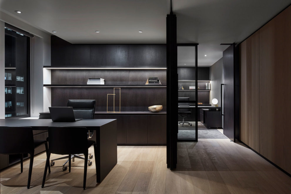
Leveraging the insights and learnings gathered through the strategy and briefing, Carr recommended an open plan, agile ready workplace, balanced with a variety of quiet spaces to retreat and reset. It was a radical change from the previous workplace, but one that responded authentically to the client’s needs. Key to successful planning was balancing the openness with moments of respite. It was important the planning principles respected the need for privacy – both visual and acoustic – within the open plan and shared zones. The ratio of enclosed retreat spaces versus open plan settings was responsive to the client’s needs and data collected during the strategy phase. The final workplace model is flexible and diverse, allowing the Lander & Rogers team the ability to expand, change or contract as needed – a particularly important option in light of the events of 2020.
The Carr team’s design decisions were underpinned by a series of keywords – trusting, relaxed, social, courageous, inquisitive, intimate. “This framework meant that we had a foundation to come back to and keep the project aligned with Lander & Rogers’ brand and vision,” explains Associate Molly Shelton.
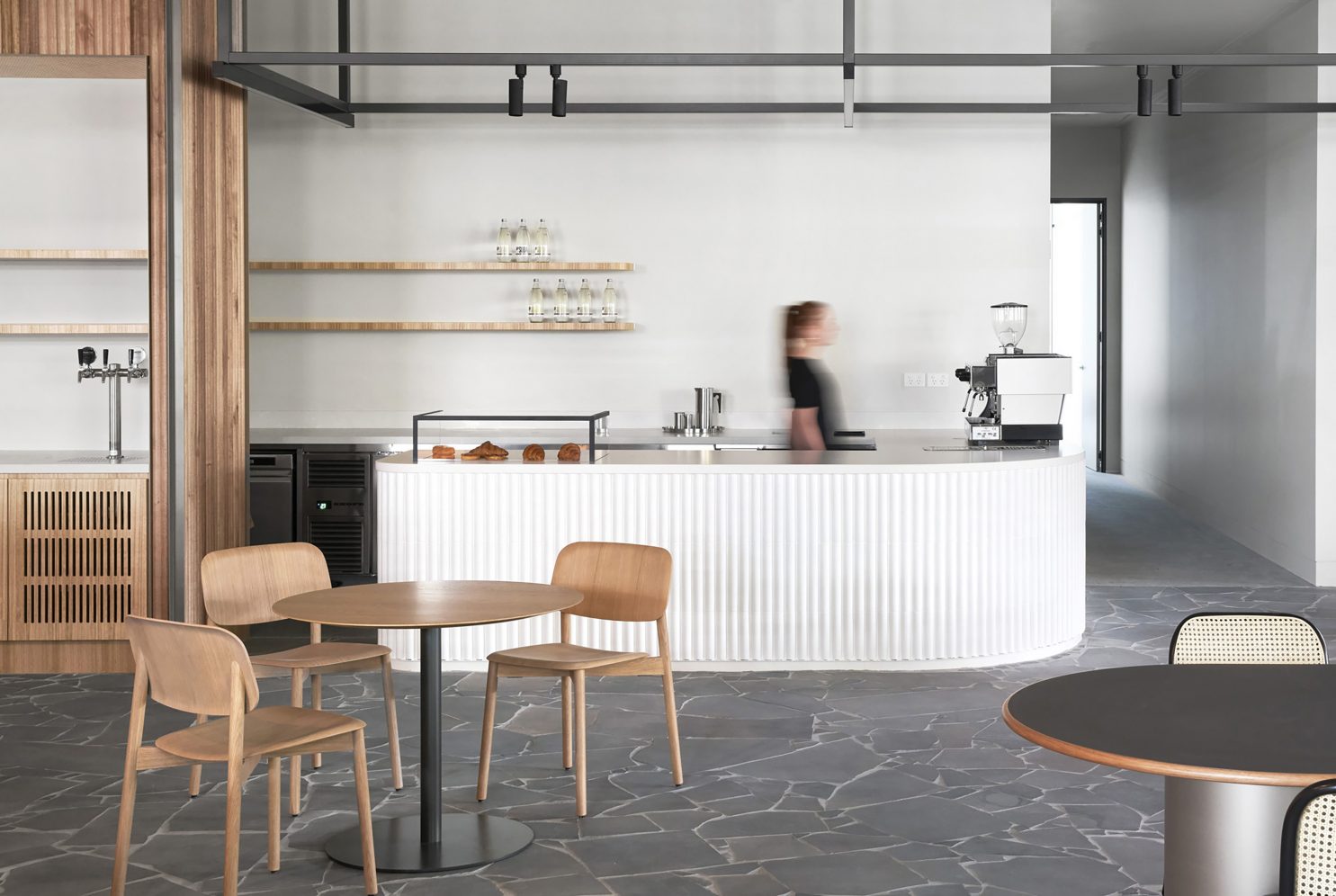
The fitout encompasses four levels, with a wrap-around terrace and an entire floor dedicated to client and team cross-pollination. As the first interface, the reception area makes a dramatic and lasting impression, while aligning to the project drivers by conveying authenticity through a selection of natural materials. The combination of organic crazy-pave bluestone flooring, swathes of vertical timber dowel and an unexpected rope ceiling all come together to create a modern yet inviting environment.
A sense of intimacy and comfort comes through in the changing ceiling heights. The base build features high ceilings, in which the rope detail adds dynamism and elevates an everyday material, while the more intimate height encourages movement through the space. The client floor includes a sophisticated café space, a large conference and eventing space for functions including catering facilities, several client-facing meeting rooms and the iHub, a special innovation lab set up as an independent workshop for client collaboration and co-working. There was also the opportunity to create a gallery space on the client floor to showcase the firm’s large art collection, which was achieved by allowing extra room in the circulation zones between the meeting rooms.
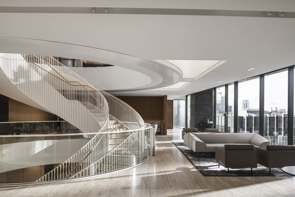
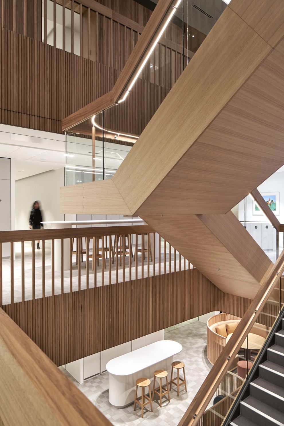
Positioning the stair on the floor plate and having it connect each level vertically instilled a sense of connection across the premises. “The form sits within a large void and was designed with offset stair runs that alternate through the levels, maximising the vertical sightlines throughout the floors and creating visibility to the social spaces,” says Molly.
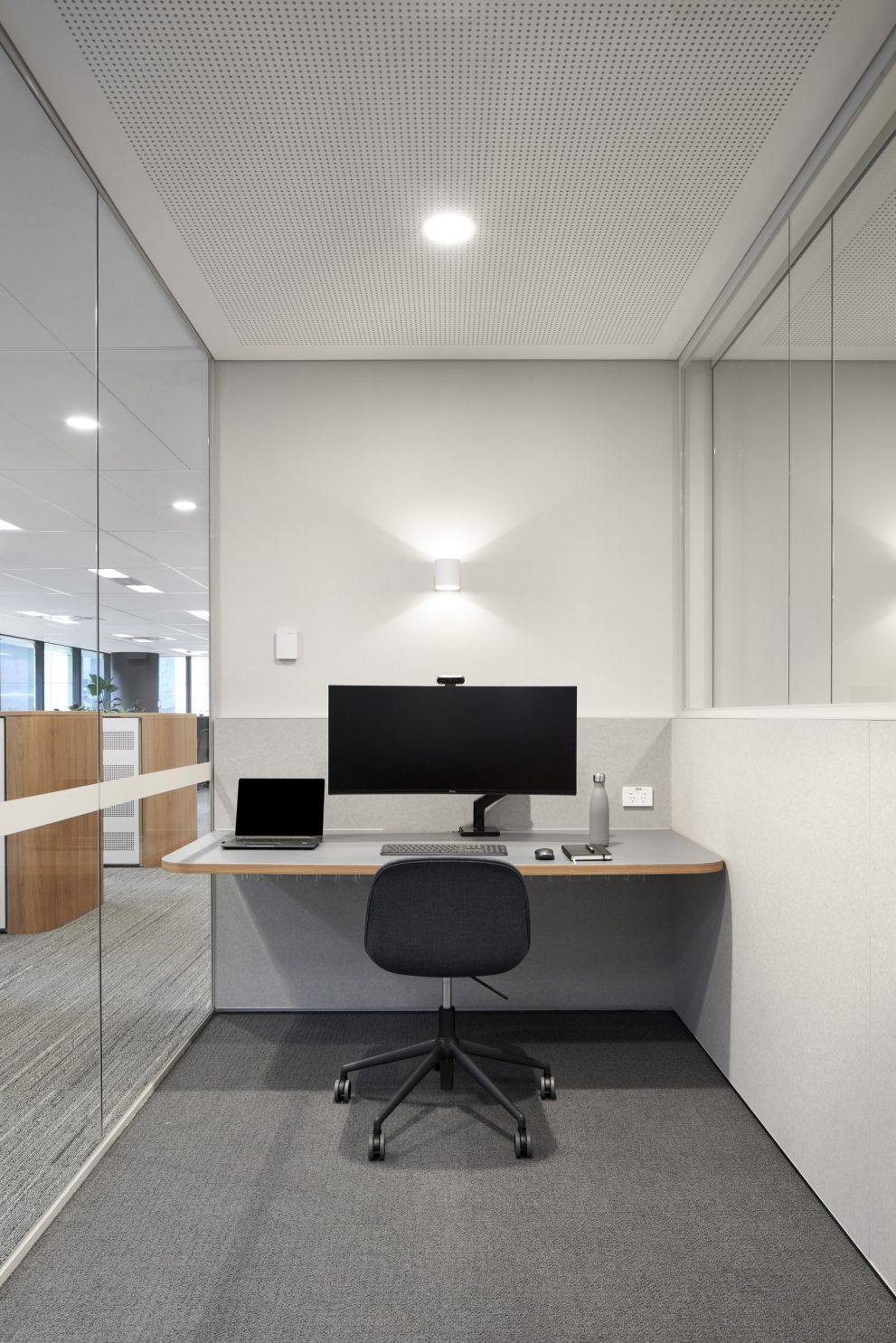
The work floors were designed around the core drivers, with a particular focus on the social, trusting and relaxed aspects. Using an open plan workplace methodology, workstations wrap the perimeter, while collaborative spaces, and shared enclosed meeting spaces are centralised. Connection and socialising for the team is pushed further by having just one main breakout space where all people from across the firm can come together, with smaller islands and circulation to ease congestion at lunchtime.
Across all the spaces and wherever possible, locally-made and designed furniture and materials were chosen to bring warmth and a sense of connection. For example, the timber used throughout is ethically and sustainably-sourced Tasmanian Oak.
The Lander & Rogers team was highly engaged throughout the project, and through open and transparent communication, they have a new workplace that fosters connection and diversity, while perfectly suiting their needs now and into the future.
