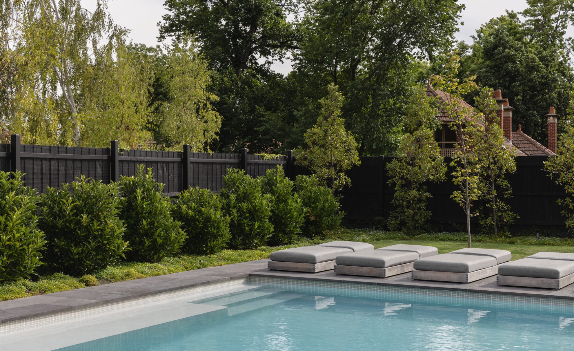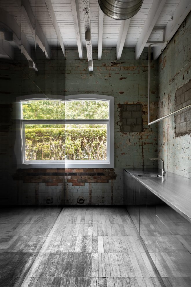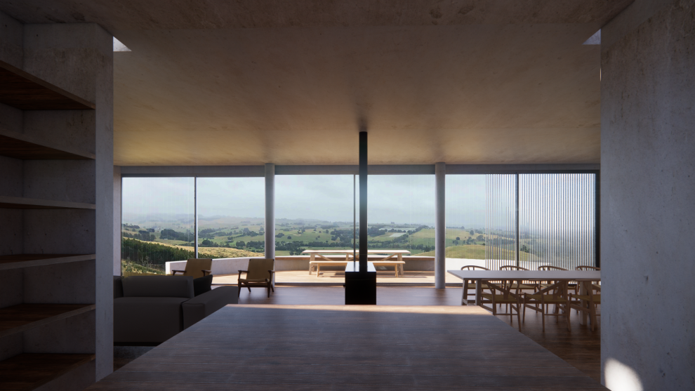
Occupying a large prominent corner block within a heritage overlay, Gridded House sits on one of Hawthorn’s charming and historically significant tree-lined crescents. From an aerial view, the series of crescents arc in unison against the adjacent Grace Park and are celebrated for their uniqueness.
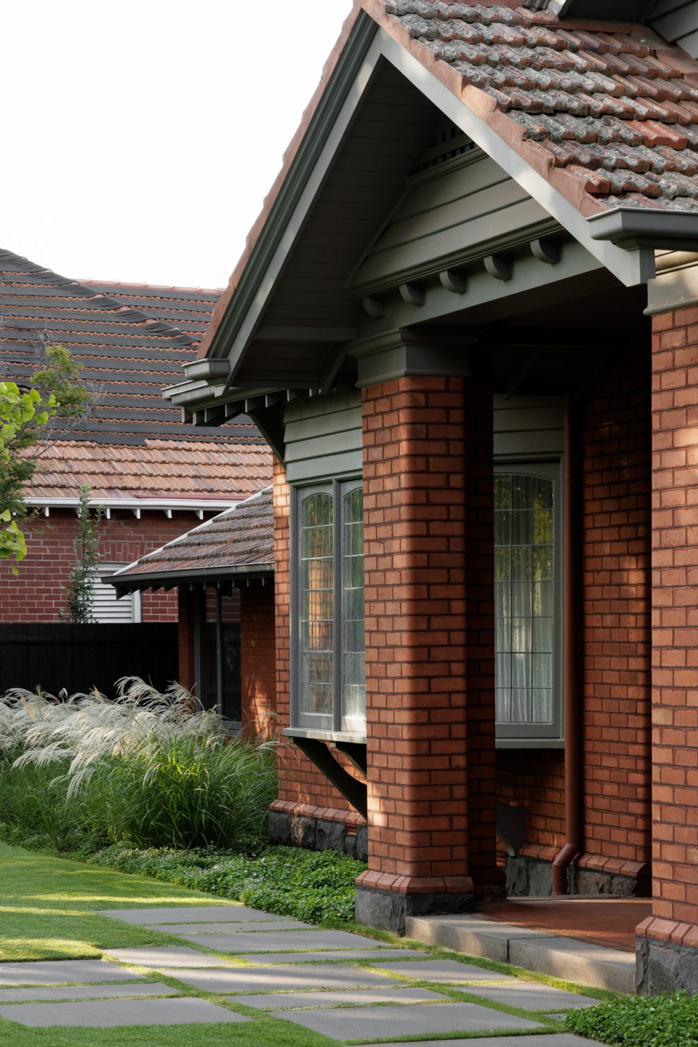
From the street, the existing building has been carefully restored to celebrate the heritage of the home, while the street entrance was relocated to align with the house entrance, creating a more coherent entry experience and a generous garden.
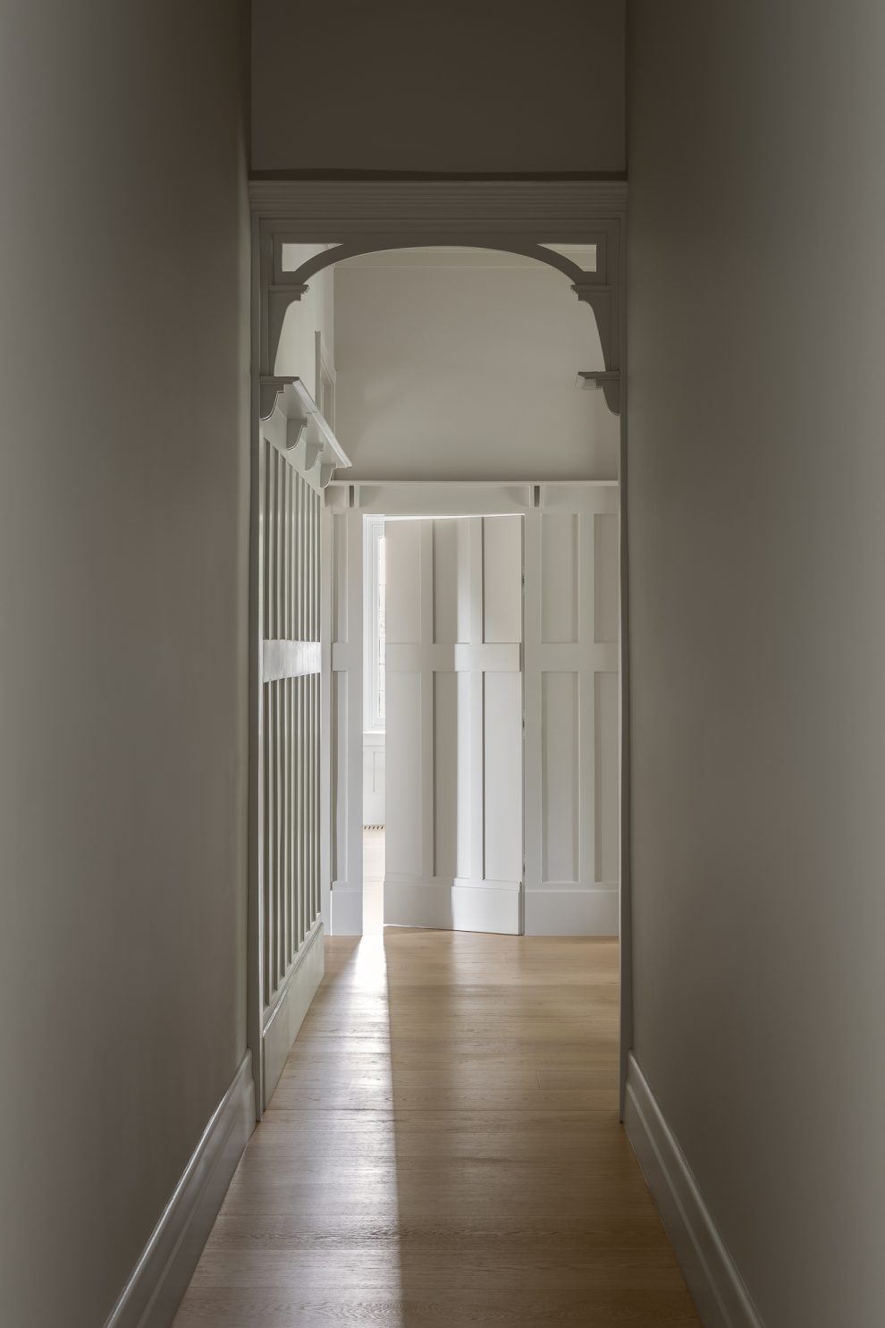
The home’s gridded heritage ceiling and wall panelling provided a starting point for a series of design decisions that inform both stages of the project. In this sense, the genesis of the design derives from an original detail, creating an inherent link between past and present.”
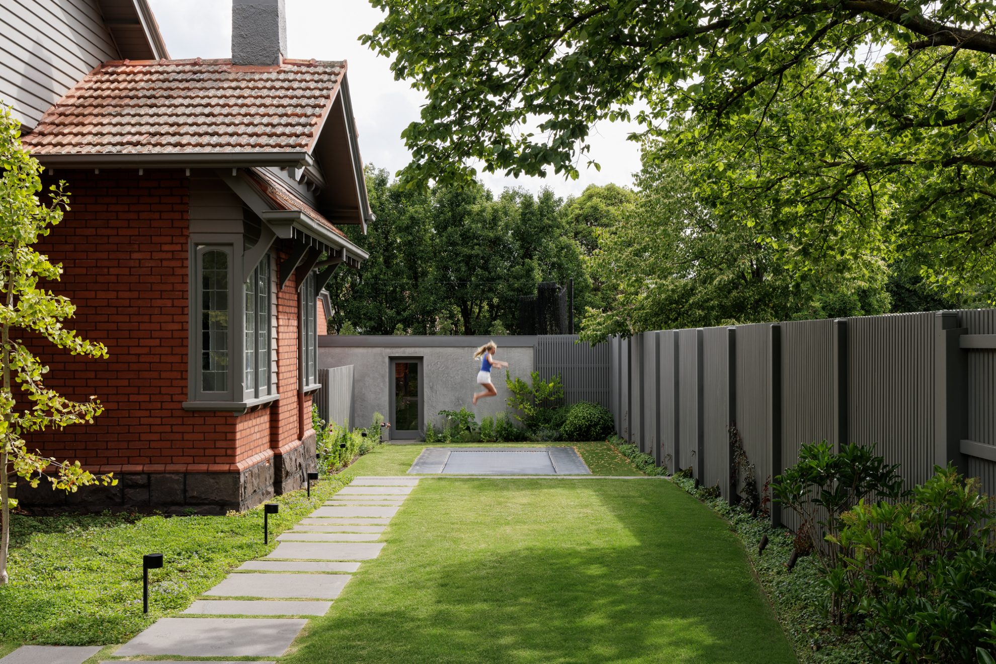
The brief asked for a modern intervention that celebrated the historic design. The owners are previous clients and long-time friends of Carr, with the team completing their previous home, Cube House, in 2015.
Our intimate understanding of their needs as a family of five enabled us to create a master plan that offered a manageable two-stage design. “Working within the original envelope, the first stage involved restoring and elevating the existing home, making it livable for their family life,” says Associate Stephanie Poole.
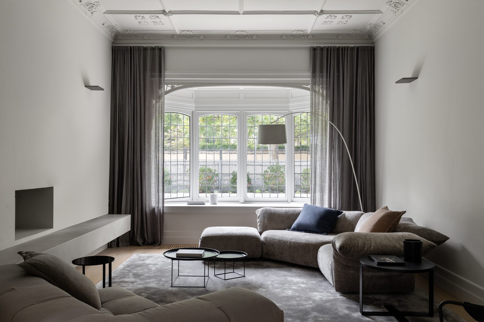
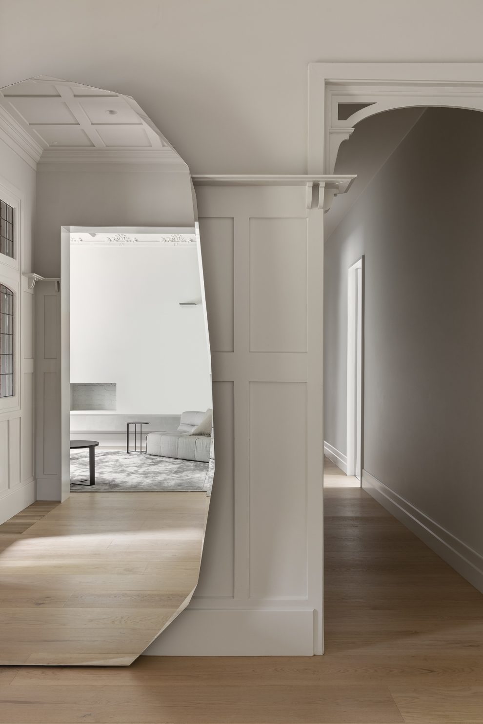
As with many historic dwellings, the original home suffered from a lack of natural light, resulting in dark internal spaces. Awkward and warren-like hallways led to extensions added in the 1980s, which lacked the artistry of the original design and convoluted the home’s internal circulation. Nevertheless, the original details – such as the leadlight bay windows, and gridded ceiling and wall paneling – provided exquisite moments that were starting points for the design’s inspiration and identity. “The home’s gridded heritage ceiling and wall panelling provided a starting point for a series of design decisions that inform both stages of the project. In this sense, the genesis of the design derives from an original detail, creating an inherent link between past and present,” explains Stephanie.
Refining the interior openings and overall circulation was a priority. Unlocking the plan saw us reconfigure the interior journey, whereby significant and deliberate moves allowed us to straighten the corridor resulting in a clean line of sight east to west; a common design thread in Carr’s work in creating spaces with aspect to view.
We identified opportunities to reinstate the presence of the heritage elements through a process of calming and easing the experience of inhabiting the home.”
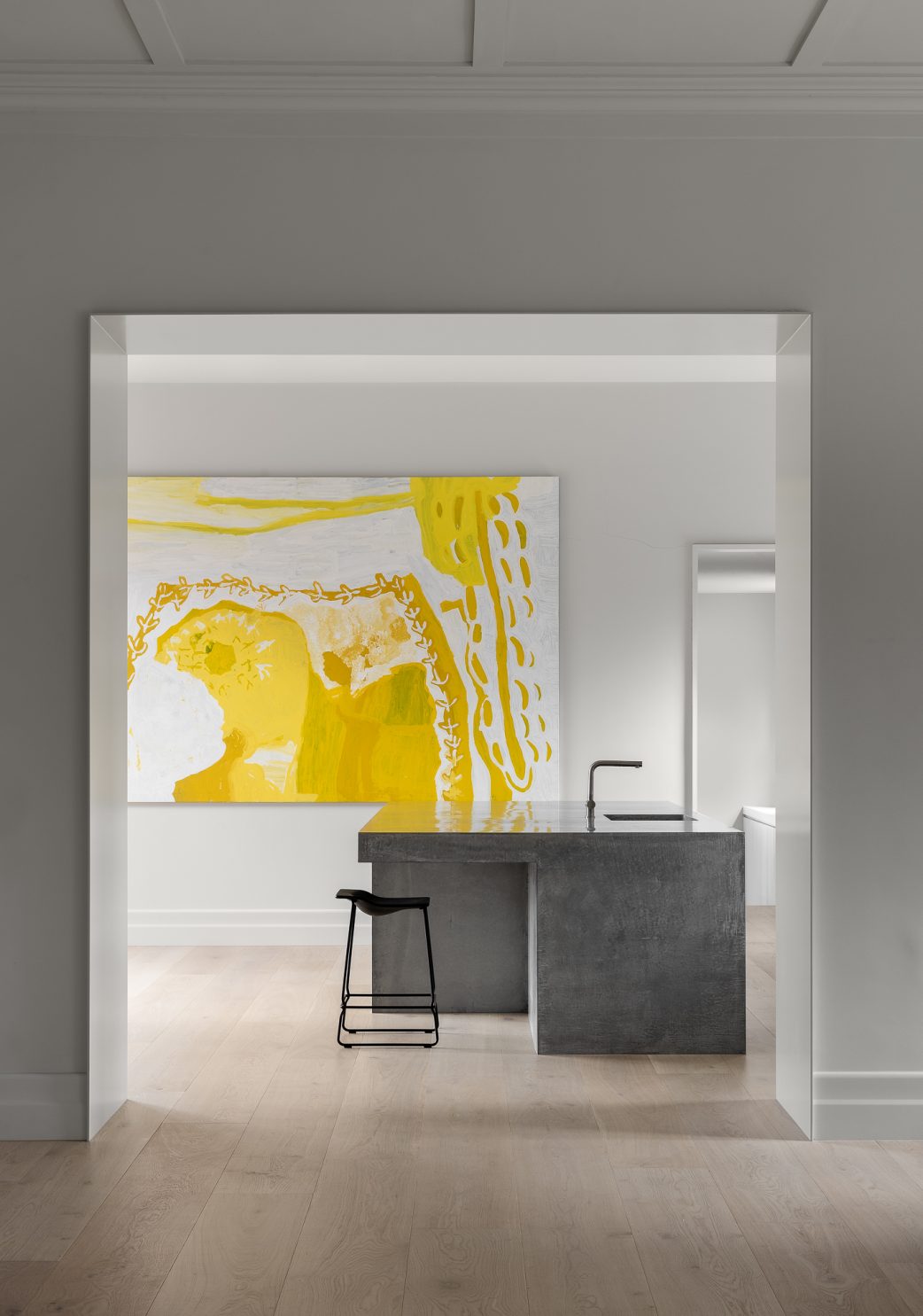
Originally configured in small, disconnected rooms, we opened the kitchen, dining and living spaces by creating large punctures in three walls to enable a visual and physical link, bringing north light through a series of celebrated portals. While offering generosity and openness, the rooms still hold their character through the retention of their proportions and details.
“This illustrates the potential of working within an existing heritage building to integrate contemporary spatial principles of open plan living, without removing the essence of the original design,” explains Stephanie.
The kitchen features a monolithic, concrete island bench, fabricated by Concrete by Keenan Harris. Designed to be an asymmetrical and cantilevered plinth, the dimensions of the benchtop are repeated in joinery throughout the house, subtly aligning these proportions through inherent consistency.
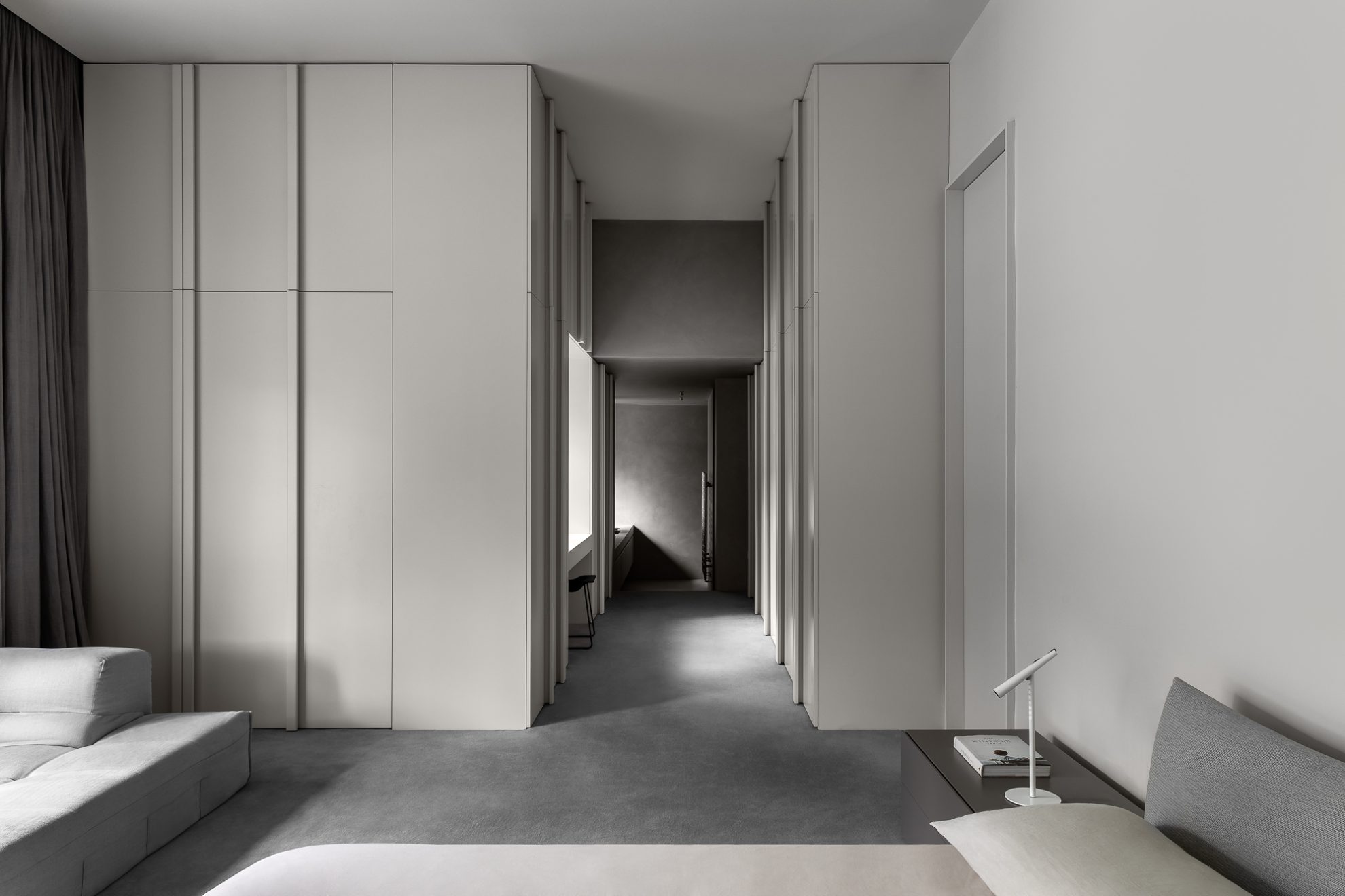
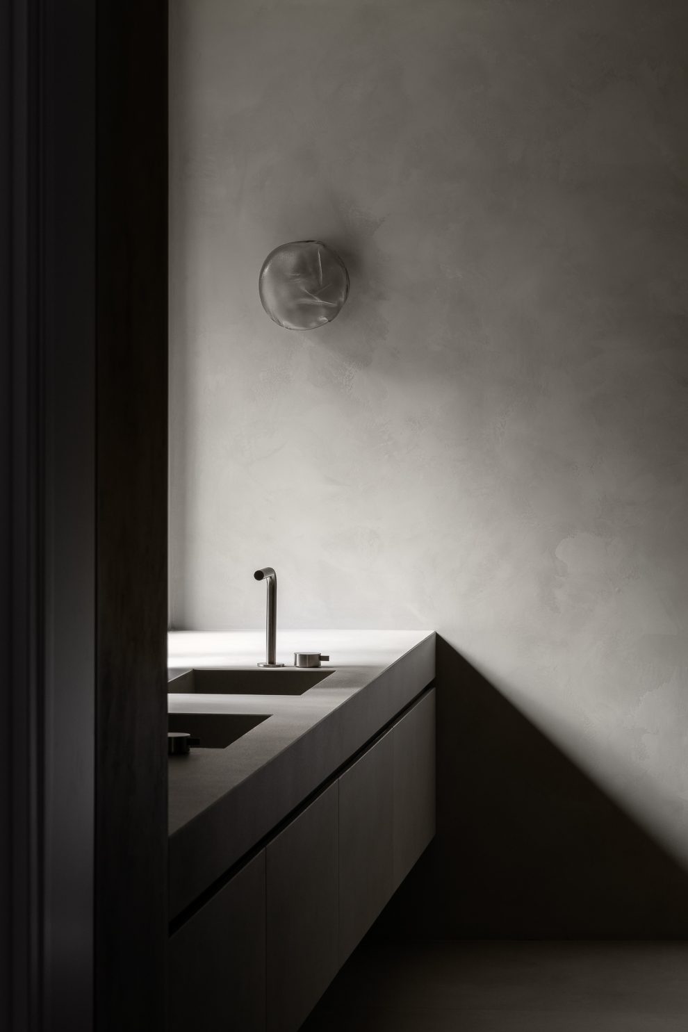
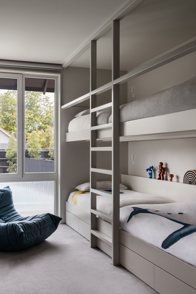
The private quarters are designated to one end of the house. The entrance to the master bedroom was shifted to create privacy, while the bedroom itself was extended to create a link to a walk-in-robe and ensuite. Custom-designed bunk beds, desks and a playroom offer the client’s children dedicated areas to live and play in.
Further emphasising the heritage detailing, the interiors are painted a soft grey, provide a complimentary and unified backdrop for the client’s extensive contemporary art collection. All the joinery details continue in the same tones to ensure a seamless visual journey between rooms.
The overall aim for the first stage of the project was to respect the original detailing while making internal moves that refined and united the spaces for generous living spaces.
