Marking Carr’s first collaboration with the renowned Australian skincare brand Aesop, the new Australian headquarters represents a new chapter for the company following recent global growth. Moving towards an increasingly international approach, with offices in London and Paris, Aesop appointed Carr to craft interiors that facilitate a collegiate and sophisticated workplace while evoking a lasting impression that embodied the brand.
Located in Collingwood, Melbourne, the Aesop headquarters encompasses a changing business model, one that Carr deeply understood. Initially, Aesop engaged Carr to reassess its existing strategic brief to best manage and optimise its pivot in operations and direction. Under these changed circumstances, a new workplace was required, which speaks to the internal and external functions of a global business with a Melbourne office and employees.
With this foundational understanding of Aesop’s business strategy, Carr sought to exhibit the company’s culture and brand through ritualistic, restrained and curated design choices. The design team referred to the quote by American artist Leonard Koren, ‘Pare it back to the essence but don’t remove the poetry’, as reflective of the design processes for the physical environment.
For every single decision, we thought about rituals embedded in Aesop’s culture. In all that they do, there is a moment to pause and go through the motions to have a sensory and tactile experience. This distinct and considered culture is a living environment through how people interact and carry themselves at Aesop.
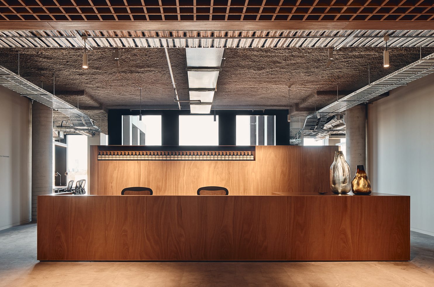
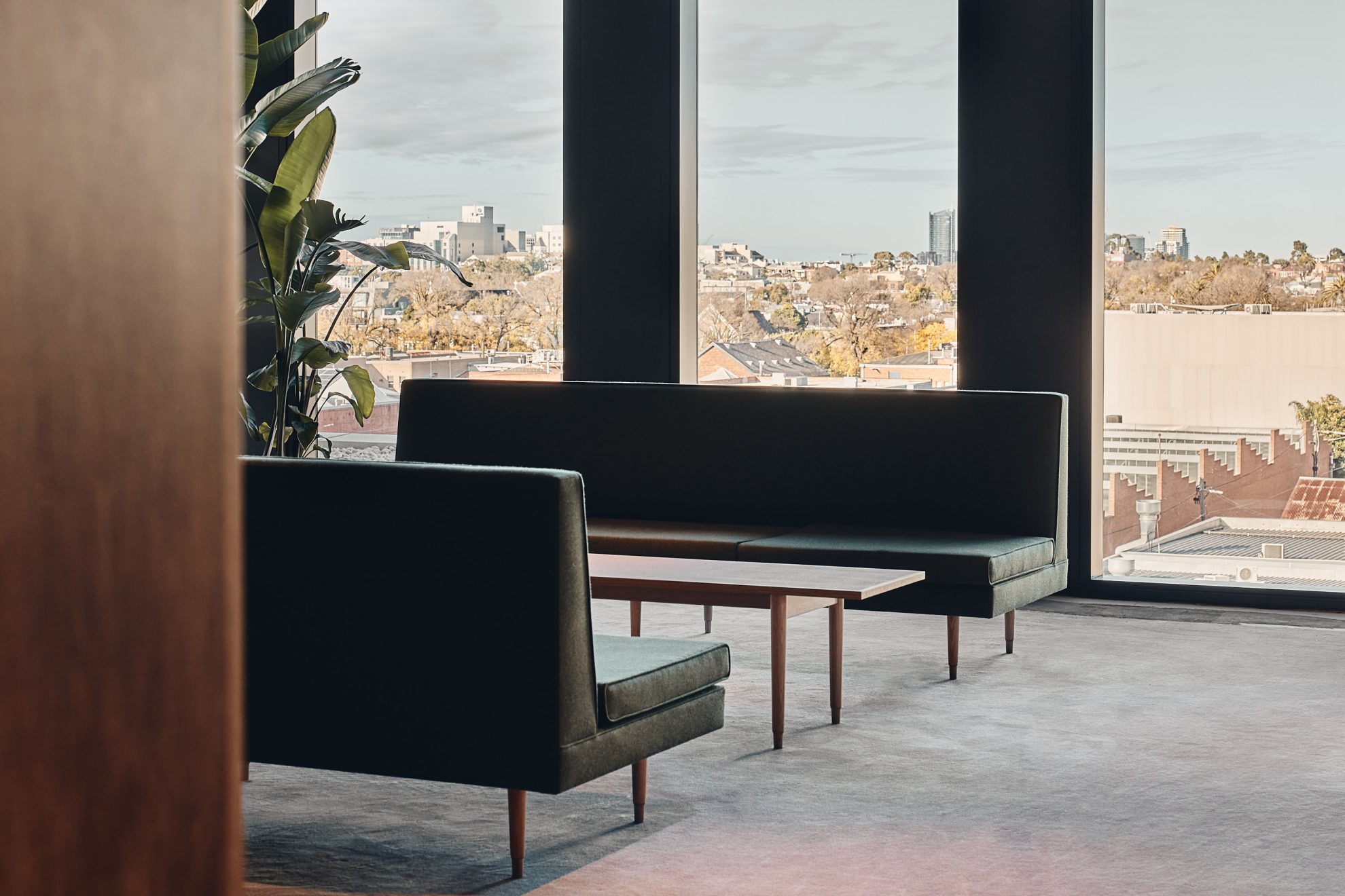
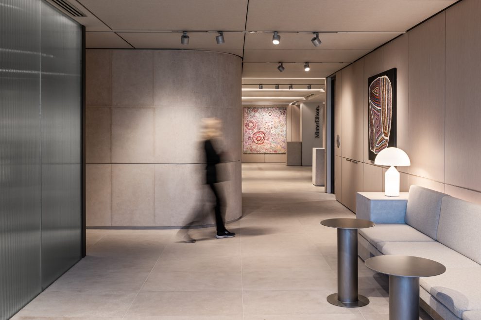
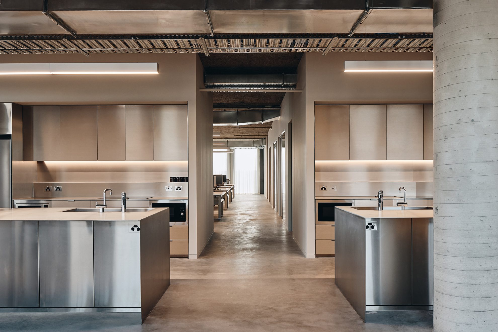
Through moments of compression and release, a restrained but powerful experience is evoked within the building across two levels. Level five includes main staff amenities such as a sizeable kitchen primed for intimate or large gatherings, a central staff hub, breakout rooms, and a pitch space to showcase new products. On level four, the interiors are oriented for clients and guests. While workspaces exist on this level, the primary intention is to reflect the hosting experience you would receive at an Aesop retail store the moment you come through the entry door.
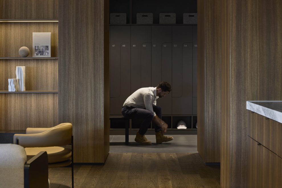
“An important part of the design approach is restraint – a certain level of precision synonymous with Carr,” shares Interior Designer Kirby Humphries, with the arrival space prompting an opportunity to conceal and reveal the space and encouraging a moment of pause. “The warm timber-filled arrival space with a lowered waffle ceiling and subtle, dim lighting creates a sense of compression and intimacy. Beyond this point, the journey is created through moments of discovery as the user is released into the open workspaces and communal gathering areas with the built environment planned in a way that again provides a contraction that leads into the adjacent spaces.”
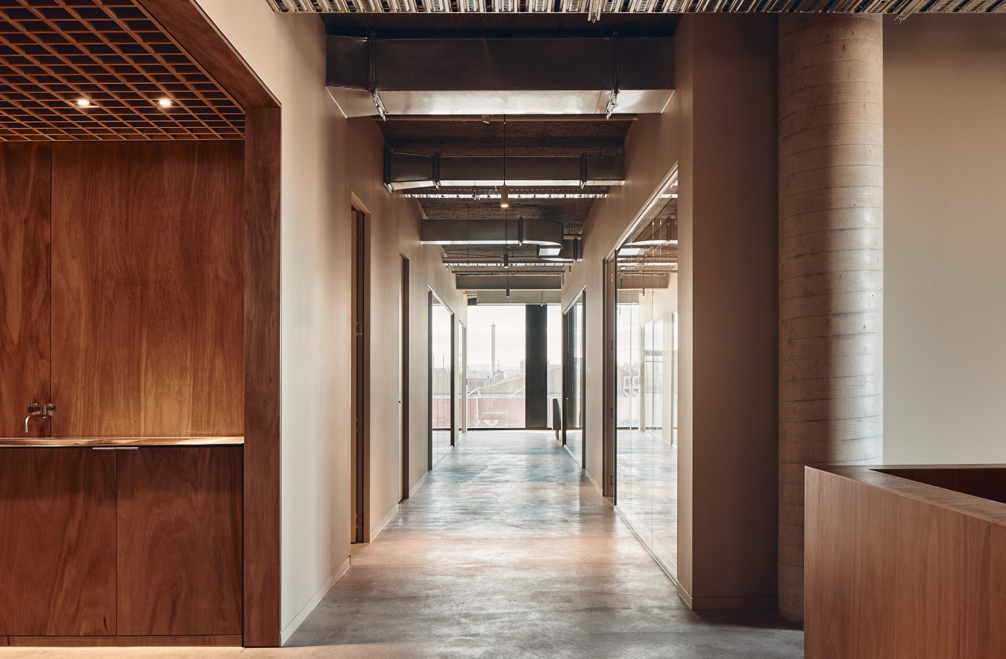
With everything carefully curated to elevate the brand’s ethos, Aesop and Carr ensured there was a seamless transition for staff. With a flawless onboarding process, from the moment the staff walked in, the space was beautifully curated to embody Aesop’s culture.
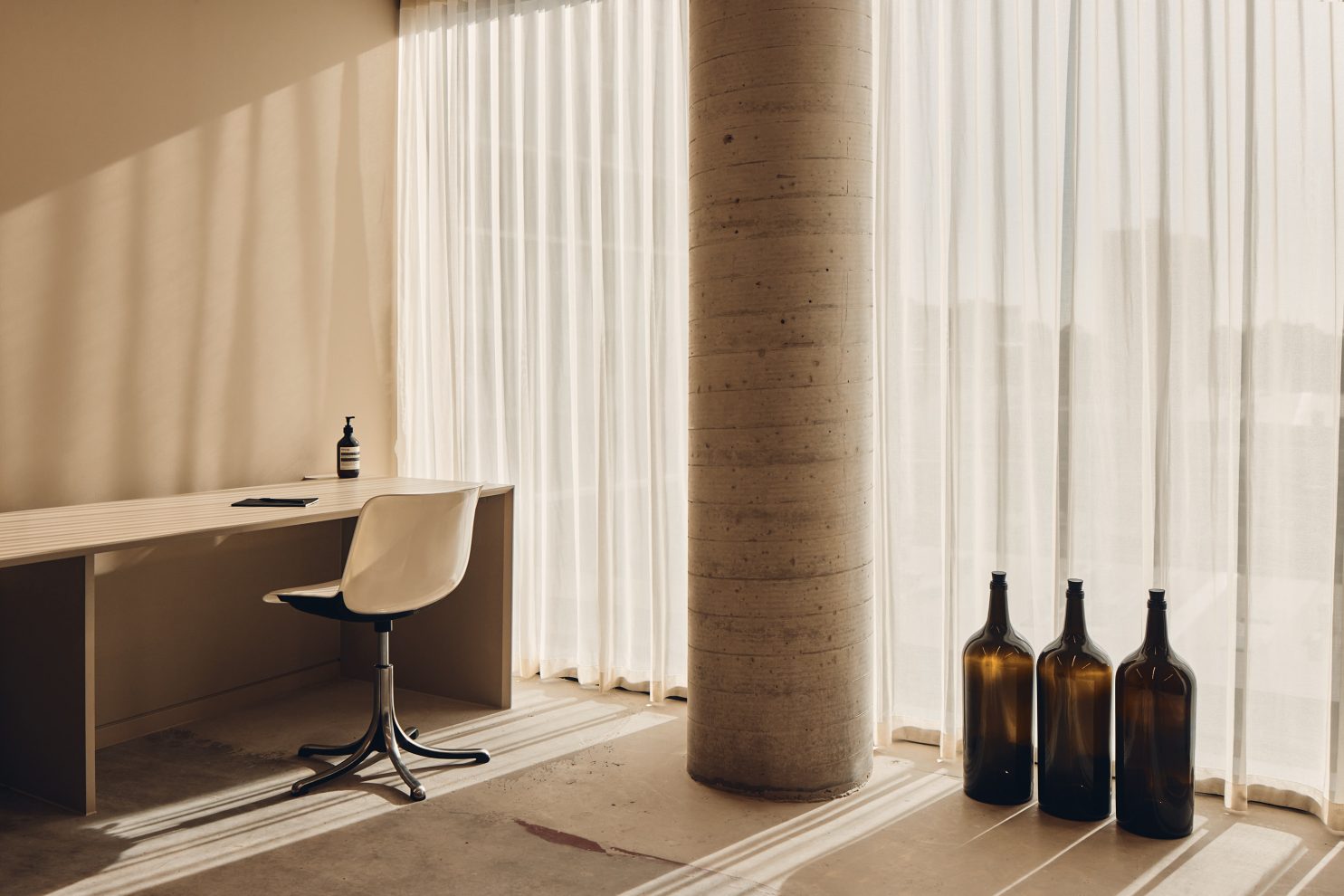
As a brand, Aesop always looks to its surrounding contexts to be reflected in the interiors. Sitting within the concrete jungle of Collingwood, the new headquarters exhibits concrete flooring and walls with a muted colour palette. To add warmth, the play of light and shade softens the concrete while adding texture and movement to the space. And with the headquarters occupying a brand-new commercial building, as opposed to Aesop’s previous Victorian-era warehouses, Carr incorporated a sense of home by playing with light and shade. Reminiscent of soft dapples of sunlight typically experienced in a residence, the mood is elevated through considered and atmospheric design insertions.
Also designed by Carr is the Aesop laboratory located at 23W within the 88 Landridge workplace precinct. From the outside, with no fanfare or ostentatious signage, the laboratory stands inconspicuously as it was intended. Those attending the lab are met with a three-metre-high steel door, equipped with the original cast metal handle from Aesop’s first premises. Everything touched, seen and experienced within the laboratory reinforces the skincare’s renowned and admired brand ethos: one of quality, care and context. As such, the concept for the design is founded on the belief to work with what already exists. Retaining the original brick and concrete shell, the design treads lightly and harnesses its history by emphasising and appreciating the original structure, texture and natural light sources.
Of its place, the inserted laboratory weaves itself into the fabric of its industrial neighbourhood and is synonymous with the skincare label’s brand identity. The mechanical material vocabulary of galvanised steel paired with natural light sources works in harmony with the warehouse’s whitewashed brick shell, creating both a functional and captivating space for lab workers, team members and visitors.
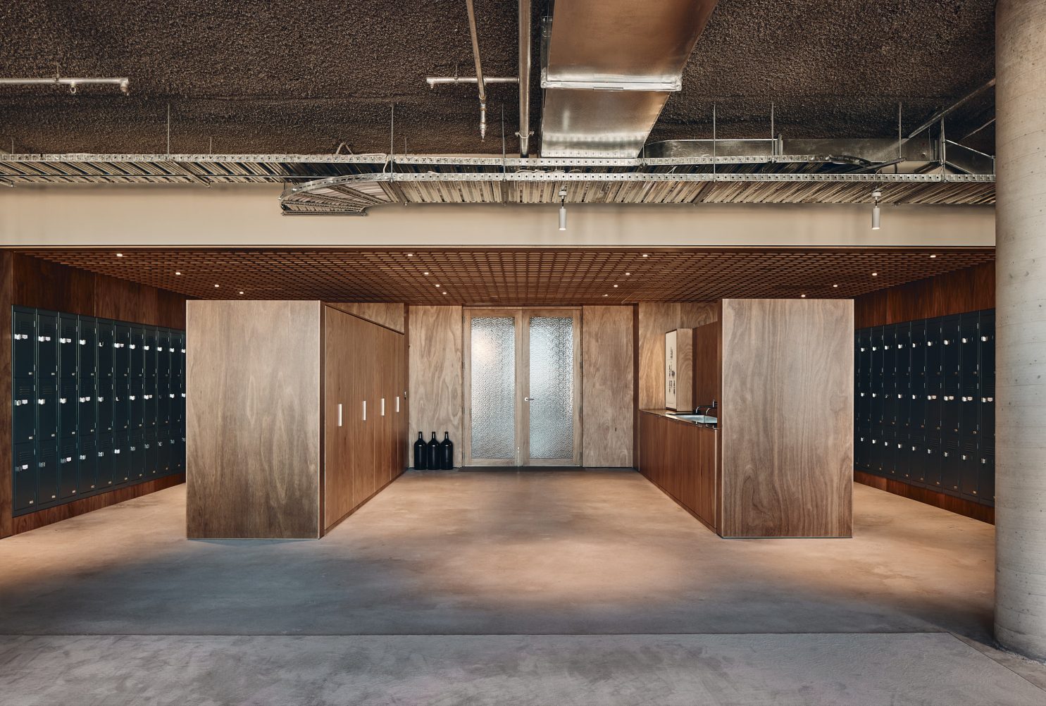
Within the headquarters, a subtle material palette of natural Australian blackbutt timber, stainless steel, and muted tones anchor a peaceful backdrop for the people and furniture. Pairing it back just to the essence enables the ability for “life and the brand to evolve and take hold,” shares Associate Richard Healy. “The approach to the material palette was informed by a deep appreciation of Aesop’s brand ethos with great importance placed in the truth of the materiality.”
In possession of an eclectic collection of historical furniture and artifacts collected over the past four decades, Aesop continues to showcase these pieces, telling a story of the brand’s evolution. It’s moments like this that embed the physical environment with intangible memories.
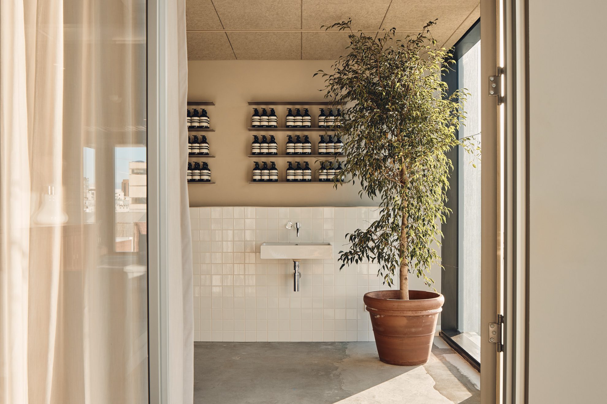
An important part of the design approach is restraint – a certain level of precision synonymous with Carr.”
Sensory and comforting, the new Aesop headquarters by Carr represents the skincare brand’s innovative future in a nourishing workplace now called home.
