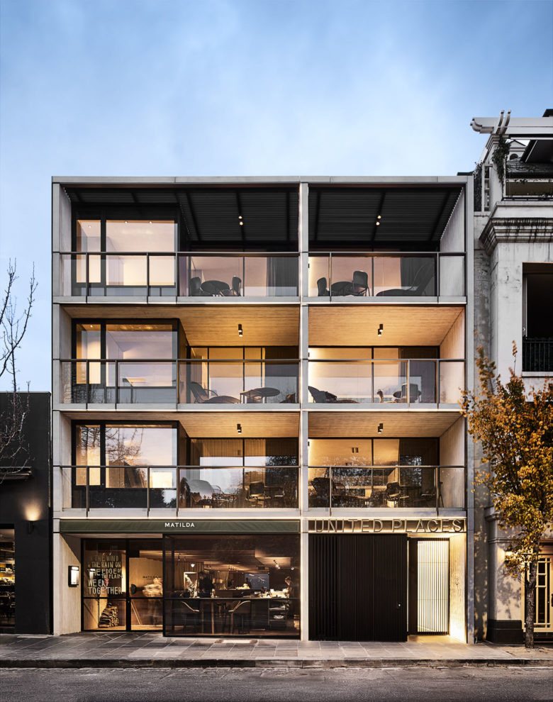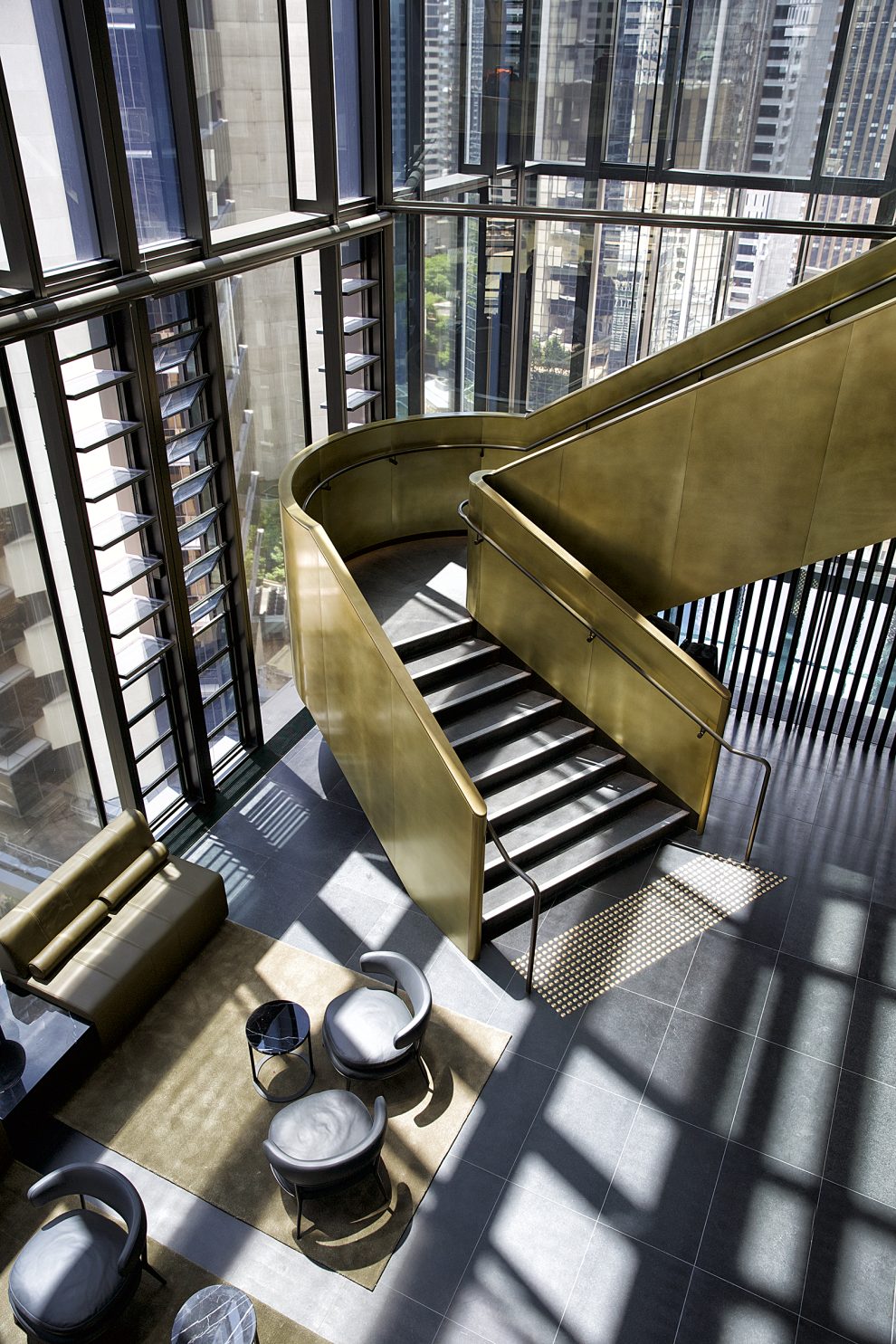
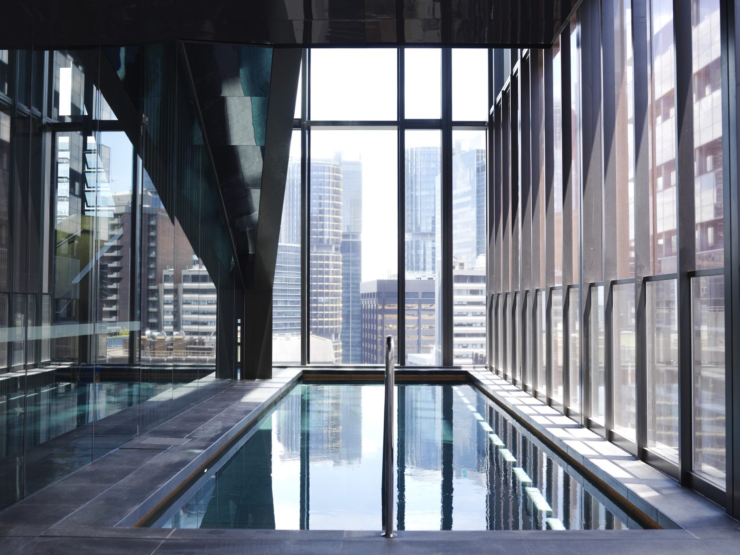
Located at 280 George Street, Sydney, adjacent to the business district’s vibrant Australia Square, the elegant sandstone podium topped by a glazed upper structure totals 22 floors. Entering via the lower ground floor, guests feel the monumental scale of the building as they journey up through the building to level 21 where they disembark at reception. Immediately teleported away from the frenetic streets up to the hotel’s top floor, guests experience an arrival journey like no other, where the reception and pool uniquely coexist on the same level. Stepping out into the triple-height reception space, with the activity of the restaurant buzzing on the above mezzanine, guests are welcomed by sweeping city and bay views that instantly offer a rich Sydney experience.
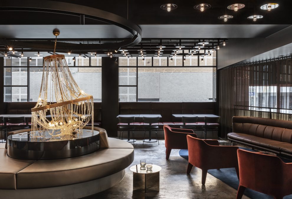
Our primary departure points for the design development of the interior spaces looked to the principles laid out by the client, TOGA, and architects, JPW, which focused on ensuring a sense of place. Appealing to both local and international guests, the concept for the interiors is based on resonating images of Sydney. Replicating dappled light on the ocean and other naturally repeating patterns, Sydney’s rugged coastline, warm climate and sprawling collection of harbors and bays were sources of inspiration for the interior language. This can be seen from the olive-based carpets to the use of chiseled granite and bronze-tinted glazing, which picks up Sydney’s warm environment. Strong colours were avoided, with a series of tones that collectively make up a rich and textured palette used throughout. The architecture’s warm materiality and verticality is translated throughout the interior design details, such as the internal screen baton doors right through to the hotel room joinery.
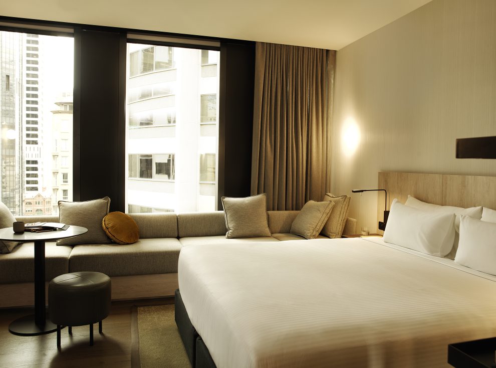
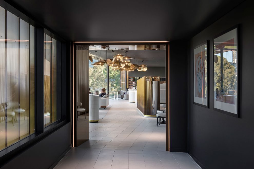
The lobby is intentionally dark to amplify and frame the view, rendering the dark furniture as layered silhouettes cocooned by dark floor and wall finishes. This helps the hierarchy of experience, ensuring the view is recognised first, with the shapes, textures and the internal environment at large coming into focus second. The dark interior language is continued as you move throughout the corridors, creating a sense of anticipation and quiet as guests transition towards their room. A sensory shift is experienced when crossing the threshold into the conversely bright hotel suite. This offers guests a beautiful relief and aids the feeling of expansion out from the compressed transitional spaces.
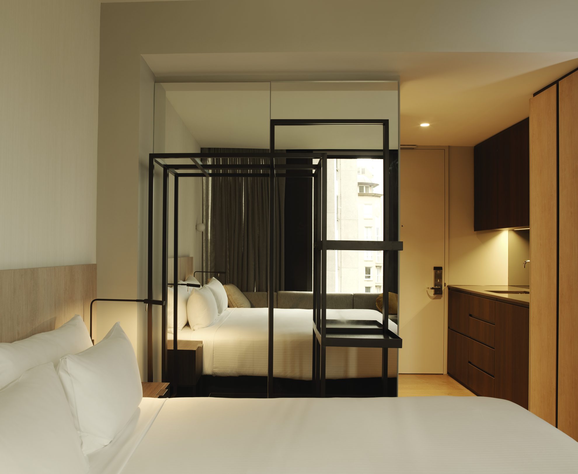
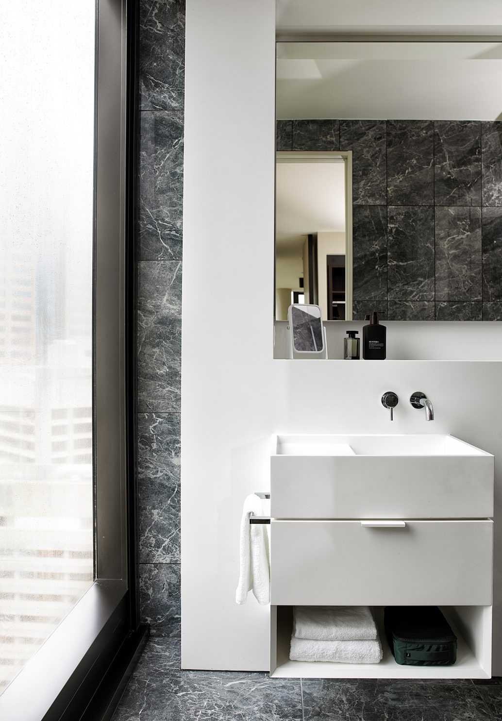
For the array of suite planning options, Carr worked to ensure apartment-style features were incorporated regardless of each hotel suite’s footprint. Amenities such as a full kitchenette and space for laundering, plus ample storage in the bedrooms, offer guests premium, at-home comforts that are particularly suited to longer stays. In addition, the room designs use clever techniques to create a sense of generosity, such as the large wall-to-wall, upholstered banquette seating placed in the full-height window, which offers a feeling of luxury. These moments when combined enable A by Adina to offer the business or leisure traveler premium comfort when away from home, experiencing the beauty of Sydney.
