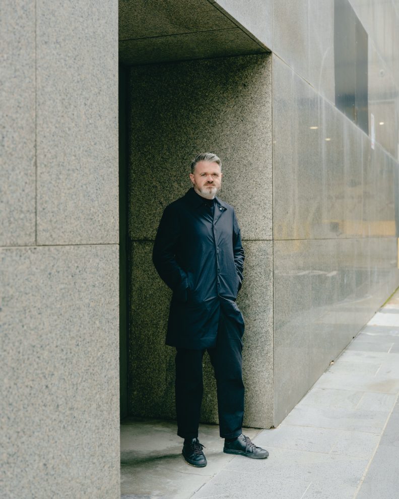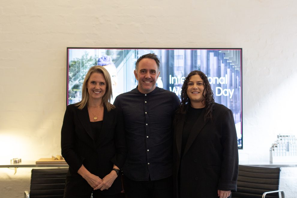
Gillian Serisier, Editor At Large at Habitus and Indesign, interviews Chris McCue on Carr’s minimal but impactful design intervention in Refinery House.
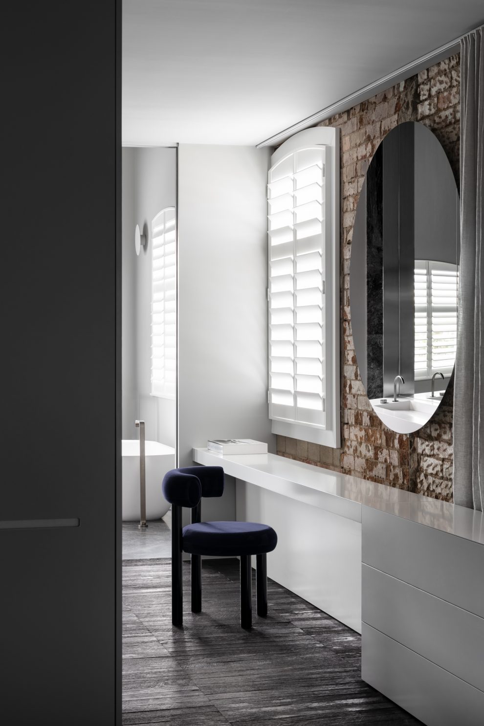
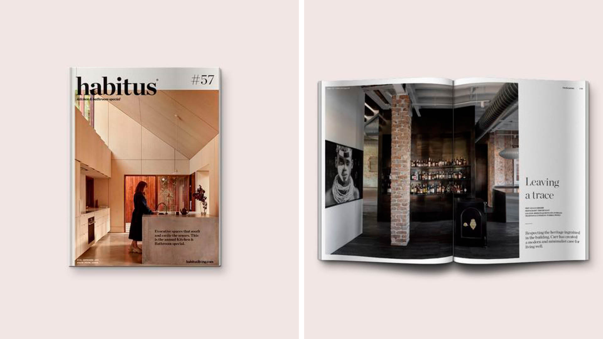
Respecting the heritage ingrained in the building, Carr has created a modern and minimalist case for living well.
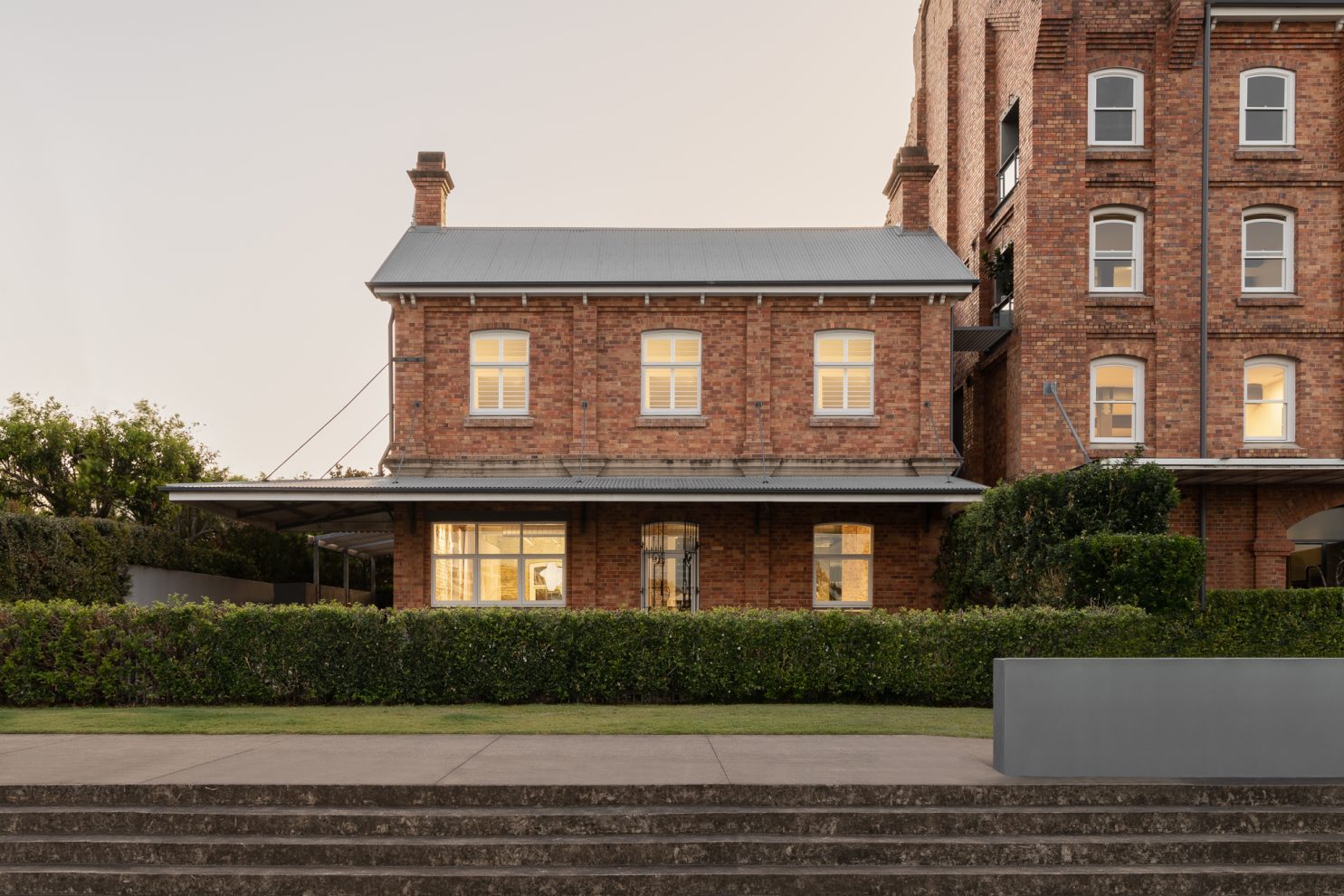
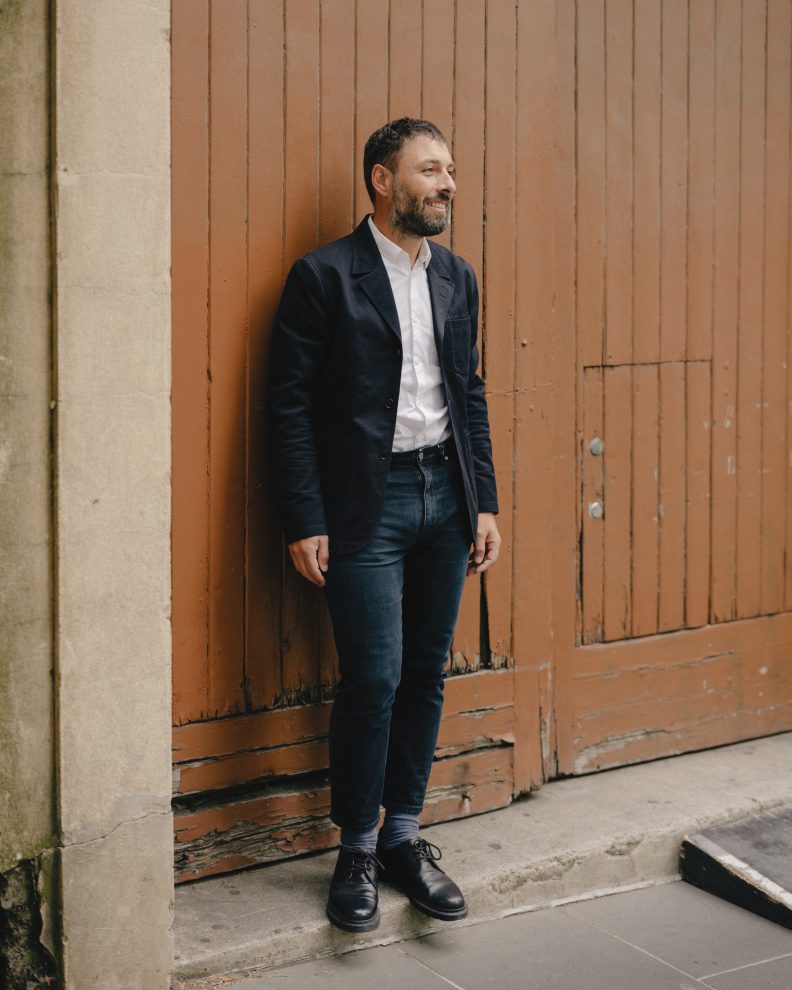
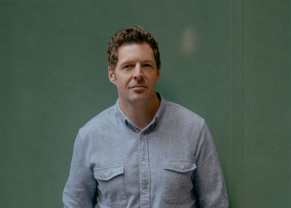
Once the headquarters for the CSR Refinery, Refinery House had the great luck in being developed by Carr, where the intervention was minimal and dictated by the building itself. Having worked with the client, developer Kokoda Property, for the past decade, the brief for good accommodation for travelling staff was simple. As was Carr managing director Chris McCue’s response: “I wanted to do as little as possible… so that the beautiful fabric that was there before me on day one could be the same as when we finished the job.”
Granted, that simplicity was to be supported by a new staircase and beautiful black waxed stainless steel joinery. But wherever possible the fabric of the building remains the hero.
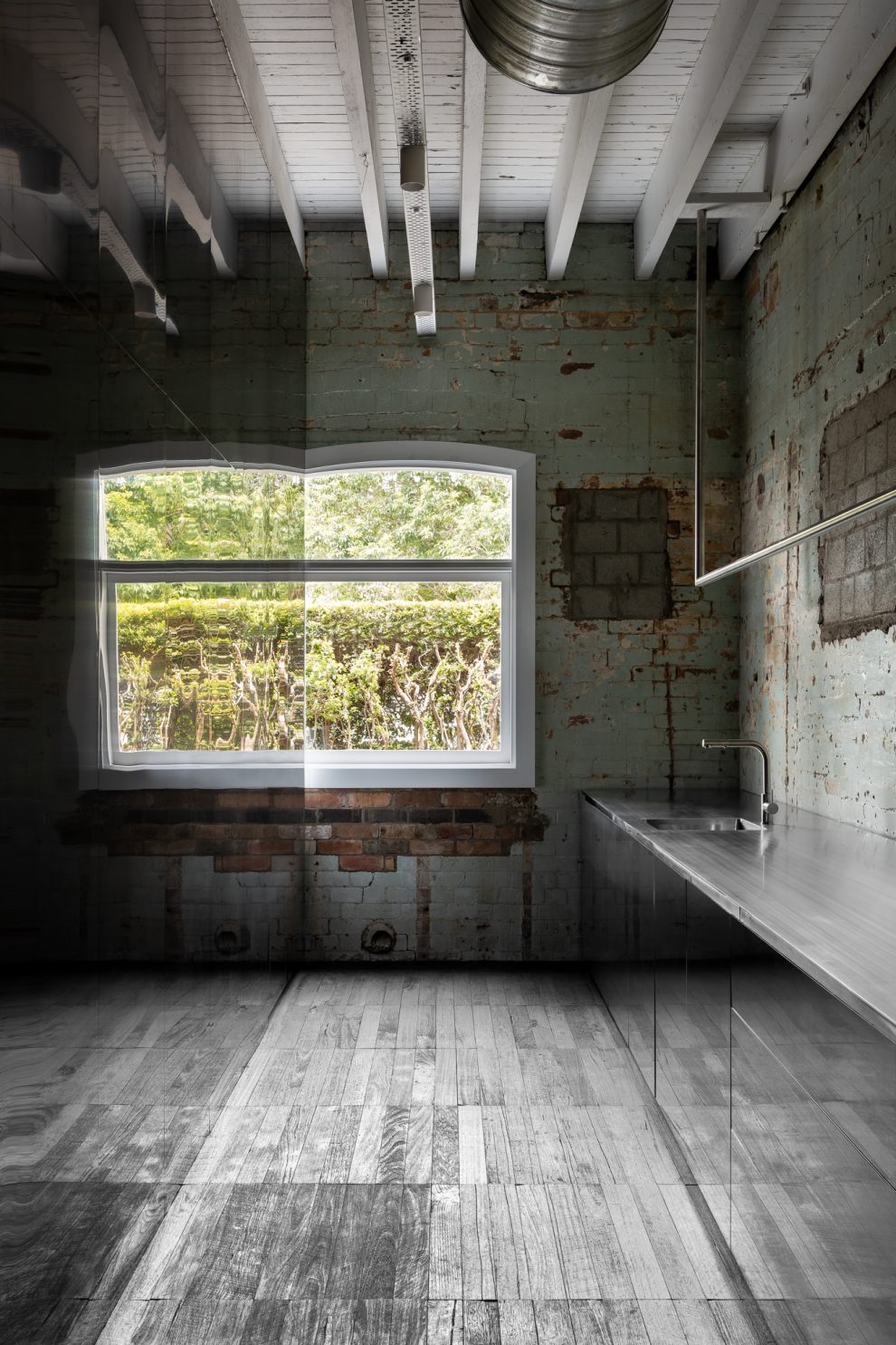
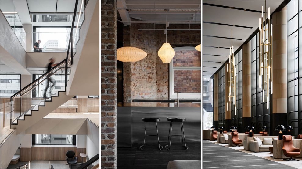
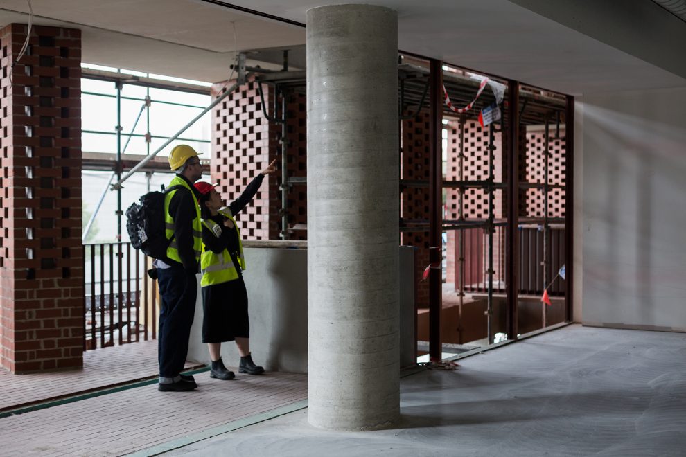
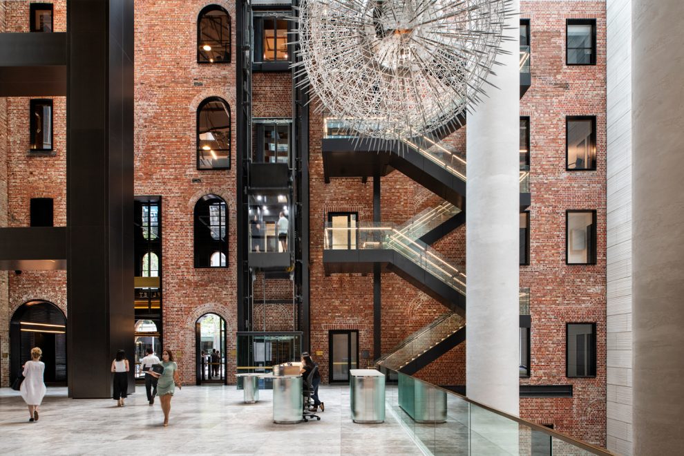
The two-storey brick building on the river in New Farm, Brisbane, had been stripped back to a shell with the layers of history clearly legible. Cleaning the surfaces to a stable condition, McCue was adamant the building narrative remain the guiding principle.
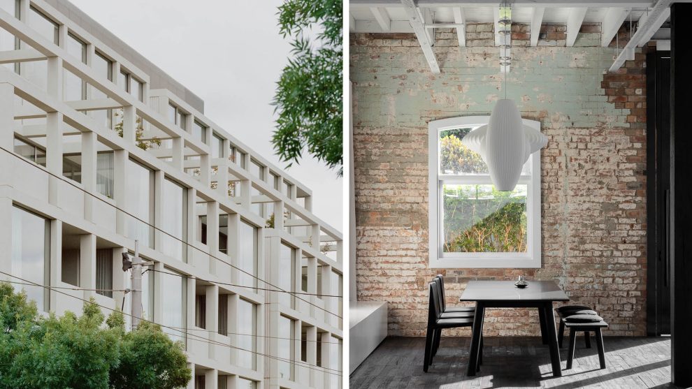
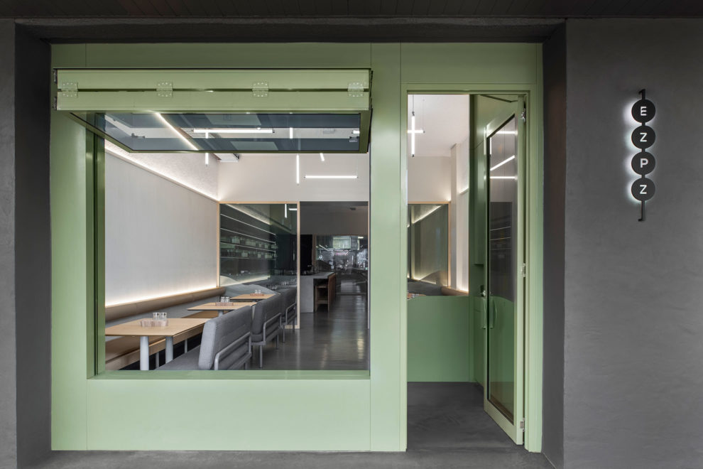
As such, the green paint in the laundry continues to speak to the original character, while setting a new aesthetic tone.
Paired here with a large open window, expansive cabinetry and some seriously clever thinking, the room sets new standards for laundries. The wall of blackened and waxed steel cabinetry conceals the downstairs powder room.
Opposite, low cabinets and a benchtop in the same material accommodate both laundry and butler’s pantry utilities. The decision to avoid wall-mounted cabinets gives the long narrow room a more open aspect.
Moreover, the long suspended rod over the bench, while ostensibly a drying rail, is in fact a bespoke lighting pole that allows caterers to use this space efficiently during events.
Which brings us to the expanded use of Refinery House. While briefed as staff accommodation, the space would also need to host events and hold potential for future use as a four-bedroom home.
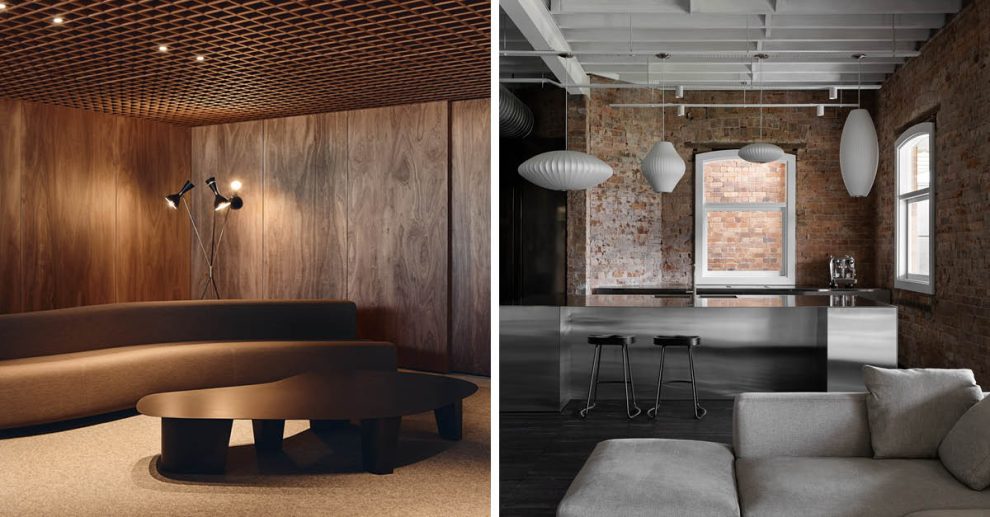
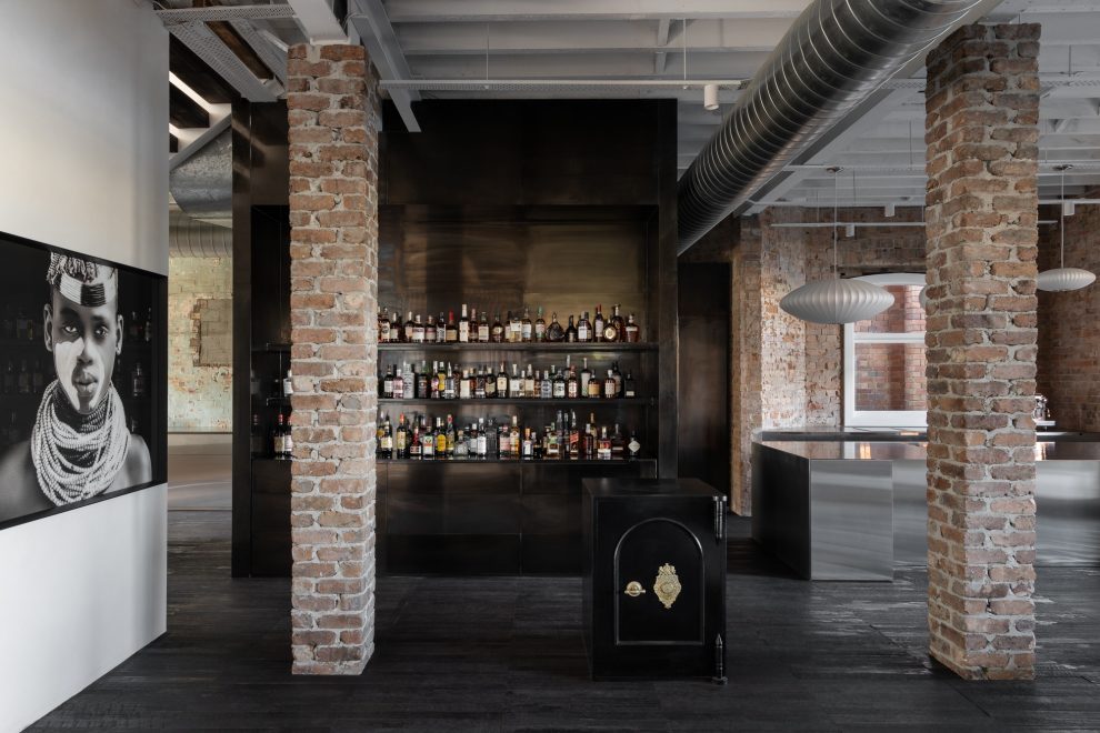
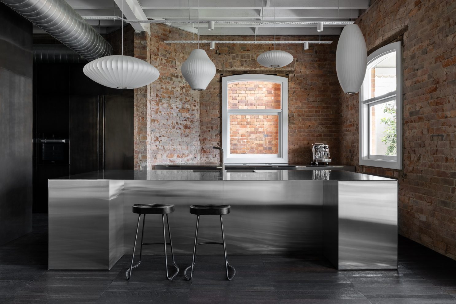
The house is divided into a public lower floor and private upper. On the lower level, where the messy mortar of a pair of pillars is celebrated, a floor of locally sourced recycled timber provides the foundational palette: “We didn’t want to do parquetry. That stack bonded form allowed us to use the rough-hewn texture of old wharf timbers but in a contemporary way,” says McCue.
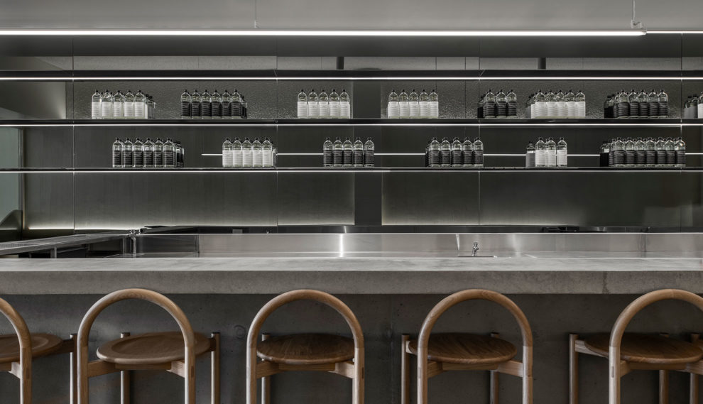
Interestingly, when sanded back, the character of the timbers became amplified rather than fading away. Central to this main open space – where entertaining clients will be as comfortable as using the space as a living room – the black steel bar comprises a vast lit wall. It is both ostentatious and recessive with the flick of a switch lending the whole a non-event invisibility.
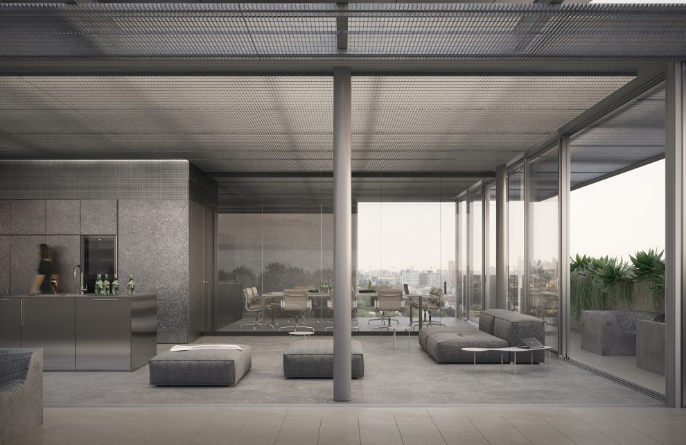
Countering this is a precisely detailed stainless steel kitchen where all cabinetry has been kept low to render function inconspicuous, while sharply contrasting with the exposed bricks and rough timbers. “There is an intentional juxtaposition of the clean and the perfect with the organic and messy,” says McCue.
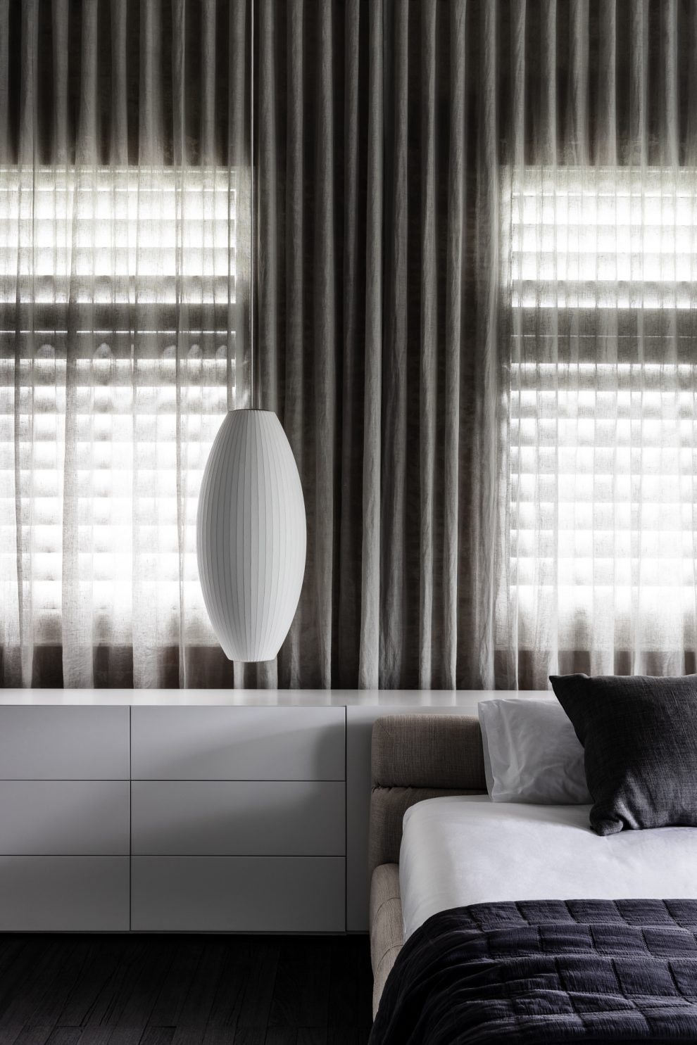
Above this sits a suite of four Nelson Pendant lamps. As the only rounded form in the room the impact is astounding: “We wanted a degree of warmth and almost familiarity. The Nelson lamps are iconic, and most people are aware of them whether they know the designer or not; they would have seen them.
“There is an intentional juxtaposition of the clean and the perfect with the organic and messy.”
“We were not concerned about how hard the insertions were going to be because we knew that they’d be beautiful, but it felt like the right juxtaposition between something highly tactile and textural, and the warmth of the lighting playing against the stainless materiality,” says McCue.
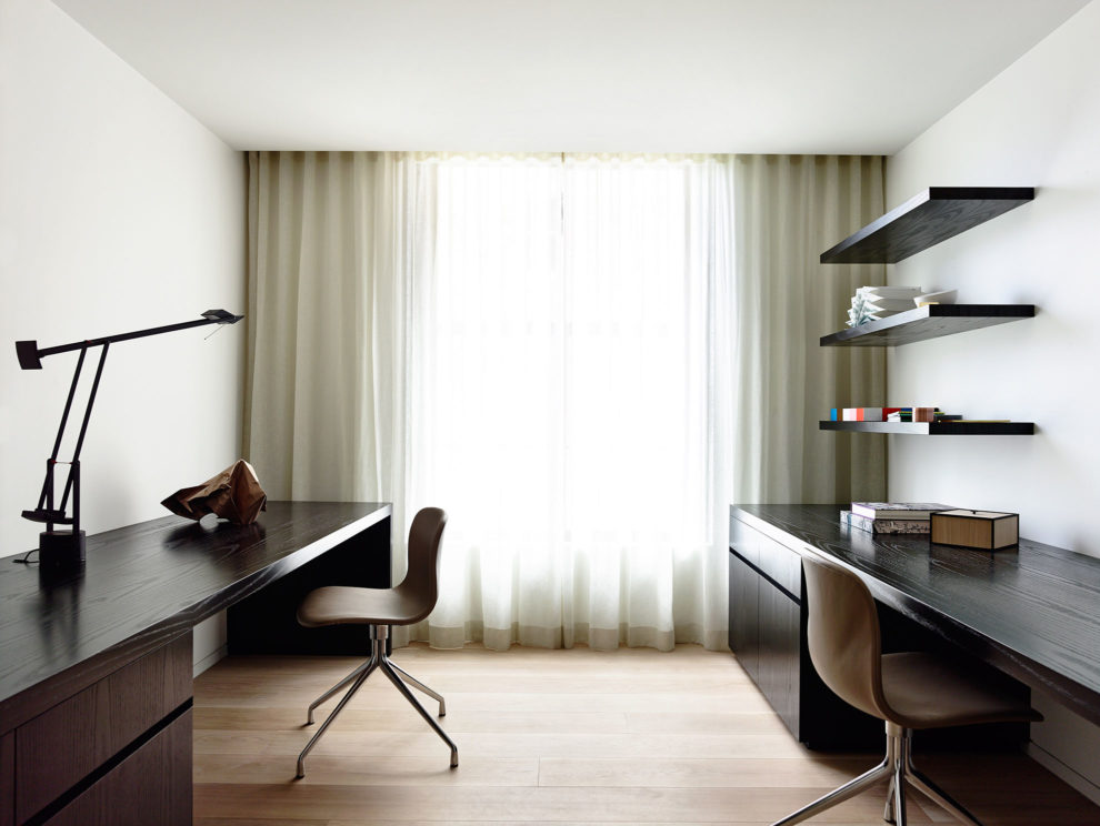
These lovely sculptural lamps reappear on the upper floor where four bedrooms, each with an ensuite, reside. In these rooms the character of the building is toned down, with lined walls rendering the brickwork an accent rather than feature. That said, the office nooks are a beautiful hybrid with slick lower cabinetry and exposed bricks paired so anyone who is seated has only the bricks as their view.
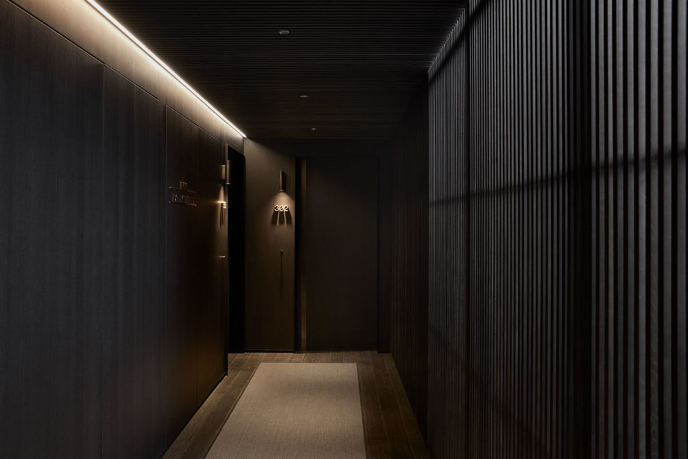
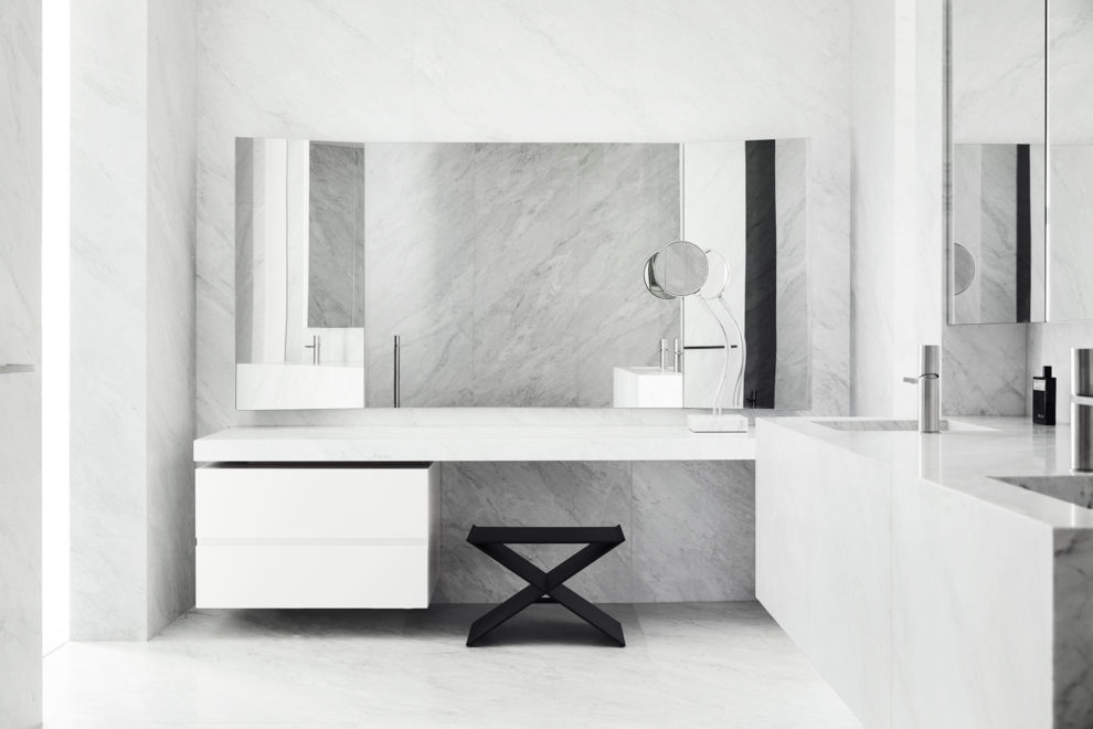
The sharp detailing of the ground floor is revisited in the bedrooms with bedheads that extend into low cabinetry storage, which then becomes a dressing table, and finally ends in a spine from which the bath emerges.
A Queensland vernacular is also introduced with white operable shutters. “That was simply a matter of walking along the boardwalk and looking at what will work locally. And the shutters were a really simple solution,” says McCue, who was enamoured with the Queensland light and keeps turning the lights off to better enjoy its presence in the house.
“There’s such beautiful light in Brisbane as it is. But washing light through the space and reflecting off the stainless steel or off the wax steel, you get a beautiful play of light bouncing off, and particularly the green of the laundry as part of the old wall.”
The simple idea of allowing the original character of a building to maintain its narrative in a new iteration is a design anomaly, in that it only works when a deceptively precise and exact response is controlled with an iron fist throughout.
As an exemplary architecture and design firm, Carr is both inclined and able to deliver this level of perfection. Refinery House is a gorgeously realised home of interesting and delightful moments.
Publication – Habitus Issue 57
Writer – Gillian Serisier
Publication date – 15 June 2023
