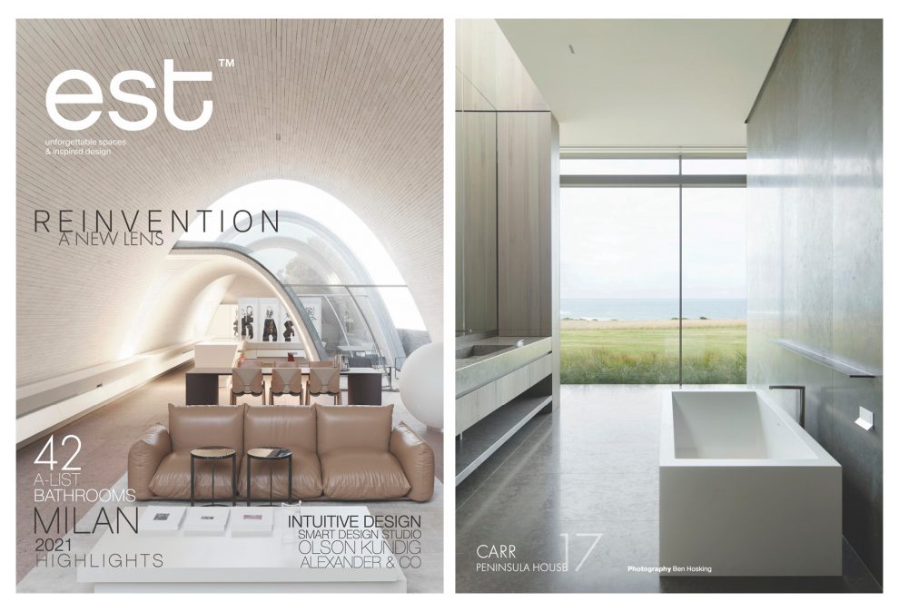
To celebrate our five decades, Stephen Crafti revisits the iconic Merriwee Crescent residence, reflecting with its owners on its enduring appeal.
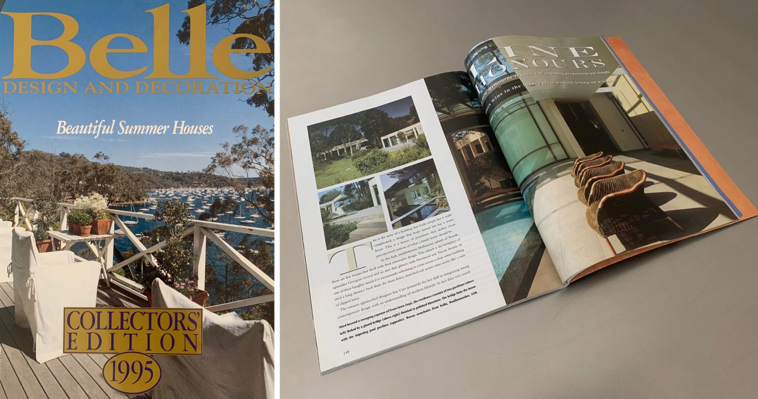
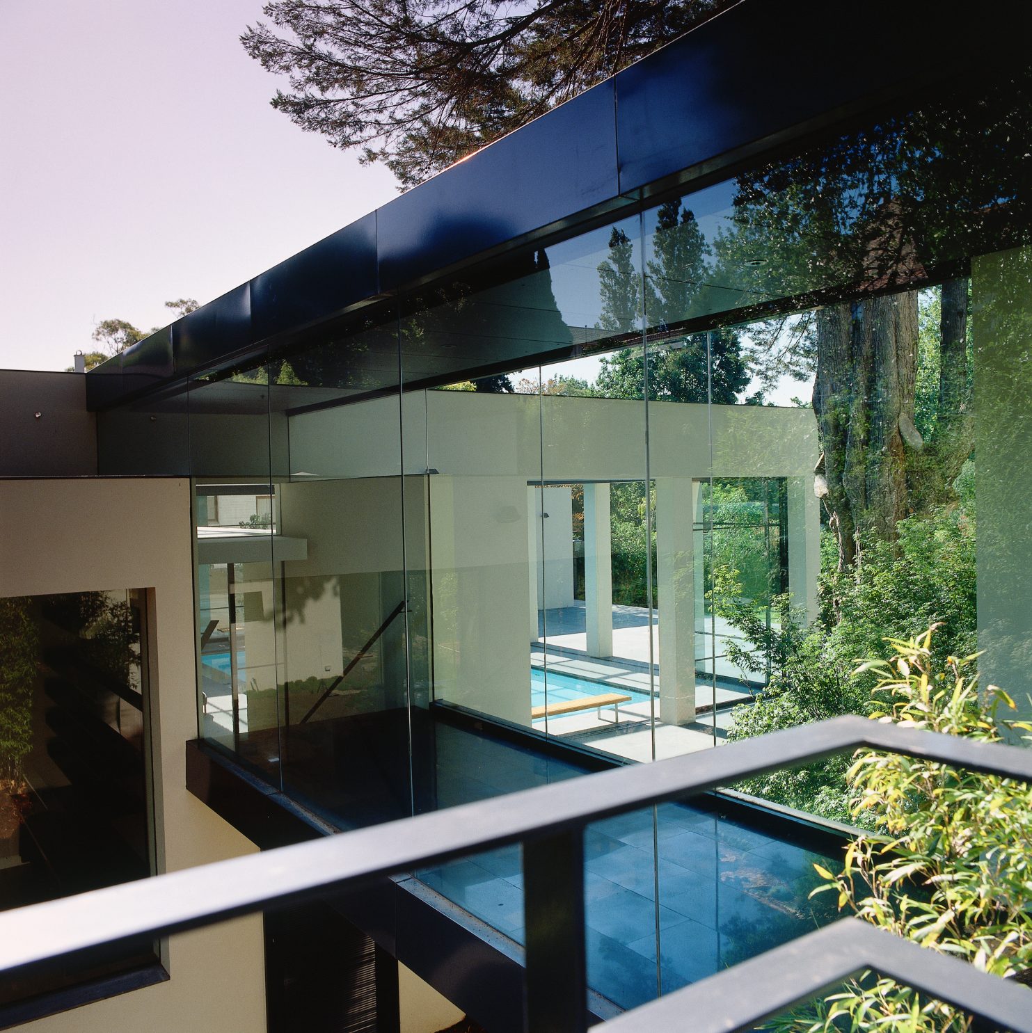
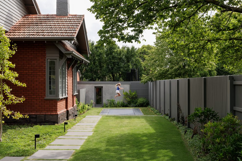
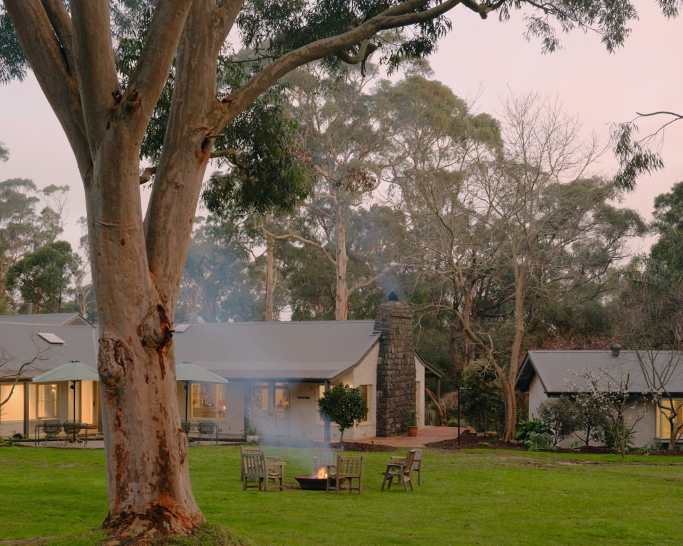
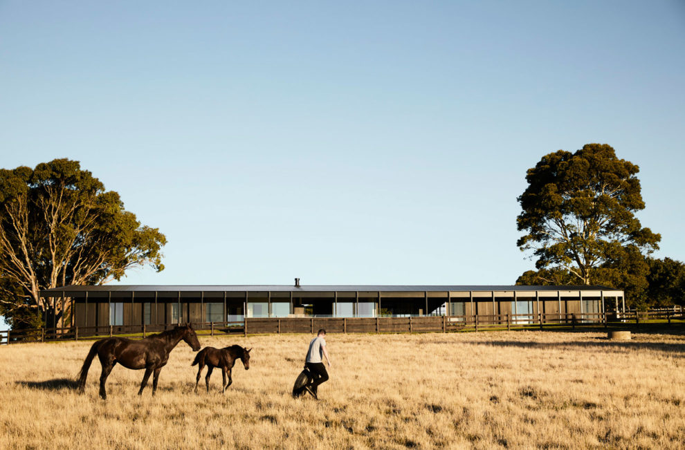
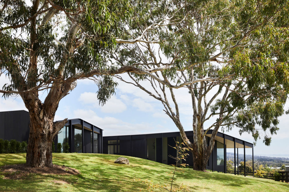
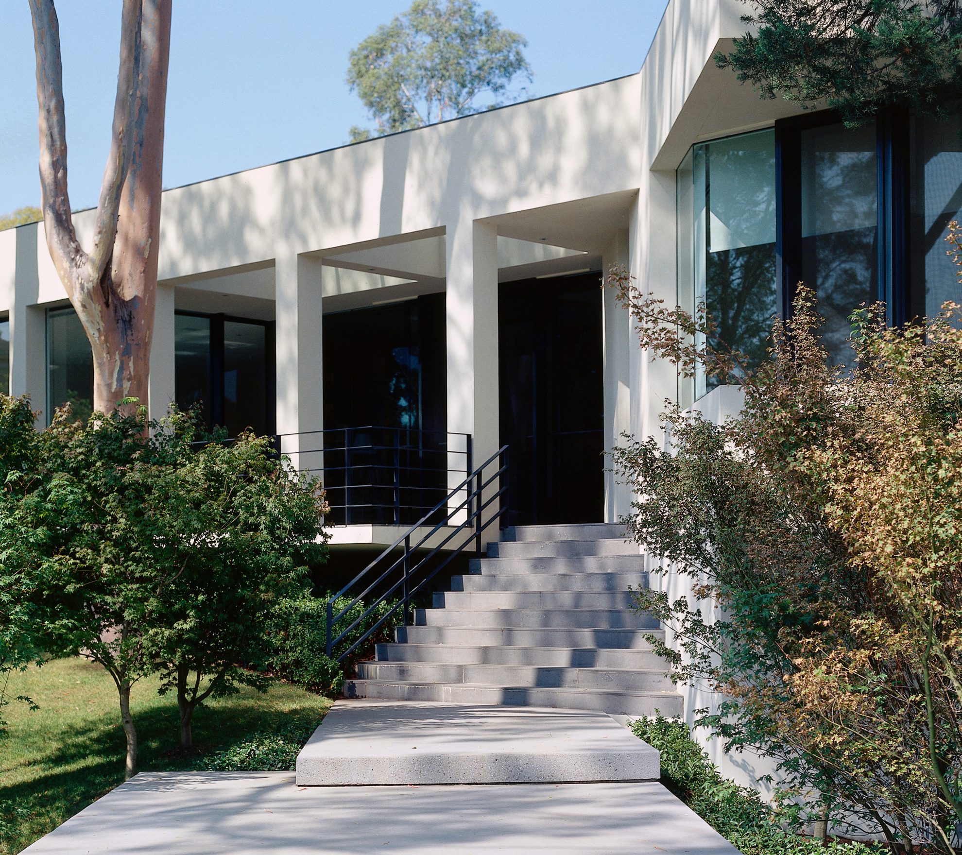
Thirty years have passed since this house was completed. Set amongst established trees on an expansive elevated and undulating site (originally two separate properties), there’s a sense of timelessness, a house that can’t be dated. For the owners, Agita and John Haddad, who moved into a former house on one of the properties, it still gives them enormous pleasure to both live here, and to show it to neighbours and those expressing an interest. For this writer, who was fortunate to show the Merriwee Cresent home on one of his first architecture tours in the 1990s, the experience still resonates decades later.
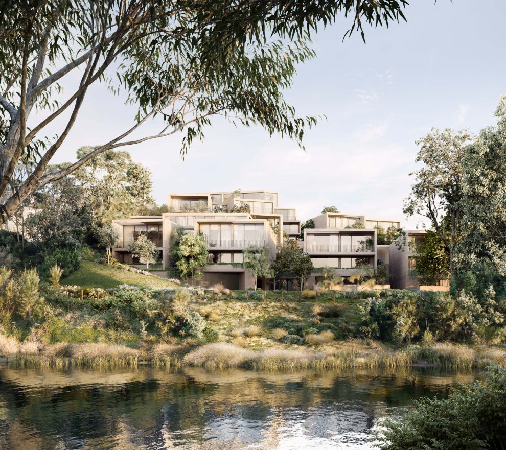
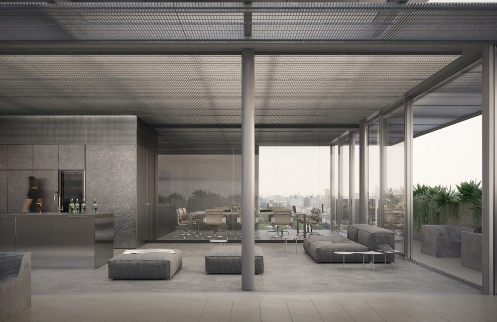
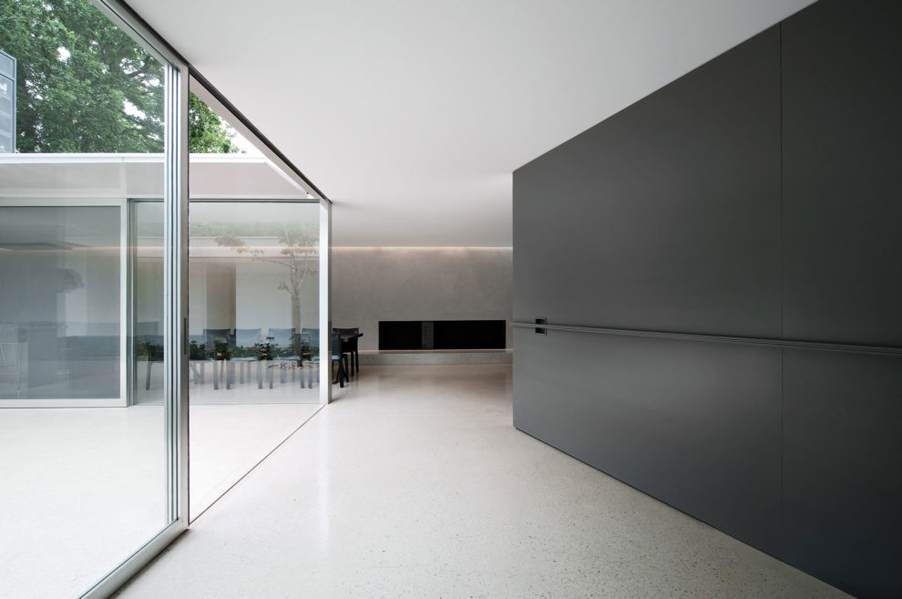
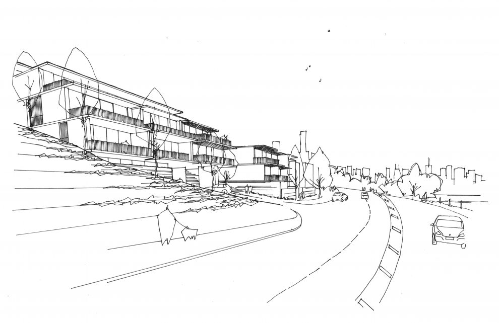
With a natural watercourse running through the property, leading to Gardiner’s Creek, Sue’s solution was to create one large single-storey house (approximately 1,000 square metres) that straddled this easement with an inclusion of a suspended bridge. This connects the kitchen, two living areas, a separate dining area and a study to the east with the bedrooms, including the main bedroom and guest bedroom, to the west.
Agita, who studied architecture, approached three architects to create a new home. “I had a strong idea of what I was looking for: contemporary, simple and not overly fussy. I’d like to think design is part of my DNA,” says Agita, whose love of Bauhaus architecture and the early European modernists, was also on her mind. While the three architects interviewed offered the couple a clean and modernist aesthetic, she felt none really listened to her concerns and gave the impression that the process would be less than collaborative. One of her decisions to engage Sue Carr was seeing her former home on the market. “I fell in love with that house, the way spaces were beautifully curated. I was delighted when Sue agreed to take on our project.”
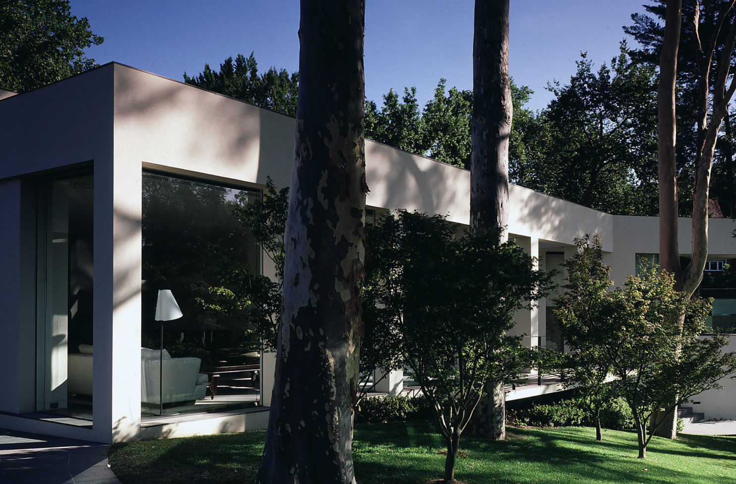
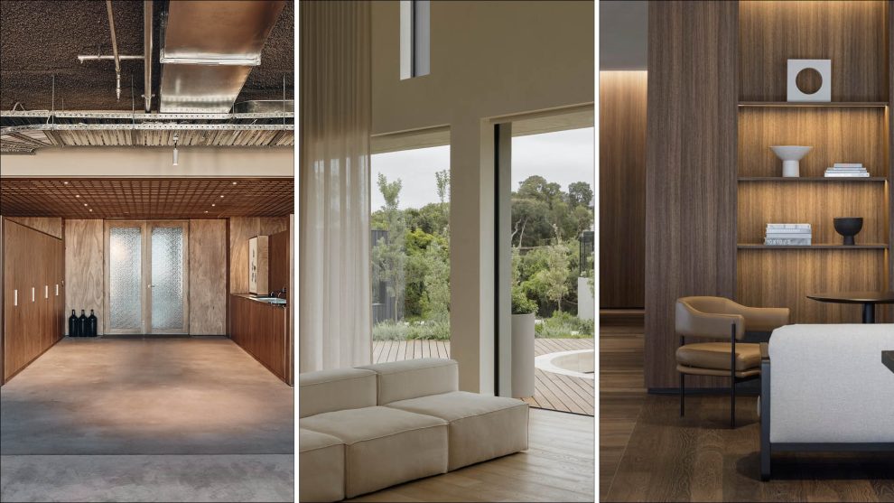
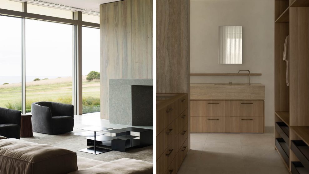
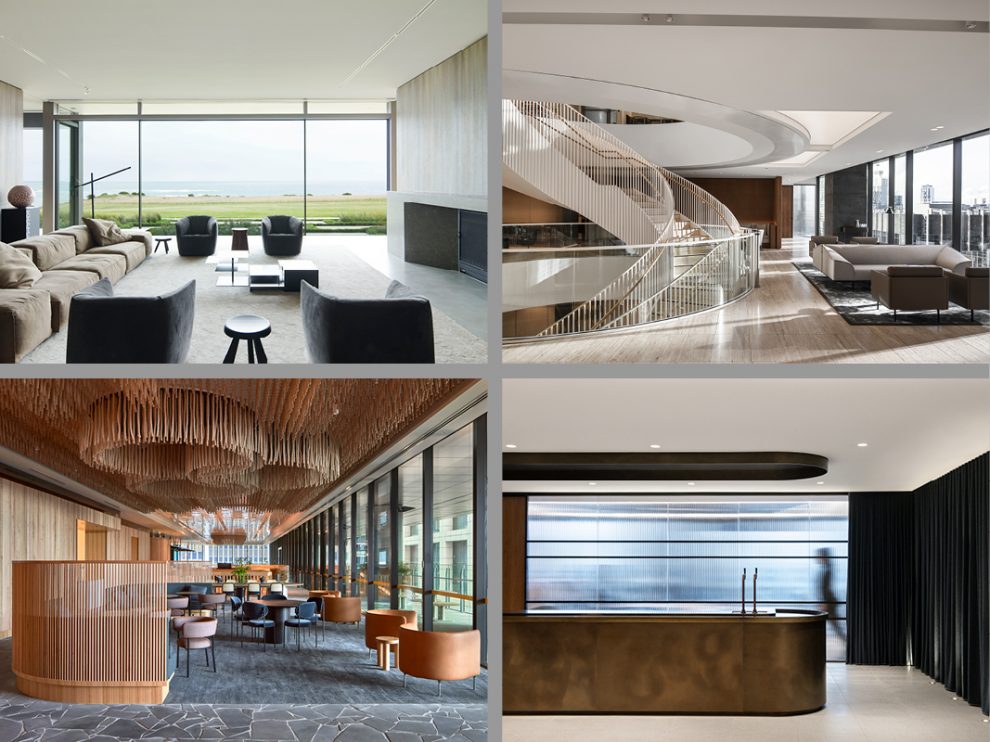
And unlike her initial experience with the architects she interviewed, Agita fondly recalls the words from Sue when taking the brief, ‘I hear you’. “The process, as much as the outcome remains joyous. And I’m still very proud of what we achieved together,” says Agita, whose brief to Sue was for a very open plan design, with a strong connection to the garden and a resort-like ambience that would be a continual reminder of the family’s regular travels to Bali. The words ‘plain, and simple’ were important, avoiding any superfluous decoration, something both designer and client still cherish today. “Every room is a delight, and with the extensive glazing you’re always connected to the garden. Both the interiors and exteriors are visually calm,” Agita adds.
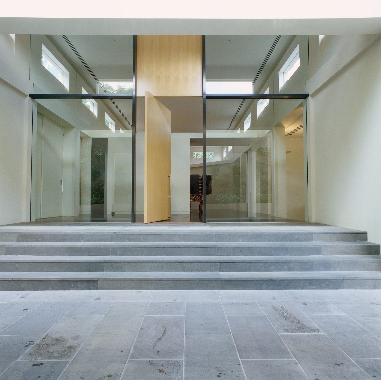
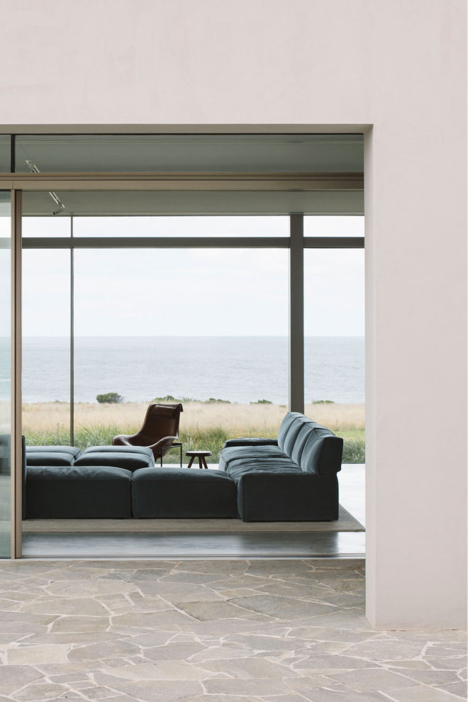
Sue Carr has always seen the client as pivotal to the design process and was as delighted as Agita when the initial call came through in 1988. Sue was also focused on the site and the brief and unlike others who talked about construction costs in the first meeting, this was certainly not raised at this time. And so the design evolved, with fewer larger spaces than enclosed rooms that lead off the main spine/atrium with a ceiling height of approximately five metres. Bluestone paving using for the terraces continues to the interior, with the bluestone floor inside being honed. In keeping with the brief, these spaces gently unfold to the garden through a series of protected outdoor terraces that are framed by the established cypress trees, eucalypts and paper barks.
The words ‘plain, and simple’ were important, avoiding any superfluous decoration, something both designer and client still cherish today.
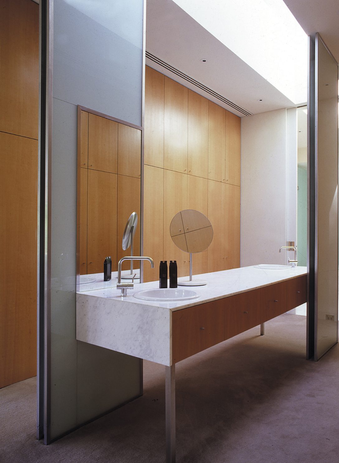
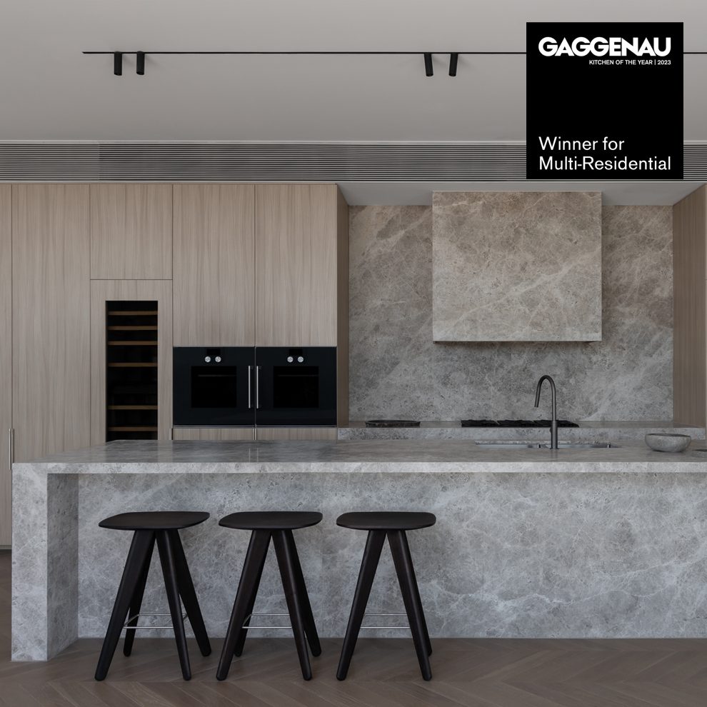
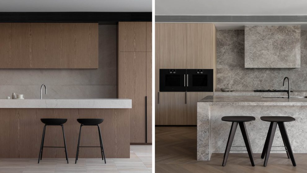
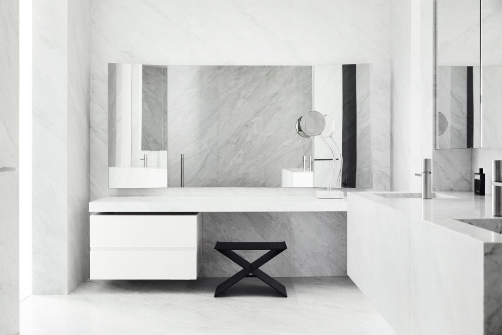
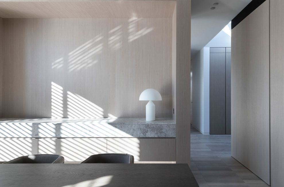
Unlike many houses that update wet areas such as kitchens and bathrooms after 30 years, the kitchen and bathrooms at the Merriwee Cresent house remain intact. The kitchen, for example, features rock maple joinery, Carrara marble benches and stainless-steel splashbacks framing the cooking areas (Carrara marble remains a signature in many of Carr’s designs today). Likewise, the bathrooms, with marble benches and rock maple joinery (the latter also appearing as a feature wall) remain contemporary today.
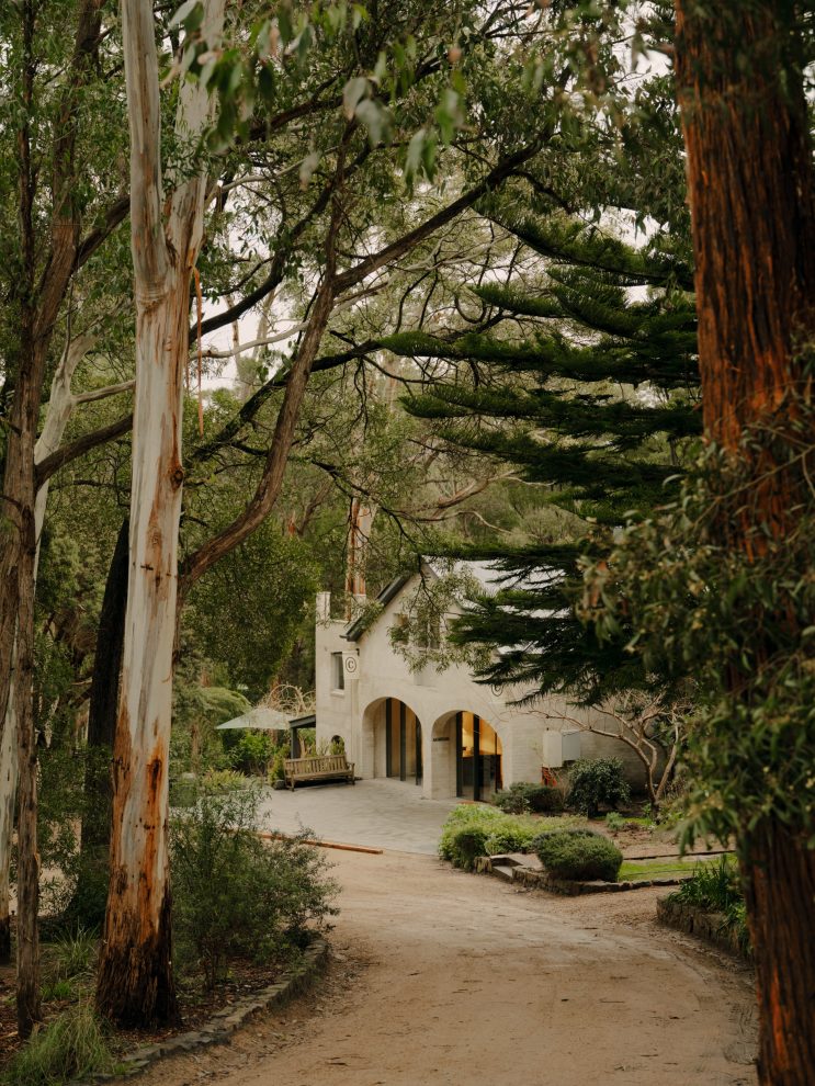
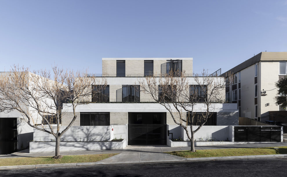
Other features, such as the three-metre-high rock maple pivotal front door (set into a five-metre-high timber-clad wall), still provides a sense of arrival, although thoughtfully positioned to one side, at the end of an impressive winding driveway. Like the entry sequence, which is highly discreet, the presentation to the street remains understated, timeless and contemporary 30 years later.
“Every great project starts with a great client, pushing boundaries and coming with high expectations,” says Sue, who still clearly recalls the Haddad’s enthusiasm, carefully following the design process from the initial concepts through to documentation and construction.
“They were on time for every inspection and every detail was addressed,” adds Sue, who feels gratified that a house built 30 years ago continues to delight decades later.
Words by Stephen Crafti
More from Stephen Crafti on RMIT’s podcast, Talking Design, where he speaks to Sue Carr and her path to finding interior design at university and her determination to start her own practice in 1971.

